We previously learned how to use the SVD as a tool for constructing low-rank matrices.
We now consider it as a tool for transforming (i.e., reducing the dimension of) our data.
Overview
Collected data is often high-dimensional, and a large number of features is challenging to work with.
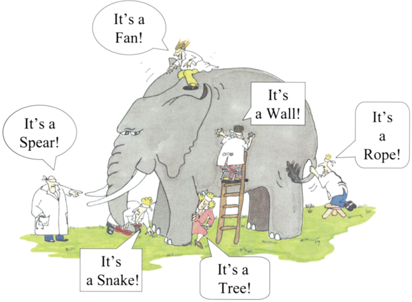
The blind men and the elephant: each one measures a few dimensions of the same object and reaches a different conclusion. Dimensionality reduction looks for the few coordinates that describe the whole. (Illustration of the traditional parable; artist unknown.)
High-Dimensional Challenges
We have seen some of these challenges already, in particular:
the curse of dimensionality, where data points become sparse in higher dimensions and distance metrics have less meaning,
overfitting, where high-dimensional data can lead to overly complex models that fit to noise in the data as opposed to the actual signal,
computational complexity, high-dimensional data requires more computing power and memory,
visualization, where high-dimensional data makes understanding and interpreting the data difficult.
How can we reduce the dimension of our data but still preserve the most important information in our dataset?
We will demonstrate the relationship between PCA and the SVD.
t-SNE is an alternative nonlinear method for dimensionality reduction.
PCA
Dimensionality Reduction
Input: \(\mathbf{x}_1,\ldots, \mathbf{x}_m\) with \(\mathbf{x}_i \in \mathbb{R}^n \: \: \forall \: i \in \{1, \ldots, m\}.\)
Output: \(\mathbf{y}_1,\dots, \mathbf{y}_m\) with \(\mathbf{y}_i \in \mathbb{R}^d \: \: \forall \: i \in \{1, \dots, m\}\).
The goal is to compute the new data points \(\mathbf{y}_i\) such that \(d << n\) while still preserving the most information contained in the data points \(\mathbf{x}_i\).
Be aware that row i of the data matrix \(X_0\) is the \(n\) dimensional vector \(\mathbf{x}_i\). This keeps our matrix in the structure \(m\) data rows and \(n\) features (columns). The same is true for \(Y\) (i.e., there are \(m\) rows with \(d\) features). Throughout this lecture \(m\) is the number of points and \(n\) the number of features – the same matrix-theory convention as last lecture’s SVD.
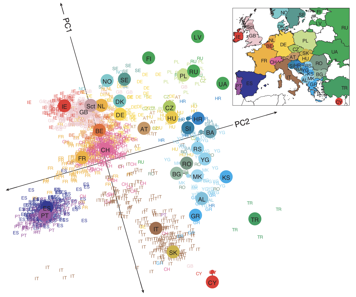
We consider a dataset from Novembre et al. (2008). The authors collected DNA data from about 3000 individuals of European ancestry.
Each feature is a SNP (single nucleotide polymorphism): a position in the genome where the base pair varies from person to person. At each SNP, a person’s genotype is coded by how many copies of the less common (minor) variant they carry – 0, 1, or 2, one copy from each parent.
The data for each individual consisted of approximately 500k SNPs. This means the data matrix we are working with is roughly 3000 x 500k, with entries in \(\{0, 1, 2\}\).
The authors performed PCA and plotted the 1387 individuals whose four grandparents all came from the same country, so that each point can be colored by a single country of origin.
The matrix \(S\) is symmetric, i.e., \(S = S^{T}.\) Its diagonal holds the variance of each feature (3 and 3) and its off-diagonal the covariance between them (1.5).
Variance Along a Direction
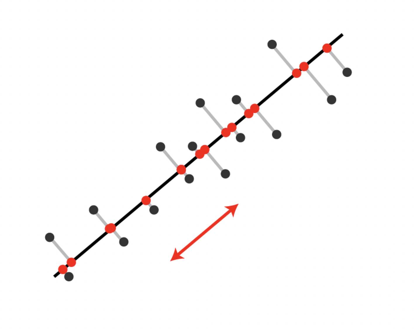
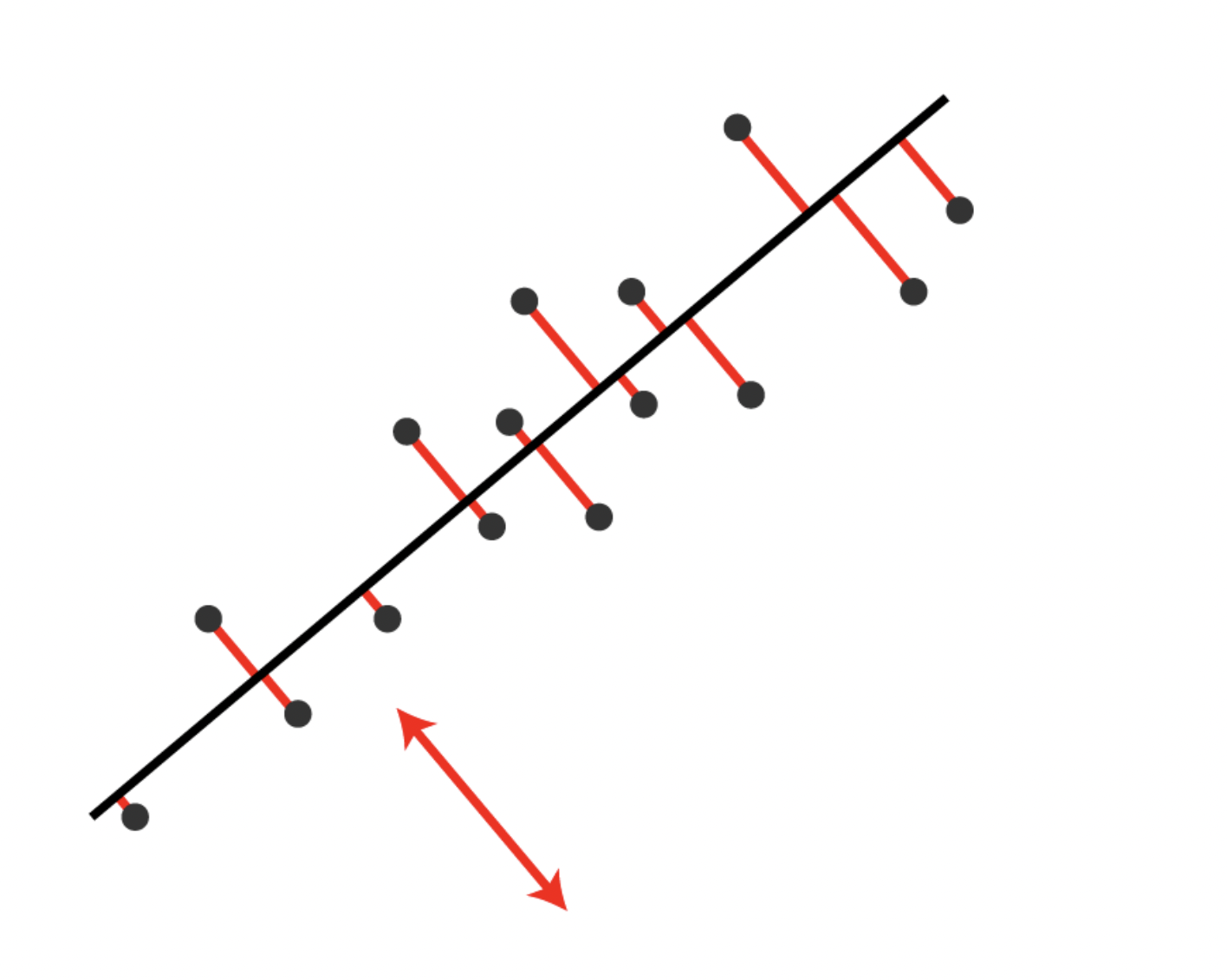
Pick any direction: a unit vector \(\mathbf{w}\in\mathbb{R}^n\) with \(\|\mathbf{w}\| = 1\). Projecting every centered point onto it gives one coordinate per point, the vector \(X\mathbf{w}\in\mathbb{R}^m\), which has mean zero because the columns of \(X\) do.
The maximizer is an eigenvector of \(S\), and the variance it achieves is \(\mathbf{w}^{T}S\mathbf{w} = \lambda\,\mathbf{w}^{T}\mathbf{w} = \lambda\): its eigenvalue.
The largest variance therefore belongs to the eigenvector with the largest eigenvalue. The next direction, constrained to be orthogonal to the first, is the eigenvector with the second-largest eigenvalue, and so on.
The two pictures above are the same problem. For each point, Pythagoras gives \(\|\mathbf{x}_i\|^2 = (\mathbf{x}_i\cdot\mathbf{w})^2 + (\text{distance from } \mathbf{x}_i \text{ to the line})^2\). Summed over the points, the left side does not depend on \(\mathbf{w}\), so maximizing the projected variance is minimizing the squared residuals.
This is why the next step is an eigendecomposition of \(S\).
Spectral Decomposition
We use the fact that the covariance matrix \(S\) is symmetric to apply the Spectral Decomposition, which states:
Every real symmetric matrix \(S\) has the factorization \(V\Lambda V^{T}\), where \(\Lambda\) is a diagonal matrix that contains the eigenvalues of S and the columns of \(V\) are orthonormal eigenvectors of \(S\).
This is a special case of eigendecomposition for symmetric matrices.
The covariance matrix \(S \in \mathbb{R}^{n\times n}\) has the spectral decomposition \(S = V\Lambda V^T\) where
The direction \(\mathbf{v}_i\) is the \(i\)-th principal component and the corresponding \(\lambda_i\) is the variance of the data along it – the \(i\)-th largest variance in the dataset, by the argument above.
In other words, \(\mathbf{v}_1\) is the first principal component and is the direction that accounts for the most variance in the dataset.
The vector \(\mathbf{v}_d\) is the \(d\)-th principal component and is the direction that accounts for the \(d\)-th most variance in the dataset.
The reduced data matrix is obtained by computing
\[
Y = XV'.
\]
Its \(j\)-th column is \(X\mathbf{v}_j\), so \(\operatorname{Var}(Y_j) = \mathbf{v}_j^TS\mathbf{v}_j = \lambda_j\): the columns of \(Y\) have exactly the variances \(\lambda_1, \dots, \lambda_d\), and they are uncorrelated with one another.
Spatial Interpretation – Dimensions
The operation \(Y = XV'\) performs a change of basis and projection of your data:
\(X \in \mathbb{R}^{m \times n}\): each of the \(m\) rows is a data point in the original \(n\)-dimensional feature space
\(V' \in \mathbb{R}^{n \times d}\): contains the first \(d\) principal components as columns (these are orthonormal vectors)
\(Y \in \mathbb{R}^{m \times d}\): each row is now a data point in the new \(d\)-dimensional space
Geometric Interpretation
Rotation: The multiplication by \(V'\) rotates your coordinate system. The columns of \(V'\) define a new set of \(d\) orthogonal axes that point in the directions of maximum variance.
Projection: Each data point in \(X\) is projected onto this new coordinate system. For each row vector \(\mathbf{x}_i\) (a point in \(\mathbb{R}^n\)): \[\mathbf{y}_i = \mathbf{x}_i V' = \begin{bmatrix} \mathbf{x}_i \cdot \mathbf{v}_1 & \mathbf{x}_i \cdot \mathbf{v}_2 & \cdots & \mathbf{x}_i \cdot \mathbf{v}_d \end{bmatrix}\]
Dimensionality Reduction: You’re effectively taking each point in \(n\)-dimensional space and expressing it using only \(d\) coordinates - the coordinates along the principal component directions. You’re discarding the components along directions with low variance.
Intuitive View
Think of it as finding the “best viewing angle” for your data. If you have data in 3D that’s mostly flat (like a pancake), PCA finds that the data lies approximately in a 2D plane. \(V'\) defines that plane’s orientation, and \(Y\) gives you the coordinates of each point within that plane.
Returning to our example \[X
= \begin{bmatrix}
2 & 1\\
-1 & 1\\
-1 & -2 \end{bmatrix},
\quad
S =
\begin{bmatrix}
3 & 1.5\\
1.5 & 3
\end{bmatrix}
\]
What is the value of the total variance in the data?
Total variance: \(T = \lambda_1 + \lambda_2 = 6\).
This is also \(S_{11} + S_{22} = \operatorname{trace}(S)\): the eigenvalues redistribute the per-feature variances across the principal directions without changing their sum. The first principal component accounts for \(4.5/6 = 75\%\) of it.
Projecting onto the first principal component (\(d = 1\)):
The variance of these three numbers is \(\frac{1}{m-1}\left(\frac{9}{2} + 0 + \frac{9}{2}\right) = 4.5 = \lambda_1\), exactly as the derivation promised: the eigenvalue is the variance of the projected data.
The columns of \(V\) are the principal directions (or components).
The reduced dimension data is the projection of the data in the direction of the principal directions, i.e., \(Y=XV'\).
The total variance \(T\) in the data is the sum of all eigenvalues: \(T = \lambda_1 + \lambda_2 + \dots + \lambda_n.\)
The first eigenvector \(\mathbf{v}_1\) points in the most significant direction of the data. This direction explains the largest fraction \(\lambda_1/T\) of the total variance.
The second eigenvector \(\mathbf{v}_2\) accounts for a smaller fraction \(\lambda_2/T\).
The explained variance of component \(i\) is the value \(\lambda_i/T\). These fractions are non-increasing in \(i\) and sum to 1.
The cumulative (total) explained variance is the sum of the explained variances up to component \(k\), e.g. \(\sum_{i=1}^{k} \frac{\lambda_i}{T}\). The total explained variance for all eigenvalues is 1.
Case Study: Random Data
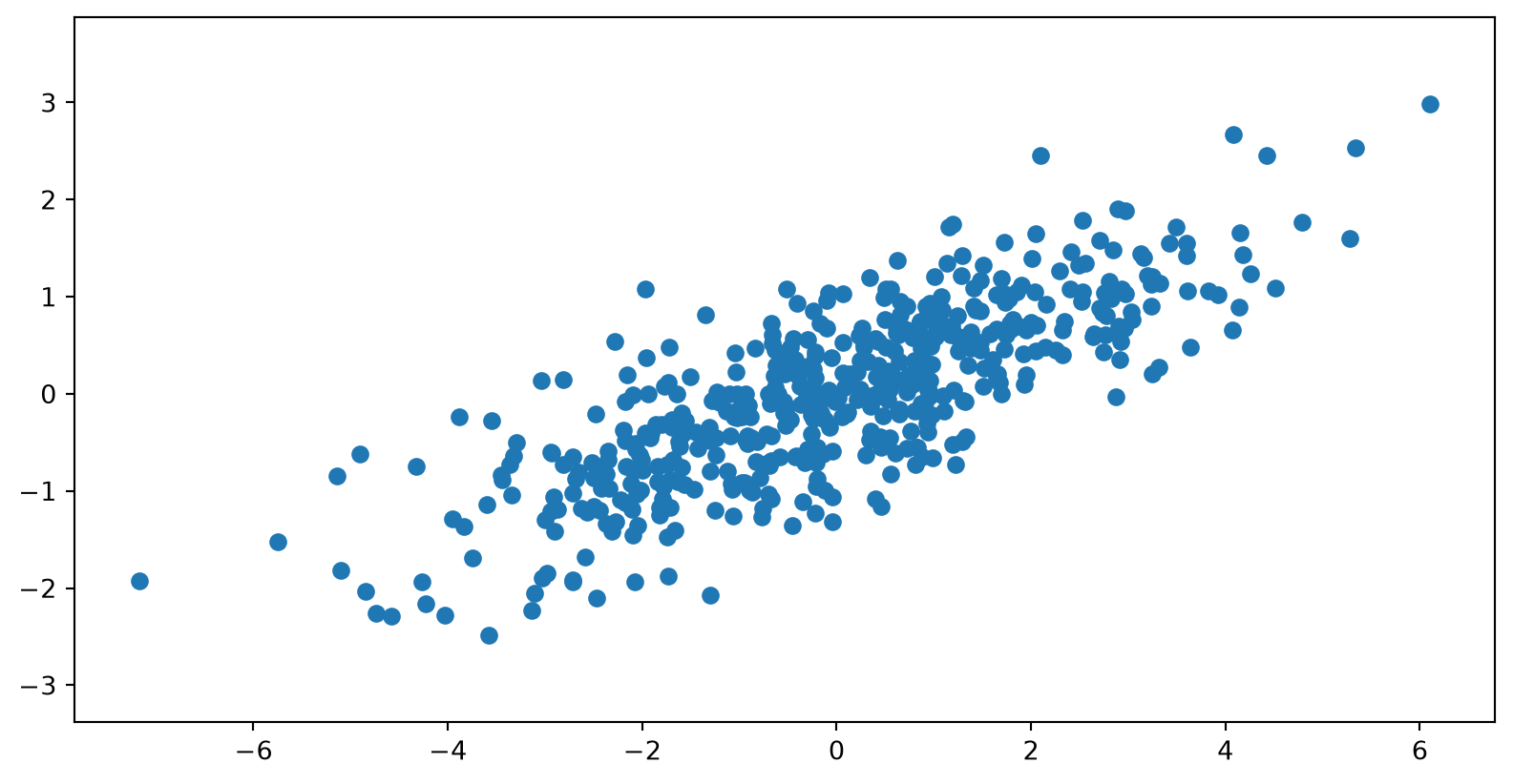
Let’s consider some randomly generated data consisting of 2 features.
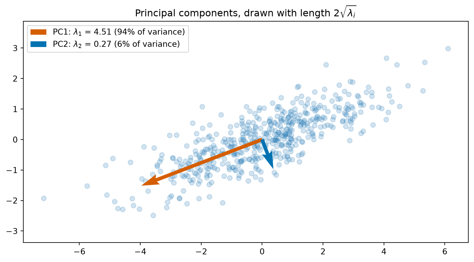
Let’s do PCA and plot the principal components over our dataset. As expected, the principal components are orthogonal and point in the directions of the maximum variance.
Each arrow is drawn with length \(2\sqrt{\lambda_i}\), two standard deviations of the data along that component, so the arrows show the variance split as well as the directions.
Code
origin = np.zeros(2)# Compute the covariance matrix (X is already centered)cov_matrix = np.cov(X, rowvar=False)# Eigenvalues and eigenvectors, sorted in descending ordereigenvalues, eigenvectors = np.linalg.eigh(cov_matrix)order = np.argsort(eigenvalues)[::-1]eigenvalues, eigenvectors = eigenvalues[order], eigenvectors[:, order]plt.scatter(X[:, 0], X[:, 1], alpha=0.2)for i, colour inenumerate([OKABE_ITO[3], OKABE_ITO[5]]): length =2* np.sqrt(eigenvalues[i]) plt.quiver(*origin, *(length * eigenvectors[:, i]), angles='xy', scale_units='xy', scale=1, color=colour, width=0.008, label=f'PC{i+1}: $\\lambda_{i+1}$ = {eigenvalues[i]:.2f} 'f'({eigenvalues[i] / eigenvalues.sum():.0%} of variance)')plt.legend(loc='upper left')plt.title(r'Principal components, drawn with length $2\sqrt{\lambda_i}$')plt.axis('equal')plt.show()
The sign of each arrow is arbitrary: \(\mathbf{v}\) and \(-\mathbf{v}\) are both unit eigenvectors for the same \(\lambda\), and numpy.linalg.eigh, numpy.linalg.svd and scikit-learn’s PCA are each free to return either. Only the line through the origin and the variance along it are determined. Do not read meaning into a principal component pointing “left” rather than “right”, and expect two libraries to disagree on signs.
Case Study: Digits
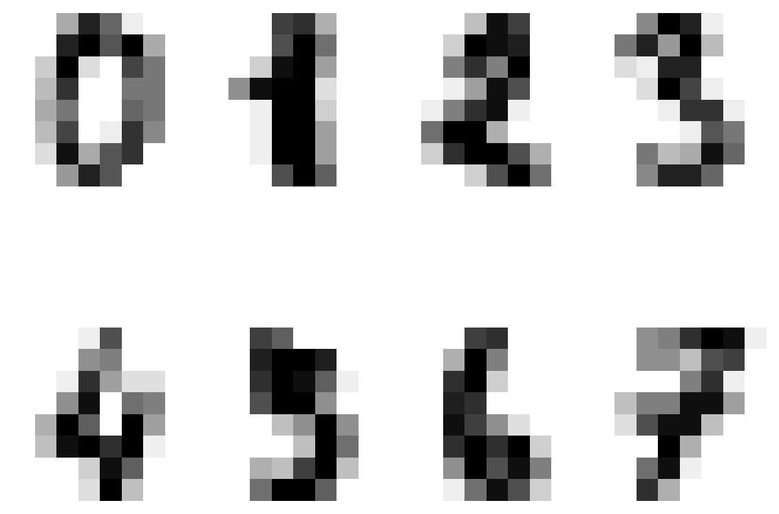
Let’s consider another example using scikit-learn’s digits dataset: 1,797 handwritten digits scanned at \(8\times 8\) pixels (from the UCI repository). It is a small cousin of the well-known MNIST set, whose images are \(28\times 28\).
Code
from sklearn import datasetsdigits = datasets.load_digits()plt.figure(figsize=(6, 6),)for i inrange(8): plt.subplot(2, 4, i +1) plt.imshow(digits.images[i], cmap='gray_r') plt.axis('off')plt.tight_layout()plt.show()
We first stack the columns of each digit on top of each other (this operation is called vectorizing) and perform PCA on the 64-D representation of the digits.
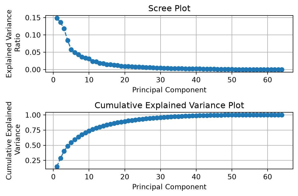
We can plot the explained variance ratio and the total (cumulative) explained variance ratio.
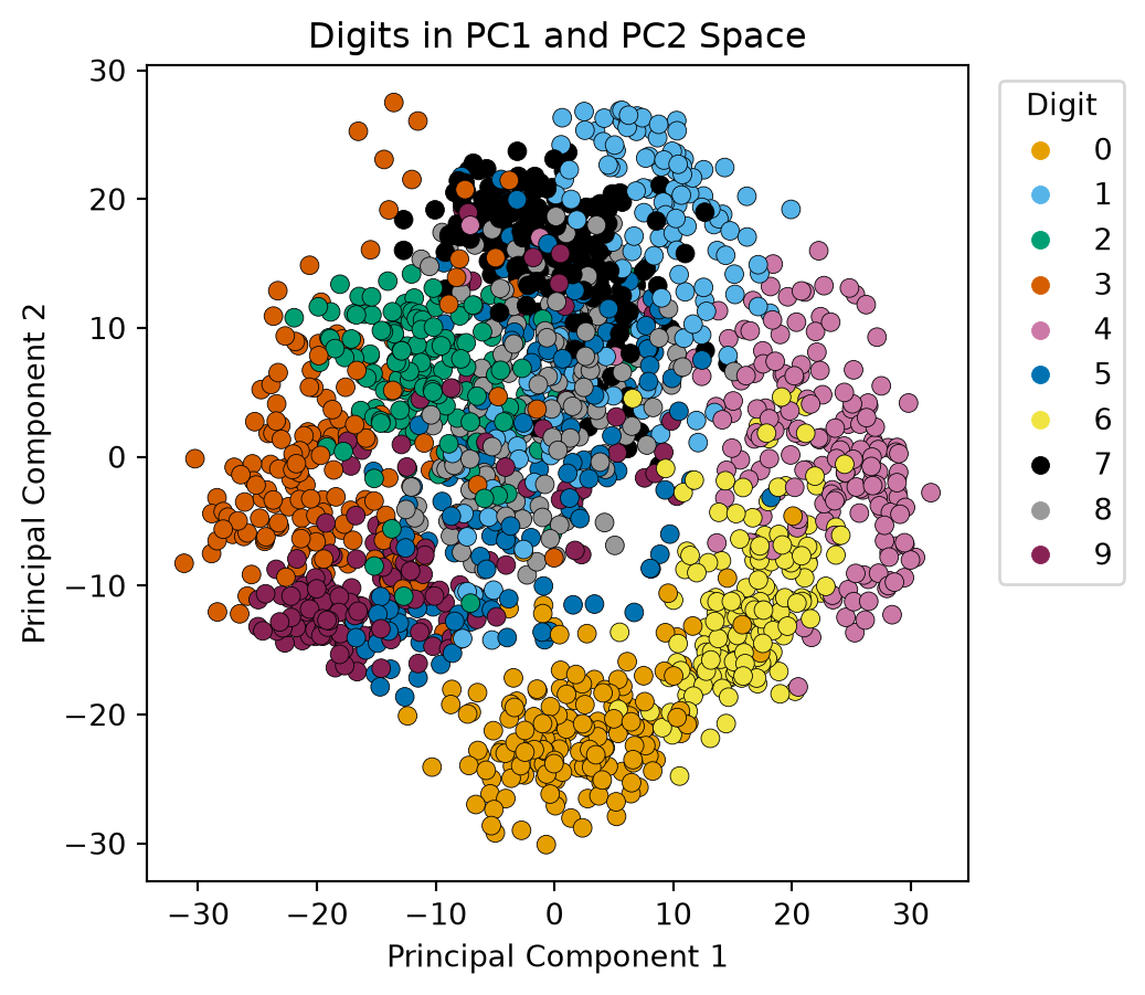
Let’s plot the data in the first 2 principal component directions. We’ll use the digit labels to color each digit in the reduced space.
Code
# Okabe-Ito is a colour-blind-safe palette of eight colours; ten digits need two more.DIGIT_CMAP = ListedColormap(OKABE_ITO + ['#999999', '#882255'])def digit_scatter(ax, Z, labels, title, s=25):"""Scatter a 2-D embedding Z, one colour per digit class.""" sc = ax.scatter(Z[:, 0], Z[:, 1], c=labels, cmap=DIGIT_CMAP, vmin=-0.5, vmax=9.5, edgecolor='k', linewidth=0.3, s=s) ax.set_title(title)return scfig, ax = plt.subplots(figsize=(5, 5))sc = digit_scatter(ax, X_pca, y, 'Digits in PC1 and PC2 Space', s=40)ax.set_xlabel('Principal Component 1')ax.set_ylabel('Principal Component 2')ax.legend(*sc.legend_elements(), title="Digit", bbox_to_anchor=(1.02, 1), loc='upper left')plt.show()
We observe the following in our plot of the digits in the first two principal components:
There is a decent clustering of some of our digits, in particular 0, 2, 3, 4, and 6.
The numbers 0 and 6 seem to be relatively close to each other in this space.
There is not a very clear separation of the number 5 from some of the other points.
To scale or not to scale
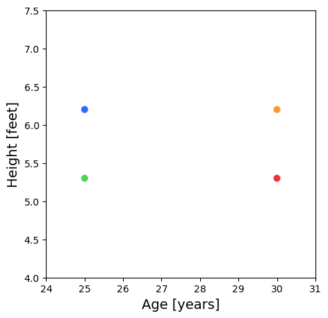
Consider a situation where we have age (years) and height (feet) data for 4 people.
Person
Age [years]
Height [feet]
A
25
6.232
B
30
6.232
C
25
5.248
D
30
5.248
Notice that the dominant direction of the variance is aligned horizontally.
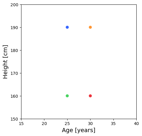
What if the height is in cm?
Person
Age [years]
Height [cm]
A
25
189.95
B
30
189.95
C
25
159.96
D
30
159.96
Notice that the dominant direction of the variance is aligned vertically.
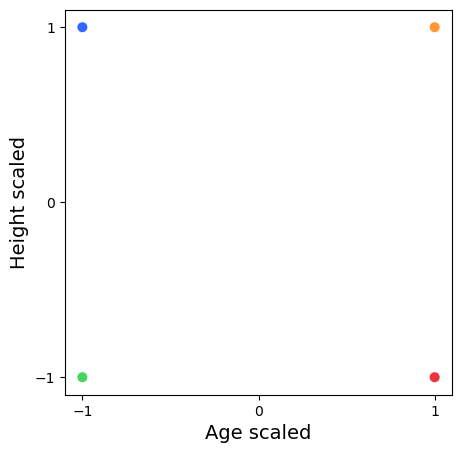
Let’s standardize our data: subtract each column’s mean and divide by its standard deviation.
Person
Age [years]
Height [cm]
A
-1
1
B
1
1
C
-1
-1
D
1
-1
When we standardize our data, we observe an equal distribution of the variance.
What quantity is represented by \(\frac{Cov(X, Y)}{\sigma_X\sigma_Y}\), where \(X\) and \(Y\) represent the random variables of a person’s age and height, respectively?
This is the correlation coefficient, and the matrix of these values is the correlation matrix. When you standardize your data you are no longer working with the covariance matrix but the correlation matrix.
PCA on a standardized dataset and working with the correlation matrix is the best practice when your data has very different scales.
PCA identifies the directions with the maximum variance and large scale data can disproportionately influence the results of your PCA.
When not to standardize: when the features already share a unit and their differing variances are the signal. Pixel intensities (the digits above), SNP counts (Novembre et al.), and last lecture’s traffic counts are all left unscaled, because standardizing would inflate a nearly constant, noisy feature to the same weight as an informative one.
Relationship to the SVD
Recall that the SVD of a (mean-centered) data matrix \(X\in\mathbb{R}^{m\times n}\) (\(m>n\)) is
\[
X = U\Sigma V^T.
\]
The shapes are as in lecture 12’s thin SVD: \(U\) is \(m\times n\) with orthonormal columns, and \(\Sigma\) and \(V^T\) are \(n\times n\).
How can we relate this to what we learned in PCA?
In PCA, we computed an eigen-decomposition of the covariance matrix, i.e., \(S=V\Lambda V^{T}\).
Consider the following computation using the SVD of \(X\)
We see that eigenvalues \(\lambda_i\) of the matrix \(S\) are the squares \(\sigma_{i}^{2}\) of the singular values \(\Sigma\) (scaled by \(\frac{1}{m-1}\)).
Scores, Reconstruction, and the Variance You Threw Away
Three identities tie PCA to last lecture’s truncated SVD. Let \(X = U\Sigma V^T\), let \(V'\) be the first \(d\) columns of \(V\), \(U'\) the first \(d\) columns of \(U\), and \(\Sigma'\) the top-left \(d\times d\) block of \(\Sigma\).
Scores.\(Y = XV' = U\Sigma V^TV' = U'\Sigma'\), because \(V^TV'\) is the first \(d\) columns of the identity. Column \(j\) of \(Y\) is \(\sigma_j\mathbf{u}_j\) and has variance \(\sigma_j^2/(m-1) = \lambda_j\).
Reconstruction. Mapping the scores back to \(\mathbb{R}^n\), \(X^{(d)} = YV'^T = U'\Sigma'V'^T\), is exactly the rank-\(d\) truncated SVD. By Eckart–Young (lecture 12) it is the best rank-\(d\) approximation of \(X\) in the Frobenius norm. PCA with \(d\) components and the rank-\(d\) SVD of the centered data are the same thing.
Error.\(\|X - X^{(d)}\|_F^2 = \sum_{i>d}\sigma_i^2 = (m-1)\sum_{i>d}\lambda_i\). The squared reconstruction error is the variance you threw away. Dividing by \(\|X\|_F^2 = (m-1)T\) turns it into \(1 - (\text{cumulative explained variance through } d)\).
On the three-point example, \(\sigma_1 = 3\) and \(\sigma_2 = \sqrt{3}\) (since \(\sigma_i^2 = (m-1)\lambda_i = 2\lambda_i\)), and keeping one component should leave a squared error of \((m-1)\lambda_2 = 3\):
singular values: [3.     1.7321]   sigma^2/(m-1): [4.5 1.5]
X v1     : [-2.1213 -0.      2.1213]   (sign flipped relative to eigh above: v1 vs -v1)
u1 sigma1: [-2.1213 -0.      2.1213]   (identical, as Y = U' Sigma' says)
||X - X_d||_F^2 = 3.0   (m-1) lambda_2 = 3.0
In practice, PCA is done by computing the SVD of your data matrix as opposed to forming the covariance matrix and computing the eigenvalues.
The principal components are the right singular vectors \(V\). The projected data is \(Y = XV' = U'\Sigma'\). The eigenvalues of \(S\) are obtained from squaring the entries of \(\Sigma\) and scaling them by \(\frac{1}{m-1}\).
Reasons to compute PCA this way are
Numerical Stability: Forming \(X^TX\) squares the condition number, \(\kappa(X^TX) = \kappa(X)^2\) (lecture 11). Small singular values of \(X\) become tiny eigenvalues of \(S\) that can round to zero or even negative, and the corresponding eigenvectors are lost to noise. The SVD works on \(X\) directly and never forms the product.
Efficiency: SVD is computationally efficient, especially for large datasets. Many optimized algorithms and libraries (like those in NumPy and scikit-learn) leverage SVD for fast computations.
Direct Computation of Principal Components: SVD directly provides the principal components (right singular vectors) and the singular values, which are related to the explained variance. This makes the process straightforward and avoids the need to compute the covariance matrix explicitly.
Pros and Cons
Here are some advantages and disadvantages of using PCA.
Advantages
Allows for visualizations
Removes redundant variables
Can reduce overfitting (fewer inputs to the downstream model)
Speeds up other ML algorithms
Disadvantages
reduces interpretability
can result in information loss
can be less effective than non-linear methods
t-SNE
When PCA Is Not Enough
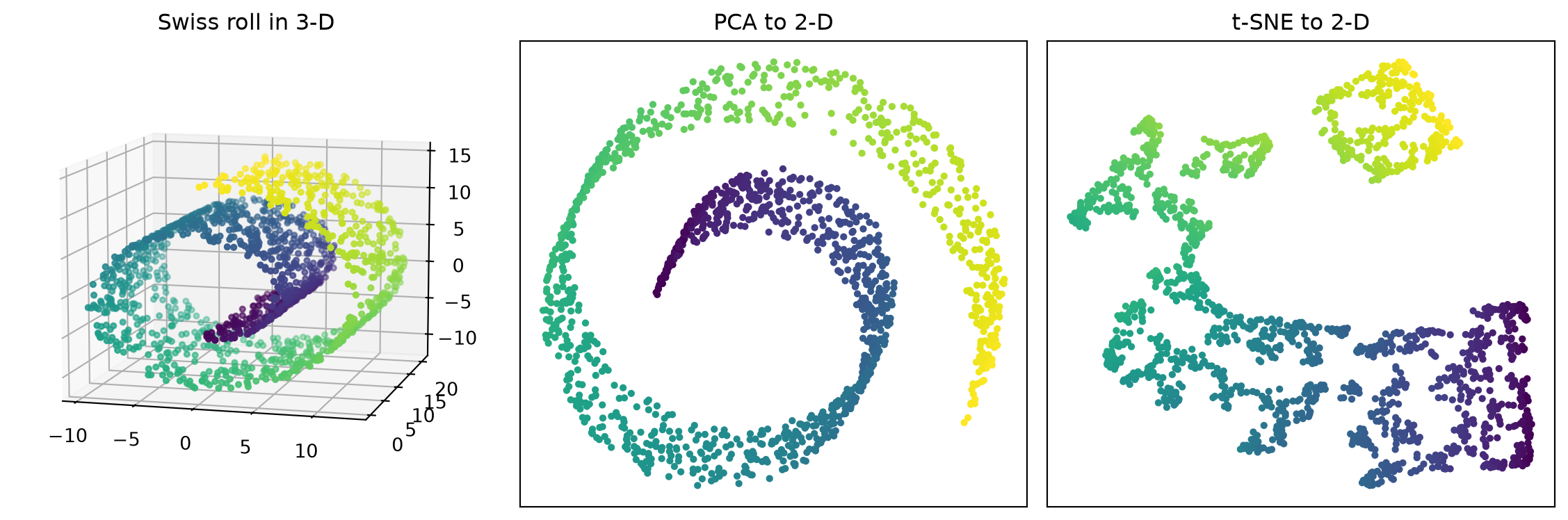
PCA is linear: it chooses the best flat viewing angle. Some data has few intrinsic dimensions but is curled up in the ambient space, and no flat projection can unroll it.
Code
from sklearn.datasets import make_swiss_rollfrom sklearn.manifold import TSNEX_roll, t_roll = make_swiss_roll(n_samples=1500, noise=0.05, random_state=0)roll_pca = PCA(n_components=2).fit_transform(X_roll)roll_tsne = TSNE(n_components=2, perplexity=30, random_state=0).fit_transform(X_roll)fig = plt.figure(figsize=(12, 4))ax = fig.add_subplot(1, 3, 1, projection='3d')ax.scatter(X_roll[:, 0], X_roll[:, 1], X_roll[:, 2], c=t_roll, cmap='viridis', s=8)ax.view_init(elev=10, azim=-75)ax.set_title('Swiss roll in 3-D')ax = fig.add_subplot(1, 3, 2)ax.scatter(roll_pca[:, 0], roll_pca[:, 1], c=t_roll, cmap='viridis', s=8)ax.set_title('PCA to 2-D')ax = fig.add_subplot(1, 3, 3)ax.scatter(roll_tsne[:, 0], roll_tsne[:, 1], c=t_roll, cmap='viridis', s=8)ax.set_title('t-SNE to 2-D')for a in fig.axes[1:]: a.set_xticks([]) a.set_yticks([])plt.tight_layout()plt.show()
Colour is the position along the roll. PCA squashes the roll flat, so successive turns land on top of each other and far-apart colours mix. t-SNE keeps each point next to its high-dimensional neighbours, so the colour varies smoothly across the map.
What is t-SNE?
t-SNE stands for t-distributed Stochastic Neighbor Embedding
A dimensionality reduction technique specifically designed for visualization
Transforms high-dimensional data (hundreds or thousands of features) into 2D or 3D
Goal: Preserve the local structure of your data while making it viewable
Developed by Laurens van der Maaten and Geoffrey Hinton in 2008, see Van der Maaten and Hinton (2008).
Think of it as creating a “map” of your data where similar points stay close together.
Why Do We Need t-SNE?
The Curse of Dimensionality
Real datasets often have many features (dimensions)
Impossible to visualize data with 100+ dimensions
Linear methods like PCA can only flatten, never unroll (previous slide)
What t-SNE offers:
Reveals clusters and patterns in complex data
Preserves neighborhood relationships between points
Creates intuitive, interpretable visualizations
How Does t-SNE Work?
The Big Picture
Step 1: Measure Similarity in High Dimensions
Calculate how “similar” each pair of points is in the original space
Similar points get high probability, distant points get low probability
Step 2: Create a Random Low-Dimensional Map
Start with random positions for all points in 2D/3D
Step 3: Optimize the Map
Iteratively move points around to match the high-dimensional similarities
Points that were neighbors in high-D should be neighbors in low-D
Step 1: Compute Pairwise Similarities
Calculate pairwise similarities between the \(m\) points in the high-dimensional space.
Use a Gaussian distribution to convert distances into probabilities.
The probability \(p_{j\vert i}\) between points \(i\) and \(j\) is given by: \[
p_{j\vert i} = \frac{\exp(-\|x_i - x_j\|^2 / 2\sigma_i^2)}{\sum_{k \neq i} \exp(-\|x_i - x_k\|^2 / 2\sigma_i^2)}.
\]
The \(p_{j\vert i}\) value represents the conditional probability that point \(x_i\) would choose \(x_j\) as its neighbor.
Note that we set \(p_{i\vert i} = 0\) – we don’t consider a point to be its own neighbor.
Step 1: Symmetrize
In general \(p_{j\vert i} \neq p_{i\vert j}\): each point has its own bandwidth \(\sigma_i\), and a point in a dense region “chooses” its neighbors differently from one in a sparse region.
t-SNE therefore combines the two conditionals into a single joint probability \[
p_{ij} = \frac{p_{j\vert i} + p_{i\vert j}}{2m},
\] where \(m\) is the number of data points.
Dividing by \(2m\) makes \(\sum_{i \neq j} p_{ij} = 1\), so \(P\) is one probability distribution over all pairs. It also guarantees \(\sum_j p_{ij} > \frac{1}{2m}\) for every point \(i\), so even an outlier contributes to the cost and is not simply ignored.
Using this \(p_{ij}\) is called symmetric t-SNE.
Step 1: Choosing \(\sigma\)
Every point gets its own bandwidth \(\sigma_i\), chosen so that its Gaussian neighborhood contains a fixed effective number of neighbors. That number is the perplexity, the one hyperparameter you must set.
Dense regions get a small \(\sigma_i\), sparse regions a large one.
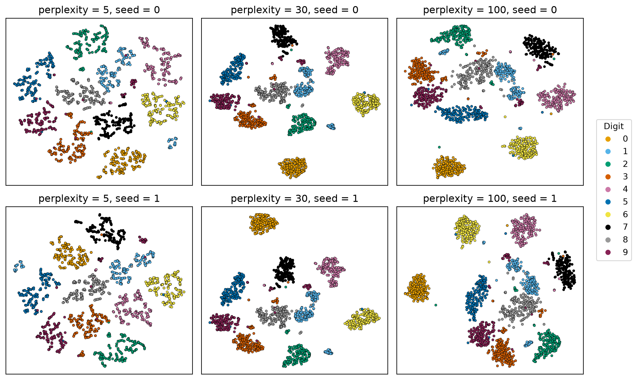
Low perplexity (5–10) looks only at very local structure, and the map can fragment into many small clumps. High perplexity (50–100) uses broader neighborhoods, and small clusters merge. It must be smaller than the number of points.
The perplexity commonly ranges between 5 and 50; scikit-learn’s default is 30. Try several values and trust only the structure that persists – we do exactly that on the digits below.
Initialize points randomly in the low-dimensional space.
Define a similar probability distribution using a simplified Student-t distribution: \[
q_{ij} = \frac{(1 + \|y_i - y_j\|^2)^{-1}}{\sum_{k \neq l} (1 + \|y_k - y_l\|^2)^{-1}}.
\]
Step 3: Minimize Kullback-Leibler Divergence
Minimize the Kullback-Leibler (KL) divergence between the high-dimensional and low-dimensional pair distributions: \[
KL(P \| Q) = \sum_{i \neq j} p_{ij} \log \frac{p_{ij}}{q_{ij}}.
\]
\(KL(P\|Q) \geq 0\), with equality only when \(Q = P\). A perfect map would reproduce every pairwise similarity, which is usually impossible in 2-D, so what matters is which mismatches cost the most. The weights \(p_{ij}\) decide:
\(p_{ij}\) large but \(q_{ij}\) small (neighbors in high-D placed far apart in the map): a large penalty.
\(p_{ij}\) small but \(q_{ij}\) large (distant points in high-D placed close in the map): \(p_{ij}\log(p_{ij}/q_{ij})\) stays small.
So t-SNE works hard to keep neighbors together and barely cares where non-neighbors land relative to one another. This asymmetry is the reason local structure is preserved while cluster sizes and the gaps between clusters are not (see Important Limitations).
To minimize the KL divergence we use gradient descent on \(\partial KL / \partial y_i\) to iteratively adjust the positions of points, \(y_i\), in the low-dimensional space.
The Key Insight
t-SNE uses different probability distributions for each step:
High dimensions: Gaussian (normal) distribution
Measures similarity based on Euclidean distance
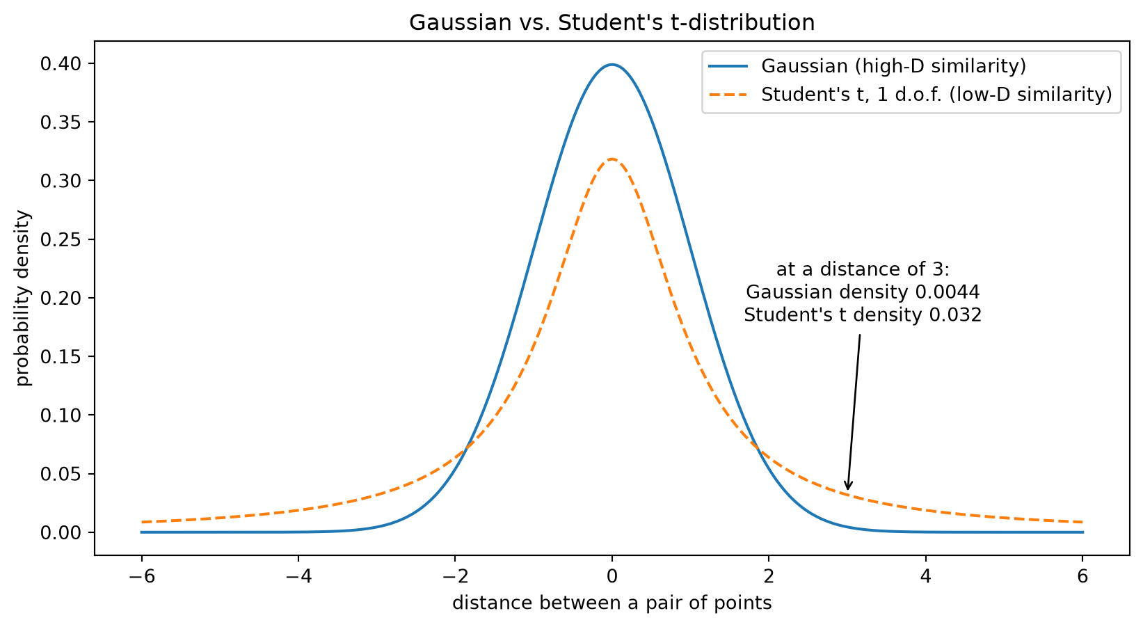
Low dimensions: Student’s t-distribution with one degree of freedom
Has “heavier tails” than the Gaussian
Allows moderate distances in low-D to represent larger distances in high-D
Helps prevent crowding and creates better separation
This asymmetry is what makes t-SNE effective!
Code
from scipy.stats import norm, tx = np.linspace(-6, 6, 400)gaussian_y = norm.pdf(x) # mean 0, standard deviation 1t_y = t.pdf(x, df=1) # Student's t with one degree of freedomplt.plot(x, gaussian_y, label='Gaussian (high-D similarity)')plt.plot(x, t_y, linestyle='dashed', label="Student's t, 1 d.o.f. (low-D similarity)")x0 =3plt.annotate(f'at a distance of {x0}:\nGaussian density {norm.pdf(x0):.4f}\n'f"Student's t density {t.pdf(x0, df=1):.3f}", xy=(x0, t.pdf(x0, df=1)), xytext=(3.2, 0.18), ha='center', arrowprops=dict(arrowstyle='->'))plt.xlabel('distance between a pair of points')plt.ylabel('probability density')plt.title("Gaussian vs. Student's t-distribution")plt.legend()plt.show()
The two curves agree near zero, so close neighbors are treated alike. In the tails the Student’s t keeps several times more mass: a pair that is moderately far apart in high-D can be placed much farther apart in the map and still match its (tiny) \(p_{ij}\). That extra room is what relieves the crowding problem – there is far less area in 2-D than volume in 64-D to spread the non-neighbors into.
Case Study: Digits
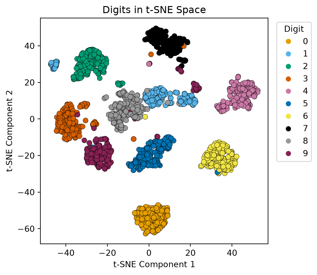
Let’s consider how t-SNE performs on the digits dataset we saw with PCA.
Compared with the PCA plot, every digit now forms its own island, including the 5s and 8s that PCA left tangled. Note that since scikit-learn 1.2 TSNE initializes the map from PCA (init='pca') rather than at random, so repeated runs on the same data look alike; the classic “a different picture every run” behavior needs init='random', which we use next.
Perplexity and Seed Change the Picture
The same 1,797 digits, six times: three perplexities across, two random initializations down.
Down a column (same perplexity, different seed): the clusters are the same, but some of them move: at perplexity 5 and 100 whole digits jump to the other side of the map, and even at 30 the 0s trade places. Where a cluster lands, and which digit it sits next to, is partly an accident of the initialization.
Across a row (same seed, different perplexity): at 5 each digit splinters into several loose fragments; at 100 the clusters are compact but 1, 8 and 9 start to bleed into a shared region. What survives every setting is which points cluster together – that is the structure to trust, not where the clusters sit.
Cluster Sizes and Gaps Are Not Preserved
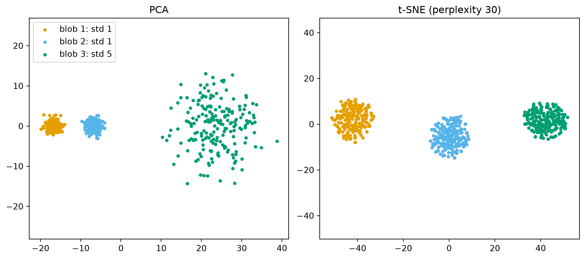
Three Gaussian blobs in 10 dimensions, built so that we know the truth: two tight blobs (standard deviation 1) at a distance of 10 from each other, and one wide blob (standard deviation 5) another 30 away.
PCA is faithful. The two tight blobs are tight and 10 apart; the wide blob is five times wider and 30 further on. Distances in the plot are distances in the data.
t-SNE equalizes. All three blobs come out about the same size and roughly evenly spaced. The wide blob is shrunk and the big gap is closed – exactly what the KL asymmetry predicts, since the cost barely notices where non-neighbors are placed.
So from a t-SNE plot you may conclude “these points are neighbors”, but not “this cluster is bigger” or “these two clusters are far apart”.