Causal Inference: Confounding, Counterfactuals, and Causal Graphs

So far in this course we have built tools that are very good at answering one kind of question: given what I observe, what should I predict? Clustering, regression, and classification all learn associations in data.

But many of the questions we actually care about as data scientists are of a different kind. They are questions about what would happen if we acted:

  • If we change the checkout button from blue to green, will more people buy?
  • If a patient takes this drug, will they recover faster?
  • If a student enrolls in the tutoring program, will their grade go up?
  • If the city raises the minimum wage, will employment fall?

These are causal questions, and — as we will see — no amount of predictive accuracy answers them by itself.

Lecture Overview

In this lecture on causal inference we cover:

  • why a fitted regression is not a causal claim: prediction vs. intervention,
  • the potential outcomes (Neyman–Rubin) framework, the ATE, and selection bias,
  • confounding, Simpson’s paradox, and direct standardization,
  • randomized controlled trials (the “gold standard”),
  • causal graphs: open and blocked paths, and the backdoor criterion for choosing what to adjust for (and what not to),
  • estimating effects without an experiment, and what to do when a confounder is unmeasured.

A fitted regression is not a causal claim

You just fit regressions. What does a coefficient mean?

In Lectures 10 and 11 you fit models like

smf.ols("Lottery ~ Literacy + Wealth + Region", data=df).fit().summary()

and read off a coefficient, a confidence interval, and a \(p\)-value for each variable.

There are two very different readings of a coefficient \(\hat\beta_1\) on \(X\):

Associational reading (what OLS estimates)

“Among the units in my data, those with \(X\) one unit higher have \(Y\) higher by \(\hat\beta_1\) on average.”

Causal reading (what a decision-maker wants)

“If I raised \(X\) by one unit, \(Y\) would change by \(\hat\beta_1\) on average.”

Least squares gives you the first reading, always. It gives you the second only under extra assumptions that the data cannot check for you. This lecture is about what those assumptions are, and what happens when they fail.

A regression you would recognize

Two variables measured daily across the summer: ice cream sales and drowning deaths. Let’s fit the regression exactly as we did in Lectures 10 and 11.

Code
import numpy as np, pandas as pd
import statsmodels.formula.api as smf

rng = np.random.default_rng(701)
n = 200
temp = rng.uniform(60, 100, n)                        # daily high temperature (°F)
ice_cream = 2.0 * temp + rng.normal(0, 15, n)         # ice cream sales
drownings = 0.10 * temp + rng.normal(0, 2.0, n)       # drowning deaths
# NOTE: ice cream does NOT appear in the equation for drownings.

df = pd.DataFrame({"ice_cream": ice_cream, "drownings": drownings, "temp": temp})
res = smf.ols("drownings ~ ice_cream", data=df).fit()
print(res.summary().tables[1])
==============================================================================
                 coef    std err          t      P>|t|      [0.025      0.975]
------------------------------------------------------------------------------
Intercept      3.1654      0.840      3.770      0.000       1.510       4.821
ice_cream      0.0320      0.005      6.262      0.000       0.022       0.042
==============================================================================

A positive slope, a tight confidence interval, \(p \approx 0\). Every diagnostic from Lecture 10 says the fit is fine. Should the city ban ice cream to reduce drownings?

Correlation is not causation

  • The regression is correct as a description of the data: on days with more ice cream sales there are more drownings.
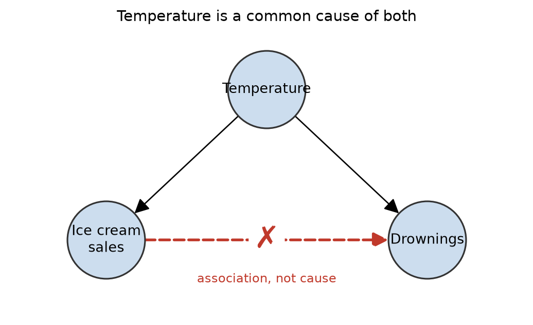
  • But look at how the data were generated: a third variable, hot weather, drives both. Hot days increase ice cream sales and send more people swimming.
  • Temperature is a confounder. Ice cream has no effect on drowning, and banning it would change nothing.

The slogan “correlation is not causation” is famous, and yet the mistakes it warns about are everywhere — most often hidden inside a regression table that looks authoritative.

The picture behind the slogan

Both arrows point out of temperature. Follow them and you can get from ice cream to drownings without either one causing the other. Later in this lecture this shape gets a name and a set of rules; for now, the shape is the whole story.

Confounding

Definition

A confounder is a variable that causally affects both the treatment (or explanatory variable) \(X\) and the outcome \(Y\). It creates an association between \(X\) and \(Y\) that is not due to \(X\) causing \(Y\).

Multiple regression can sometimes fix this — if we measure the confounder and include it:

Code
naive = smf.ols("drownings ~ ice_cream", data=df).fit().params["ice_cream"]
adj   = smf.ols("drownings ~ ice_cream + temp", data=df).fit().params["ice_cream"]
print(f"slope on ice_cream, ignoring temp:  {naive:+.3f}")
print(f"slope on ice_cream, adjusting temp: {adj:+.3f}   (truth: 0)")
slope on ice_cream, ignoring temp:  +0.032
slope on ice_cream, adjusting temp: -0.007   (truth: 0)

Adding temp to the formula drives the ice-cream coefficient to zero. So “controlling for” a variable is just adding it to the regression — but which variables to add is a causal question that the fitting procedure cannot answer. If temperature had not been measured, no amount of model selection would have saved us.

Same trap, higher stakes

A hospital analytics team fits a model on patient records and finds a strong, statistically significant relationship:

Patients who visit the hospital are more likely to die within the year than patients who do not.

Should we conclude that hospitals cause death and recommend people avoid them?

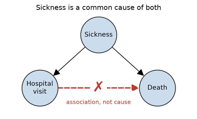
Of course not. Sick people go to hospitals. The hospital visit is associated with death because both are driven by a common cause — being sick. Same shape as the ice cream picture, with the names changed.

The model is a perfectly good predictor (“I see a hospital visit, I predict higher mortality”) and a catastrophically bad guide to action (“close the hospitals”). That gap — prediction vs. intervention — is the subject of this lecture (Angrist and Pischke 2009).

Prediction vs. intervention

Two different questions

Prediction (association)

\[ P(Y \mid X = x) \]

“Among people I observe to have \(X = x\), what is the distribution of \(Y\)?”

This is what supervised learning — including every regression you have fit — estimates.

Intervention (causation)

\[ P(Y \mid do(X = x)) \]

“If I set \(X = x\) for everyone, what is the distribution of \(Y\)?”

This is what a decision-maker needs. (Pearl 2009)

In general \(P(Y \mid X=x) \neq P(Y \mid do(X=x))\). The whole game is figuring out when — and how — we can recover the second from data that only shows us the first.

Where do spurious associations come from?

A correlation between \(X\) and \(Y\) can arise for several reasons — only one of which is “\(X\) causes \(Y\)”:

  • \(X\) causes \(Y\) (the thing we want),
  • \(Y\) causes \(X\) (reverse causation),
  • a confounder \(Z\) causes both \(X\) and \(Y\) (ice cream / drowning),
  • collider bias — conditioning or selecting on a common effect of \(X\) and \(Y\) (later in this lecture),
  • pure chance — with enough variables, some will correlate by luck.

Potential outcomes

The potential outcomes framework

To reason precisely, we use the Neyman–Rubin potential outcomes model (Splawa-Neyman et al. 1990; Rubin 1974). Our running example: does an optional tutoring program raise students’ exam scores? Students choose whether to sign up.

For each unit \(i\) (here, a student) and a binary treatment \(T_i \in \{0,1\}\) (tutored or not):

  • \(Y_i(1)\) — the exam score we would see if student \(i\) were tutored,
  • \(Y_i(0)\) — the exam score we would see if student \(i\) were not tutored.

The individual treatment effect is

\[ \tau_i = Y_i(1) - Y_i(0). \]

These are called potential outcomes because, for any given unit, only one of them is ever realized.

If we could see everything (we can’t)

Imagine an all-seeing observer who knows both potential outcomes for six students. The three weaker students signed up for tutoring; the three stronger ones did not.

Student \(T_i\) \(Y_i(0)\) \(Y_i(1)\) \(\tau_i\)
Ann 1 60 62 2
Bob 1 65 67 2
Cara 1 70 72 2
Dan 0 68 70 2
Eve 0 70 72 2
Finn 0 72 74 2
  • Tutoring raises every student’s score by exactly 2 points, so the average effect is 2.
  • Yet compare the scores we would actually observe: tutored students average \((62 + 67 + 72)/3 = 67\); untutored students average \((68 + 70 + 72)/3 = 70\). The naive comparison says tutoring lowers scores by 3.
  • The gap is in the \(Y_i(0)\) column: those who chose tutoring would have scored \(65\) on average without it, versus \(70\) for those who didn’t. That \(-5\) is not an effect of tutoring — it is who signed up.

The fundamental problem of causal inference

Nobody is all-seeing. We only ever observe the outcome for the treatment actually received:

\[ Y_i^{\text{obs}} = T_i\, Y_i(1) + (1 - T_i)\, Y_i(0). \]

Student \(T_i\) \(Y_i(0)\) \(Y_i(1)\) \(\tau_i\)
Ann 1 ? 62 ?
Bob 1 ? 67 ?
Cara 1 ? 72 ?
Dan 0 68 ? ?
Eve 0 70 ? ?
Finn 0 72 ? ?

The same table, as the world shows it to us. The other potential outcome — the counterfactual — is missing, and every \(\tau_i\) needs a grey cell.

We can never compute \(\tau_i\) for a single individual. Causal inference is fundamentally a missing data problem (Imbens and Rubin 2015). (The equation also quietly assumes each student’s score depends only on their own treatment, not on anyone else’s.)

The Average Treatment Effect (ATE)

Since individual effects are unknowable, we target population averages.

Definition

The Average Treatment Effect is the expected difference between a unit’s two potential outcomes, averaged over the whole population:

\[ \text{ATE} = \mathbb{E}[\,Y(1) - Y(0)\,] = \mathbb{E}[Y(1)] - \mathbb{E}[Y(0)]. \]

On the tutoring table, \(\text{ATE} = 2\). A related quantity you will meet: the ATT, the effect on the treated, \(\mathbb{E}[Y(1) - Y(0)\mid T=1]\). It answers “did the program help the people we actually enrolled?” — the question a program manager is asked.

Why we can’t just compare treated vs. untreated

The tempting estimator is the naive difference in means:

\[ \underbrace{\mathbb{E}[Y \mid T=1] - \mathbb{E}[Y \mid T=0]}_{\text{what we can measure}}. \]

Add and subtract the missing counterfactual \(\mathbb{E}[Y(0)\mid T=1]\) to decompose it:

\[ \underbrace{\mathbb{E}[Y(1)\mid T{=}1] - \mathbb{E}[Y(0)\mid T{=}0]}_{\text{naive difference}} = \underbrace{\text{ATT}}_{\text{causal}} + \underbrace{\mathbb{E}[Y(0)\mid T{=}1] - \mathbb{E}[Y(0)\mid T{=}0]}_{\text{selection bias}}. \]

Check it against the all-seeing table: \(\text{ATT} = 2\), selection bias \(= 65 - 70 = -5\), and \(2 + (-5) = -3\) — exactly the naive difference. The arithmetic was right; the causal reading was wrong.

Selection bias

Definition

Selection bias is the difference in outcomes that treated and untreated units would have shown even without any treatment: \(\mathbb{E}[Y(0)\mid T{=}1] - \mathbb{E}[Y(0)\mid T{=}0]\). It is nonzero whenever who gets treated depends on things that also affect the outcome.

  • Exactly the hospital example: patients who visit are sicker to begin with. And exactly the tutoring table: the students who signed up were weaker to begin with.
  • The coefficient on T in the regression Y ~ T is the naive difference — so it inherits the same bias. Our job is to make that term vanish.

A note on terminology

We use selection bias in the sense above — a baseline difference between those who were and were not treated (the econometrics usage). Epidemiologists reserve the term for bias caused by how units get into the sample. Later in this lecture we call that collider bias and treat it as a separate mechanism; keep the two apart.

Simpson’s paradox

Confounding in numbers: a kidney stone study

A famous real study compared two treatments for kidney stones (Charig et al. 1986). Here are the recovery rates:

Treatment A (surgery) Treatment B (less invasive)
Small stones 81/87 = 93% 234/270 = 87%
Large stones 192/263 = 73% 55/80 = 69%
Overall 273/350 = 78% 289/350 = 83%

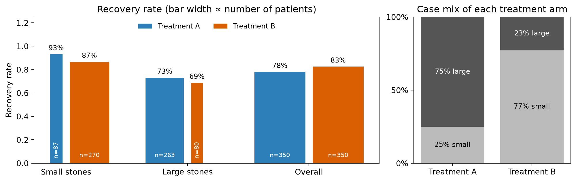
Treatment A wins for small stones and for large stones — yet Treatment B wins overall.

Stone size is a confounder. Doctors gave the risky Treatment A to the hard (large-stone) cases and Treatment B to the easy (small-stone) cases. The overall numbers mix effect with case-mix.

The two fingerprints of a confounder

Every Simpson’s table carries two fingerprints of the confounder, both visible here:

  1. The case mix differs between the arms — 75% of A’s patients had large stones vs. 23% of B’s. Those two numbers are the ones to hunt for in any such table; they are why A’s overall rate is dragged toward its hard cases and B’s toward its easy ones.
  2. The strata differ in outcome — large stones recover less often under either treatment.

Give both arms the same case mix

The overall row compared A on mostly large stones with B on mostly small stones. The fair question: what would each treatment’s recovery rate be if it had been given to the whole study population — the 51% small / 49% large mix we actually have?

Code
n_small = data["A"]["small"][1] + data["B"]["small"][1]      # 357 patients
n_large = data["A"]["large"][1] + data["B"]["large"][1]      # 343 patients
p_small, p_large = n_small / (n_small + n_large), n_large / (n_small + n_large)
print(f"P(small) = {p_small:.2f}, P(large) = {p_large:.2f}")

for tx in ("A", "B"):
    rate = {z: data[tx][z][0] / data[tx][z][1] for z in ("small", "large")}
    adjusted = rate["small"] * p_small + rate["large"] * p_large
    print(f"Treatment {tx}: adjusted recovery = {adjusted:.0%}")
P(small) = 0.51, P(large) = 0.49
Treatment A: adjusted recovery = 83%
Treatment B: adjusted recovery = 78%

Adjusted, A ≈ 83% beats B ≈ 78% — the crude 78% vs. 83% flips back to agree with the strata. This is the adjustment formula, also called direct standardization:

\[ P(Y \mid do(T{=}t)) \;=\; \sum_z P(Y \mid T{=}t,\, Z{=}z)\; P(Z{=}z), \]

each arm’s within-stratum rates weighted by the population’s stratum shares, not the arm’s own. The regression Y ~ T + Z is the same move in model form — compare within strata, then average — which is why adding temp fixed the ice cream slope.

Simpson’s paradox

Definition

Simpson’s paradox occurs when an association between \(X\) and \(Y\) that holds in every subgroup of the data reverses (or disappears) when the subgroups are combined. It happens when a third variable \(Z\) is distributed differently across the levels of \(X\) and is itself related to \(Y\) — the two fingerprints.

  • The within-stratum comparisons hold \(Z\) fixed. When \(Z\) is a confounder — as stone size is here — they are the ones to trust, and standardizing just re-weights them. Treatment A is better.
  • The overall comparison is contaminated by selection bias: A’s patients were sicker to begin with.

The paradox is not a mathematical curiosity — it is a warning: aggregated associations can point the opposite direction from the truth. But “always adjust” is not the lesson either. Deciding which variables to adjust for is itself a causal question, and causal graphs (later in this lecture) are how we answer it.

Randomization

The gold standard: randomized experiments

How do we break confounding by design? Randomly assign the treatment.

If a coin flip decides \(T_i\), then treatment is statistically independent of the potential outcomes:

\[ \{Y_i(0), Y_i(1)\} \perp\!\!\!\perp T_i. \]

Independence kills the selection-bias term: in expectation the two groups are identical in every respect (measured and unmeasured) except the treatment:

\[ \mathbb{E}[Y(0)\mid T{=}1] = \mathbb{E}[Y(0)\mid T{=}0]. \]

It also makes the treated a representative sample of everyone, so \(\text{ATT} = \text{ATE}\): the naive difference in means is an unbiased estimate of the ATE (Imbens and Rubin 2015).

Randomization removes confounding

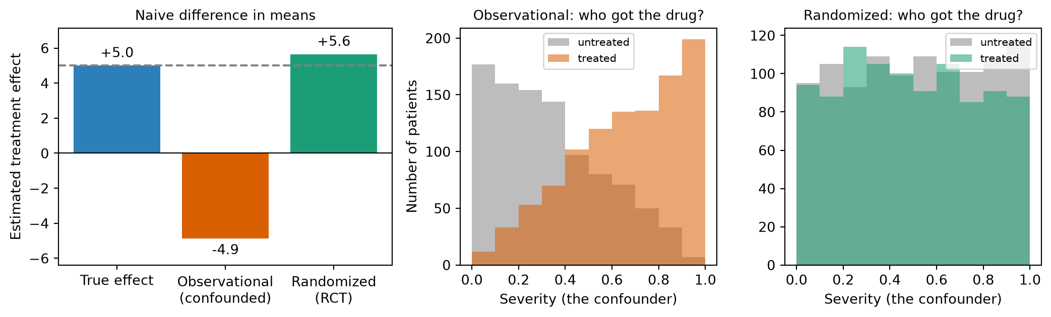
The true effect is \(+5\). The observational estimate is badly biased, and the middle panel shows the mechanism: the treated group is dominated by severe cases, who do worse for reasons that have nothing to do with the drug. Under randomization the two severity histograms lie on top of each other, and the naive estimate recovers the truth.

Causal graphs

Drawing our assumptions: causal graphs

Often we cannot randomize: it would be unethical (randomly assign people to smoke), impossible (re-run a minimum-wage law), too slow or expensive — or the treatment already happened and we only have observational data.

A causal graph is a directed acyclic graph (DAG): nodes are variables, and an arrow \(X \rightarrow Y\) means “\(X\) is a direct cause of \(Y\)” (Pearl et al. 2016).

The graph encodes assumptions we bring to the data (from domain knowledge). The data alone cannot draw it for us — but once drawn, the graph tells us exactly which variables to control for.

Reading a causal graph

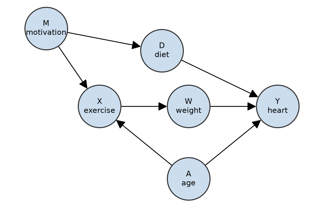
  • Node — a variable. Arrow \(A \to X\) — “\(A\) is a direct cause of \(X\)” (\(A\) is a parent of \(X\), \(X\) a child of \(A\)).
  • Directed path — follow the arrows head-to-tail: \(X \to W \to Y\). Descendants of \(X\): \(W\), \(Y\). Ancestors of \(X\): \(A\), \(M\).
  • Acyclic — no directed path returns to its start: a DAG.
  • Path — any route between two nodes, ignoring direction, no node twice: e.g. \(X \leftarrow M \to D \to Y\).

Causal effects flow along directed paths; spurious associations flow along the other paths when they are open. Every path is built from just three building blocks.

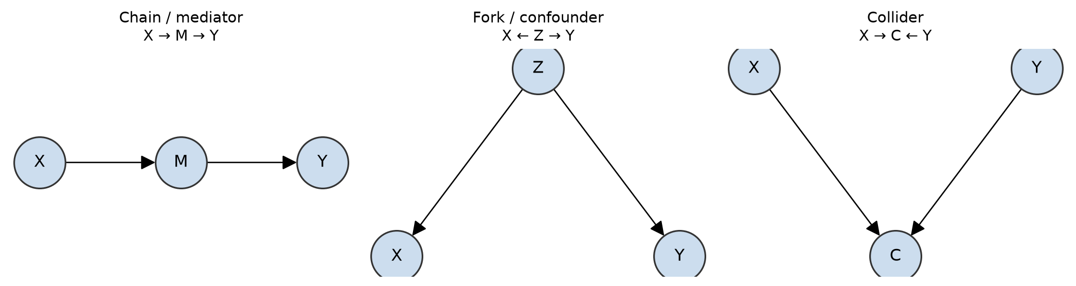
The three building blocks

  • Chain \(X \to M \to Y\): \(M\) is a mediator (it transmits the effect).
  • Fork \(X \leftarrow Z \to Y\): \(Z\) is a confounder (common cause).
  • Collider \(X \to C \leftarrow Y\): \(C\) is a common effect.

Any path is a sequence of these: each interior node is a mediator, a confounder, or a collider on that path.

Open and blocked paths

A path carries association between its endpoints only if it is open. Two rules decide:

  1. A chain or fork node is open by default and becomes blocked if you condition on it (adjust / stratify / put it in the regression).
  2. A collider node is blocked by default and becomes open if you condition on it (or on any of its descendants).

A path is blocked if at least one of its interior nodes is blocked; otherwise it is open. Two variables are (conditionally) independent when every path between them is blocked.

Sanity check on the example DAG: \(X \leftarrow A \to Y\) is open (fork, nothing conditioned) — the same shape as the ice-cream/temperature confounding we started with. Condition on \(A\) and it closes.

The golden rule: adjust for forks, not colliders

The three structures behave oppositely when you condition (adjust/stratify) on the middle node:

Structure Middle node Adjust? Why
Fork \(X \leftarrow Z \to Y\) confounder Yes blocks the backdoor path
Chain \(X \to M \to Y\) mediator No* it is the effect you want
Collider \(X \to C \leftarrow Y\) collider No! creates a spurious association

* Adjust for a mediator only if you specifically want the direct (not total) effect.

“Just throw every variable into the regression” is wrong — controlling for a collider or a mediator introduces bias. Choosing controls is a causal decision, not a statistical one (Cinelli et al. 2024).

The backdoor criterion

Confounders: the backdoor

A backdoor path is a non-causal path from \(X\) to \(Y\) that starts with an arrow into \(X\) (e.g. \(X \leftarrow Z \to Y\)). Backdoor paths are the graph-language for confounding.

Backdoor criterion: a set of variables \(S\) suffices to identify the causal effect of \(X\) on \(Y\) if \(S\) blocks every backdoor path and contains no descendants of \(X\) (Pearl 2009).

When such an \(S\) exists, the direct standardization we used on the kidney stones applies with \(S\) in place of the stratifying variable:

\[ P(Y \mid do(X{=}x)) = \sum_{s} P(Y \mid X{=}x, S{=}s)\, P(S{=}s). \]

The backdoor criterion is what tells you the formula is legitimate. It was legitimate for kidney-stone size because stone size is a fork.

The backdoor procedure, by hand

Given a DAG, a treatment \(X\) and an outcome \(Y\):

  1. List every path from \(X\) to \(Y\) (ignore arrow direction while tracing; visit no node twice).
  2. Set aside the causal paths — those where every arrow points away from \(X\) toward \(Y\). Never block these (that would be adjusting for a mediator).
  3. Classify the rest. A path whose first arrow points into \(X\) is a backdoor path — mark it open or blocked (forks/chains open, colliders closed). A path whose first arrow points out of \(X\) but that is not causal — it runs into a collider, e.g. \(X \to C \leftarrow Y\) — is neither: blocked by default, and it needs no action as long as you leave \(C\) and its descendants alone.
  4. Choose \(S\) that blocks every open backdoor path — a fork or chain node on each — containing no collider or collider-descendant on any path (backdoor or not) and no descendant of \(X\).
  5. Report \(S\) (there may be several valid choices; the smallest is usually best).

Then adjust for \(S\) by whichever estimator you like — regression, stratification, matching, propensity scores (later in this lecture).

Your turn: pick the adjustment set

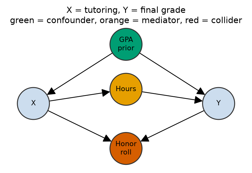
Tutoring (\(X\)) and final grade (\(Y\)), with: \(\text{GPA}_{\text{prior}} \to X\), \(\text{GPA}_{\text{prior}} \to Y\), \(X \to \text{Hours} \to Y\), and \(X \to \text{HonorRoll} \leftarrow Y\).

Which of these adjustment sets are valid for the total effect of \(X\) on \(Y\)?

    1. \(\{\text{GPA}_{\text{prior}}\}\)
    1. \(\{\text{GPA}_{\text{prior}}, \text{Hours}\}\)
    1. \(\{\text{GPA}_{\text{prior}}, \text{HonorRoll}\}\)
    1. \(\{\}\) (nothing)

Pause and decide before you read on: run the five steps.

Your turn: the answer

Path Type Action
\(X \to \text{Hours} \to Y\) causal (open) leave alone
\(X \leftarrow \text{GPA} \to Y\) backdoor (open fork) block with GPA
\(X \to \text{Honor} \leftarrow Y\) neither (blocked collider) do not touch

Only (a). (b) blocks the mediator; (c) opens the collider; (d) leaves the backdoor open. Restricting the study to honor-roll students — the “cleaner subset” — is (c) in disguise.

Colliders: adjusting can create bias

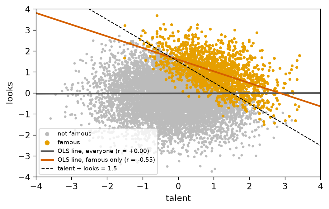
Conditioning on a collider (or its descendant) opens a spurious path. Classic example: suppose talent and looks are independent in the general population, but both help an actor get famous.

Among the famous, talent and looks are negatively correlated — “why are talented celebrities so often unattractive?” — even though they are unrelated in general. We manufactured the correlation by conditioning on fame.

This is collider bias (Berkson’s paradox) — not the fork behind selection bias.

Mediators: don’t “control away” your effect

If a job-training program raises earnings by teaching skills:

\[ \text{Training} \rightarrow \text{Skills} \rightarrow \text{Earnings} \]

Controlling for skills would block the very pathway the program works through, making the program look useless. This is overcontrol bias.

Rule of thumb for a total effect: adjust for common causes, never for anything on the causal path or for common effects (Cinelli et al. 2024).

Estimating effects

Estimating effects under “no unmeasured confounders”

Suppose we’ve drawn the DAG and found an adjustment set \(S\) that satisfies the backdoor criterion. In potential-outcomes language this is conditional ignorability:

\[ \{Y(0), Y(1)\} \perp\!\!\!\perp T \mid S \]

— randomization’s independence, now holding only within levels of \(S\). The DAG is how we argue it; it cannot be checked from data.

From here on the treatment is \(T\), as in the tutoring table; \(X\) was convenient while tracing paths.

Four ways to adjust for \(S\)

Once \(S\) is chosen, any of these recovers the effect:

  1. Regression adjustment — include \(S\) as covariates; read off the coefficient on \(T\) (this assumes the linear form is right: the regression is an estimator, not a licence).
  2. Stratification / standardization — estimate the effect within levels of \(S\), then average with the population’s stratum shares (→ ATE); use the treated group’s shares and you get the ATT.
  3. Matching — pair each treated unit with similar control unit(s) on \(S\).
  4. Propensity scores — match or weight on \(e(S) = P(T{=}1 \mid S)\), a one-number summary.

Identification (which \(S\)) and estimation (which estimator) are separate decisions. A wrong \(S\) gives a wrong answer with a tight standard error — no estimator rescues a bad graph.

Propensity scores in one slide

When \(S\) is high-dimensional, matching directly is hard. Rosenbaum and Rubin showed it is enough to match or weight on the scalar propensity score \(e(S) = P(T{=}1\mid S)\) (Rosenbaum and Rubin 1983).

  • Estimate it with any classifier of \(T\) from \(S\) — logistic regression (Lecture 11A) is the usual choice.
  • Match each treated unit to controls with a similar \(e\), or weight each unit by \(1/e(S)\) if treated and \(1/(1 - e(S))\) if not (inverse-propensity weighting, IPW).
  • Weighting builds a “pseudo-population” in which treatment is unrelated to \(S\) — mimicking a randomized experiment from observational data.

Check overlap (positivity) first

Plot the histogram of \(e\) for treated and for control units. Where one group has units and the other has none, there is no comparable counterpart and the estimate is extrapolation. An \(e\) of \(0.01\) gives a weight of \(100\): a tight standard error around a number that means nothing.

When confounders are unobserved: natural experiments

Adjustment only works for confounders we can measure. When we can’t, we look for “nature’s randomization” — sources of variation in treatment that are as good as random (Angrist and Pischke 2014).

  • Difference-in-differences (DiD) — compare the change over time in a treated group with the change in a control group; assumes parallel trends.
  • Regression discontinuity (RD) — treatment switches on at a cutoff; compare units just above and just below it; assumes nothing else jumps at the cutoff.
  • Instrumental variables (IV) — a variable that nudges the treatment as good as at random (next slide).

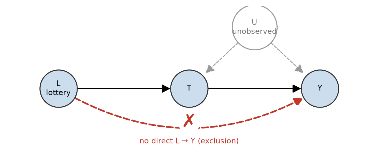
An instrument, in graph terms

  1. Relevance — the arrow \(L \to T\) exists (the lottery really changes who serves).
  2. Exclusion — no arrow \(L \to Y\): the lottery affects earnings only through service.
  3. Independence — no backdoor path from \(L\) to \(Y\): nothing points into \(L\) (it is random).

The unobserved \(U\) confounds \(T\) and \(Y\), so adjustment is impossible — but \(L\) is untouched by \(U\), and that is all IV needs.

Assumptions you can’t skip

Every observational causal estimate relies on assumptions (Hernán and Robins 2020):

  • Conditional ignorability — \(\{Y(0),Y(1)\} \perp\!\!\!\perp T \mid S\): the adjustment set blocks every backdoor path. The DAG argues it; data cannot check it.
  • Positivity (overlap) — every unit has a nonzero chance of each treatment (\(0 < e(S) < 1\)).
  • Correct graph — the DAG reflects reality.

Since ignorability is untestable, good practice includes a sensitivity analysis: how strong would an unmeasured confounder have to be to overturn the conclusion?

Summary

Summary

  1. A regression coefficient is an association, not an effect. OLS estimates \(P(Y \mid X)\); a causal claim is about \(P(Y \mid do(X))\), and the two differ whenever there is confounding.
  2. A confounder is a common cause of treatment and outcome. Adjusting for it (holding it fixed, or adding it to the regression) removes the spurious association — but only if you measured it and knew to include it.
  3. Potential outcomes \(Y(1), Y(0)\) define the effect; you only ever observe one. This is the fundamental problem of causal inference, so we estimate averages like the \(\text{ATE} = \mathbb{E}[Y(1) - Y(0)]\).
  4. Naive difference in means \(=\) causal effect \(+\) selection bias. Simpson’s paradox is what selection bias looks like in a table: within-group and overall comparisons can point in opposite directions. Look for the confounder’s two fingerprints; direct standardization gives every arm the same case mix.
  5. Randomization makes treatment independent of potential outcomes, so the selection-bias term is zero, \(\text{ATT} = \text{ATE}\), and the naive difference is unbiased for the ATE.
  6. A causal DAG encodes your assumptions, not the data’s. Chains and forks are open until you condition on them; colliders are closed until you do (or condition on a descendant).
  7. The backdoor procedure sorts every path into causal, backdoor or neither, then blocks every open backdoor with non-descendants of \(X\) — never a mediator, never a collider.
  8. When a confounder is unmeasured, adjustment cannot help. Look for a natural experiment (DiD, RD, IV), state its untestable assumption, and report a sensitivity analysis.

References

Going deeper (optional): Causal Inference: Estimating Effects works the estimators on simulated data (regression, stratification, IPW code, overlap), covers DiD, IV and RD in detail, and ends with practice scenarios.

Bibliography

Angrist, Joshua D., and Jörn-Steffen Pischke. 2009. Mostly Harmless Econometrics: An Empiricist’s Companion. Princeton University Press.
Angrist, Joshua D., and Jörn-Steffen Pischke. 2014. Mastering ’Metrics: The Path from Cause to Effect. Princeton University Press.
Charig, C. R., D. R. Webb, S. R. Payne, and J. E. Wickham. 1986. “Comparison of Treatment of Renal Calculi by Open Surgery, Percutaneous Nephrolithotomy, and Extracorporeal Shockwave Lithotripsy.” British Medical Journal (Clinical Research Ed.) 292 (6524): 879–82. https://doi.org/10.1136/bmj.292.6524.879.
Cinelli, Carlos, Andrew Forney, and Judea Pearl. 2024. “A Crash Course in Good and Bad Controls.” Sociological Methods & Research 53: 1071–104. https://doi.org/10.1177/00491241221099552.
Hernán, Miguel A., and James M. Robins. 2020. Causal Inference: What If. Chapman & Hall/CRC. https://www.hsph.harvard.edu/miguel-hernan/causal-inference-book/.
Imbens, Guido W., and Donald B. Rubin. 2015. Causal Inference for Statistics, Social, and Biomedical Sciences: An Introduction. Cambridge University Press.
Pearl, Judea. 2009. Causality: Models, Reasoning, and Inference. 2nd ed. Cambridge University Press.
Pearl, Judea, Madelyn Glymour, and Nicholas P. Jewell. 2016. Causal Inference in Statistics: A Primer. Wiley.
Rosenbaum, Paul R., and Donald B. Rubin. 1983. “The Central Role of the Propensity Score in Observational Studies for Causal Effects.” Biometrika 70 (1): 41–55. https://doi.org/10.1093/biomet/70.1.41.
Rubin, Donald B. 1974. “Estimating Causal Effects of Treatments in Randomized and Nonrandomized Studies.” Journal of Educational Psychology 66 (5): 688–701. https://doi.org/10.1037/h0037350.
Splawa-Neyman, Jerzy, D. M. Dabrowska, and T. P. Speed. 1990. “On the Application of Probability Theory to Agricultural Experiments. Essay on Principles. Section 9.” Statistical Science 5 (4): 465–72. https://doi.org/10.1214/ss/1177012031.