We now consider a new kind of data, networks, which are represented by graphs.
Motivation
Graphs allow us to represent and analyze complex relationships and structures in data.
By using nodes (vertices) and edges (connections), graphs can model various types of relationships and interactions, making it easier to visualize and understand the underlying patterns.
Example Applications in Machine Learning
Social Network Analysis
Model social networks with nodes representing individuals and edges representing relationships or interactions.
Understand community structures, influence, and information spread.
Biological Network Analysis
Model biological systems, such as protein-protein interaction networks.
Understand cellular processes and disease mechanisms.
Knowledge Graphs
Store and retrieve structured information.
Enable better search and question-answering systems.
Lecture Overview
By the end of this lecture you should be able to:
build a graph from an edge list and read its adjacency matrix as the graph: degree as a row sum, average degree \(2e/n\), density, and \(A^2\) as a count of walks;
ask the first structural questions of any network: connected components, shortest paths, diameter, and clustering coefficients;
use the \(G(n, p)\) random graph as a baseline, and recognize how real networks differ from it: heavy-tailed degrees, high clustering, small worlds;
visualize a real network and compare its metrics with a same-density random graph.
Graphs
A graph \(G=(V, E)\) is a pair, where \(V\) is a set of vertices, and \(E\) is a set of vertex pairs \((u, v)\) called edges.
The term nodes is also used for vertices. The term links or connections is also used for edges.
We’ll distinguish between undirected graphs, where the pairs in \(E\) are unordered, and directed graphs, where they are ordered.
NetworkX
We’ll use the NetworkX library to create and manipulate graphs.
import networkx as nx
Undirected Graphs
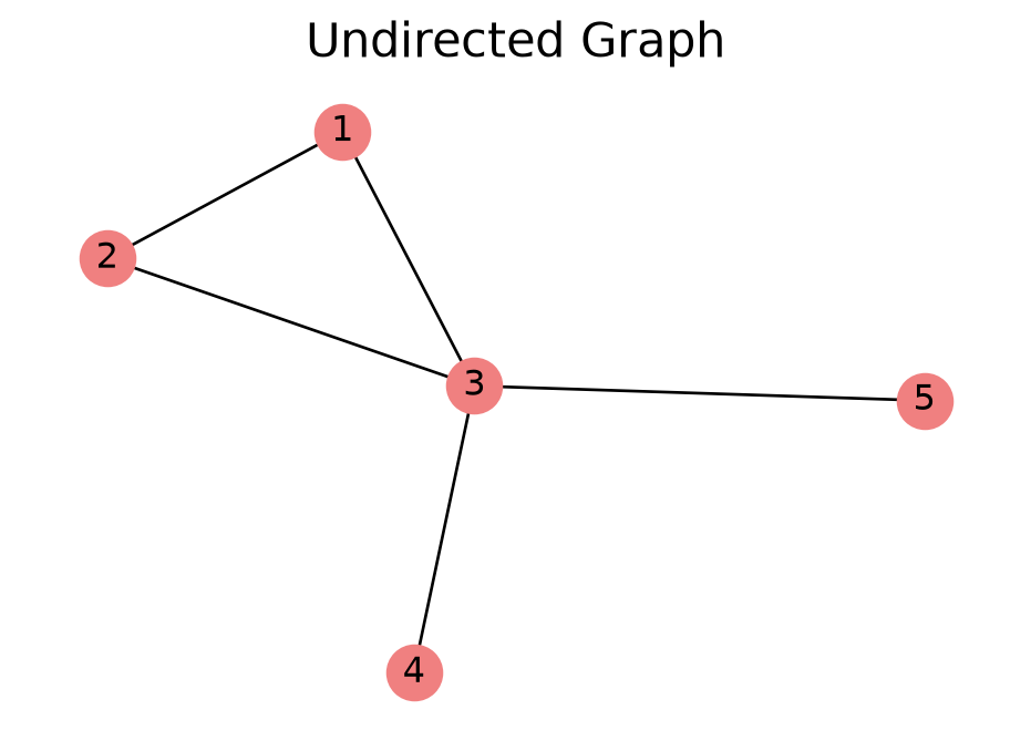
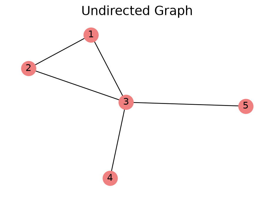
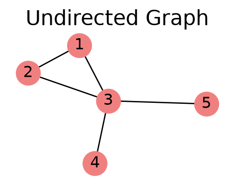
In an undirected graph, an edge \((u, v)\) is an unordered pair. The edge \((v, u)\) is the same thing.
There are no orientations in an undirected graph.
Code
# Create an undirected graph from an edge listG = nx.Graph()G.add_edges_from([(1, 2), (1, 3), (2, 3), (3, 4), (3, 5)])pos_u = nx.spring_layout(G, seed=1)draw_small(G, pos_u, 'lightcoral', 'Undirected Graph')plt.show()
Directed Graphs
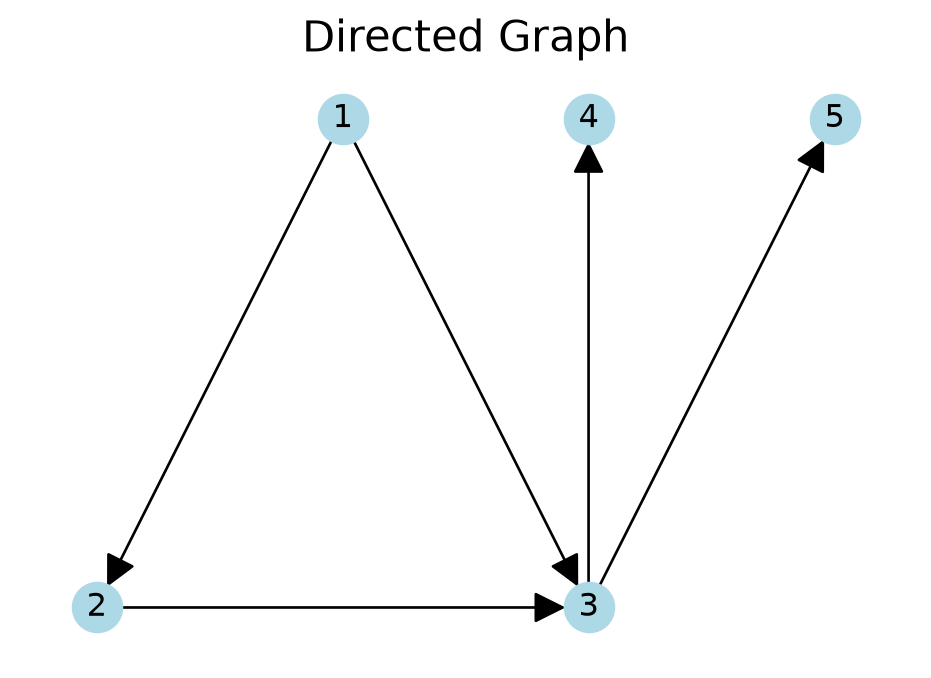
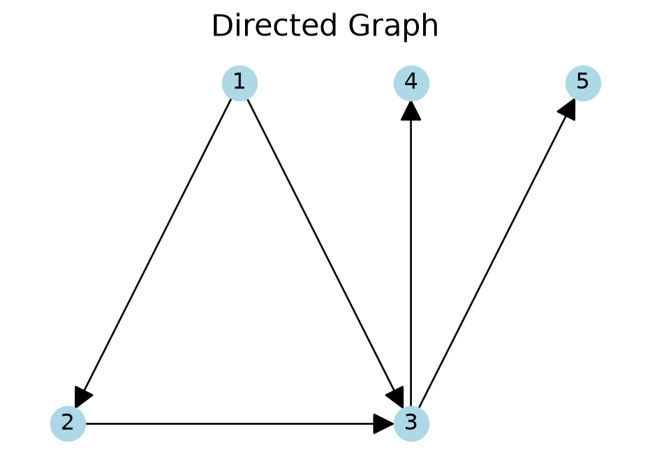
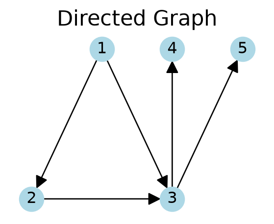
In a directed graph, \((u, v)\) is an ordered pair and it is different from \((v, u)\).
This means that the edges have an orientation. This orientation is indicated by arrows.
For example, the edge \((1, 2)\), is directed from node 1 to node 2.
Code
# Create a directed graph from the same edge listDG = nx.DiGraph()DG.add_edges_from([(1, 2), (1, 3), (2, 3), (3, 4), (3, 5)])# Fixed node positions, reused for the rest of the five-node examplespos = {1: [0, 0], 2: [-1, -1], 3: [1, -1], 4: [1, 0], 5: [2, 0]}draw_small(DG, pos, 'lightblue', 'Directed Graph', arrowsize=25)plt.show()
Paths
A path in a graph from node \(u\) to node \(v\) is a sequence of edges that starts at \(u\) and ends at \(v\), where each edge shares an endpoint with the next and no node is visited twice. Paths exist in both undirected and directed graphs.
A walk is the same, except that nodes may be revisited. We will count walks with the adjacency matrix shortly.
In a directed graph, all of the edges in a path need to be oriented head-to-tail.
If there is a path from \(u\) to \(v\), we say that \(v\) is reachable from \(u\).
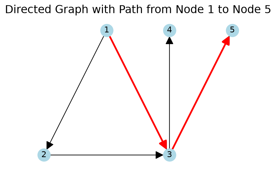
A path from node 1 to node 5 is illustrated in red.
Code
path_edges = [(1, 3), (3, 5)]draw_small(DG, pos, 'lightblue', 'Directed Graph with Path from Node 1 to Node 5', arrowsize=25)nx.draw_networkx_edges(DG, pos, edgelist=path_edges, edge_color='r', width=2.5, arrowsize=25)plt.show()
Degree
The degree of a node is the number of edges that connect to it.
In our example undirected graph, node \(3\) has degree 4.
In a directed graph, we distinguish between:
in-degree: the number of incoming edges to the node,
out-degree: the number of outgoing edges from the node.
In our directed graph example, the in-degree of node \(3\) is 2 and the out-degree is \(2\). For node \(1\), the in-degree is \(0\), and the out-degree is \(2\).
In an undirected graph with \(n\) nodes and \(e\) edges, the average node degree is \(2e/n\). Why?
If you sum the degrees of all nodes, you count each edge twice (once for each endpoint). The total degree of all nodes is then \(2e\). The average is then \(2e/n\).
In our previous undirected graph example, the total degree is \[
\text{Total Degree} = 2 + 2 + 4 + 1 + 1 = 10.
\]
The number of edges is \(5\) and \(2\cdot 5 = 10\).
Neighbors
The neighbors of a node are the nodes to which it is connected.
In an undirected graph, the degree of a node is the number of neighbors it has.
A directed graph has both outgoing and incoming neighbors.
The Adjacency Matrix
Number the nodes \(1, \dots, n\). The adjacency matrix\(A\) is the \(n \times n\) matrix with \(A_{ij} = 1\) if \((i, j) \in E\) and \(A_{ij} = 0\) otherwise.
A = nx.to_numpy_array(G, nodelist=[1, 2, 3, 4, 5], dtype=int)print(A)print("row sums: ", A.sum(axis=1))print("symmetric:", (A == A.T).all())
\(A_{13} = 1\) but \(A_{31} = 0\): the adjacency matrix of a directed graph is in general not symmetric.
Row sums are out-degrees; column sums are in-degrees. Node 3: out 2, in 2. Node 1: out 2, in 0.
Counting Walks with \(A^2\)
What does \(A^2 = A A\) count? By the definition of matrix multiplication,
\[
(A^2)_{ij} = \sum_k A_{ik} A_{kj}.
\]
A term is 1 only when \((i, k)\) and \((k, j)\) are both edges, that is, when \(i \to k \to j\) is a walk of length 2. So \((A^2)_{ij}\) counts the walks of length 2 from \(i\) to \(j\).
For the five-node example, \(e = 5\) and \(\binom{5}{2} = 10\):
print(f"density = {nx.density(G)}")
density = 0.5
Real networks are usually sparse: the density is tiny and most entries of \(A\) are 0. Density is also the natural choice of \(p\) for a random graph that matches a real one, as we will see.
Connectivity
The first question to ask about a graph is: is it connected?
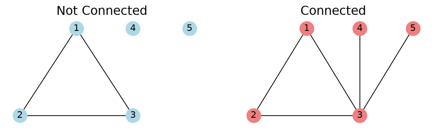
An undirected graph is connected if for each pair of nodes \((u, v)\), \(u\) is reachable from \(v\).
If the graph is not connected, it splits into connected components: maximal connected subgraphs, ones that cannot be enlarged without losing connectivity.
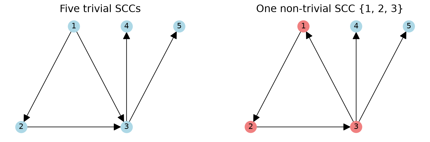
Both graphs are weakly connected. On the left, no node can get back to itself, so every node is its own SCC.
Characterizing Graphs
Given a graph, it is helpful to characterize the degrees, components, and other structures in the graph.
Comparison Case: the \(G(n, p)\) Random Graph
The most common comparison is the \(G(n, p)\) random graph. It is also called the Erdős–Rényi graph, after the two mathematicians who developed and studied it.
The \(G(n, p)\) random graph model is very simple
we start with a set of \(n\) nodes,
for each pair of nodes, we connect them with probability \(p\).
Average Node Degree of a Random Graph
Every node is potentially connected to \(n-1\) other nodes.
Therefore, the expected degree, call it \(\langle k \rangle\), of a node is given by:
\[
\langle k \rangle = p \cdot (n - 1)
\]
For large \(n\), this can be approximated as:
\[
\langle k \rangle \approx np
\]
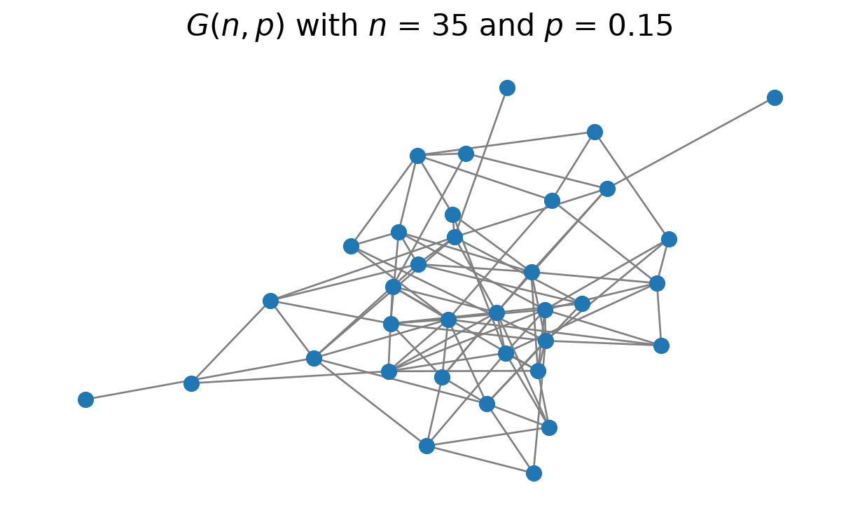
In fact the degree of a node in \(G(n, p)\) is a sum of \(n-1\) independent coin flips, so it is \(\text{Binomial}(n-1, p)\), which is approximately \(\text{Poisson}(np)\). The degrees are concentrated around the mean: a node with many times the average degree is vanishingly rare, so \(G(n, p)\) has no hubs.
Here \(n = 35\) and \(p = 0.15\), so the expected degree is \(p(n-1) = 0.15 \cdot 34 = 5.1\).
expected degree p(n-1) = 5.10; this sample's average degree 2e/n = 5.49
Most real-world graphs do not match the properties of \(G(n, p)\) graphs, however it is useful to have a comparison to a random graph.
Degree Distributions
Understanding connectivity starts with determining the observed degrees in the graph.
This is captured in the degree distribution
\[
P(X > x) = \text{probability that a node has degree greater than } x.
\]
We typically focus our attention on large values of \(x\) – nodes that are highly connected.
This is technically a complementary cumulative distribution function (CCDF) or sometimes called the survival function of the distribution.
\[
P(X > x) = 1 - P(X \leq x).
\]
where \(P(X \leq x)\) is the cumulative distribution function (CDF).
Power Law Degree Distributions
It’s common for a degree distribution to approximately follow a power-law.
The simplest power-law distribution is called the Pareto distribution. If X is a random variable with a Pareto distribution, then the probability that X is greater than some number \(x\) is given by:
\[ P(X > x) =
\begin{cases}
\left(\frac{k}{x}\right)^{\alpha} & x \geq k, \\
1 & x < k
\end{cases}
\]
where \(k\) is the minimum value of \(X\), sometimes called the scale parameter, meaning we can specify the minimum number of neighbors a node can have.
And \(\alpha\) is the exponent, sometimes called the shape parameter.
The pdf of the Pareto distribution is
\[
p(x) =
\begin{cases}
\frac{\alpha k^{\alpha}}{x^{\alpha + 1}} & x \geq k, \\
0 & x < k.
\end{cases}
\]
Three Views of the Pareto Distribution
Code
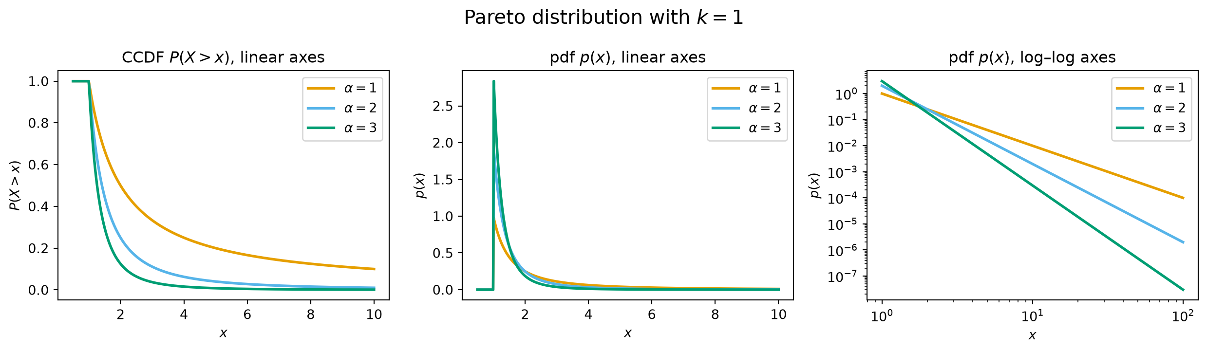
alphas = [1, 2, 3]colors = OKABE_ITO[:3]x_lin = np.linspace(0.5, 10, 500)x_log = np.logspace(0, 2, 200) # 1 to 100: two decadesfig, axes = plt.subplots(1, 3, figsize=(13, 3.8))for alpha, c inzip(alphas, colors): axes[0].plot(x_lin, pareto.sf(x_lin, alpha), color=c, lw=2, label=f'$\\alpha={alpha}$') axes[1].plot(x_lin, pareto.pdf(x_lin, alpha), color=c, lw=2, label=f'$\\alpha={alpha}$') axes[2].loglog(x_log, pareto.pdf(x_log, alpha), color=c, lw=2, label=f'$\\alpha={alpha}$')axes[0].set(title='CCDF $P(X > x)$, linear axes', xlabel='$x$', ylabel='$P(X > x)$')axes[1].set(title='pdf $p(x)$, linear axes', xlabel='$x$', ylabel='$p(x)$')axes[2].set(title='pdf $p(x)$, log–log axes', xlabel='$x$', ylabel='$p(x)$')for ax in axes: ax.legend()plt.suptitle('Pareto distribution with $k = 1$', size=15)plt.tight_layout()plt.show()
On log–log axes a Pareto distribution is a straight line: \(\log p(x) = \log(\alpha k^{\alpha}) - (\alpha + 1) \log x\), slope \(-(\alpha+1)\). The CCDF is a straight line too: \(\log P(X > x) = \alpha \log k - \alpha \log x\), slope \(-\alpha\).
In a distribution like this, almost all values are very small. However, there is a non-negligible fraction of values that are very large.
Vilfredo Pareto originally used this distribution to describe the allocation of wealth among individuals. The size of sand particles are also seen as approximately Pareto-distributed.
What does this mean for node degree?
It means that
most nodes have few neighbors, but
an important small subset of nodes have many, many neighbors.
Heavy Tails in a Graph: the Empirical CCDF
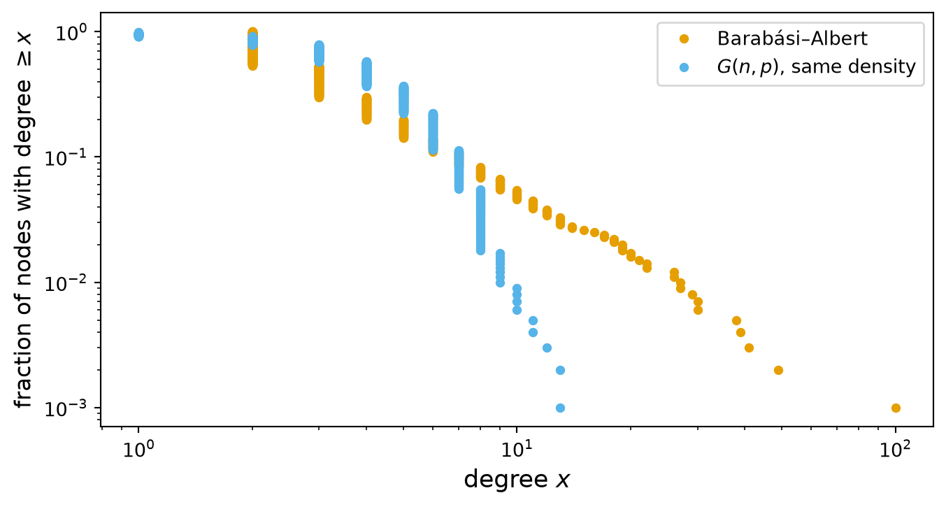
To see a heavy tail in a real graph, sort the degrees and plot the fraction of nodes at or above each one, on log–log axes.
Below: a 1,000-node Barabási–Albert graph (new nodes attach preferentially to well-connected nodes) and a \(G(n, p)\) graph with the same density.
Code
n_nodes =1000ba = nx.barabasi_albert_graph(n_nodes, 2, seed=0)gnp = nx.erdos_renyi_graph(n_nodes, nx.density(ba), seed=0)def empirical_ccdf(graph):# Fraction of nodes with degree >= each sorted degree. Using >= rather# than > keeps the largest degree off zero, which a log axis cannot show. d = np.sort([k for _, k in graph.degree()]) frac =1- np.arange(len(d)) /len(d) keep = d >0return d[keep], frac[keep]plt.figure(figsize=(8, 4))for graph, label, c in [(ba, 'Barabási–Albert', OKABE_ITO[0]), (gnp, '$G(n, p)$, same density', OKABE_ITO[1])]: d, frac = empirical_ccdf(graph) plt.loglog(d, frac, 'o', ms=4, color=c, label=label)plt.xlabel('degree $x$', size=13)plt.ylabel('fraction of nodes with degree $\\geq x$', size=12)plt.legend()plt.show()for graph, label in [(ba, 'Barabási–Albert'), (gnp, 'G(n, p)')]: deg = [k for _, k in graph.degree()]print(f"{label:16s} mean degree {np.mean(deg):.2f}, max degree {max(deg)}")
Barabási–Albert  mean degree 3.99, max degree 100
G(n, p)          mean degree 4.05, max degree 13
Same mean degree. The Barabási–Albert CCDF is close to a straight line and reaches degree 100; the \(G(n, p)\) CCDF falls off a cliff before 15.
Power Law Degree Distributions are Ubiquitous
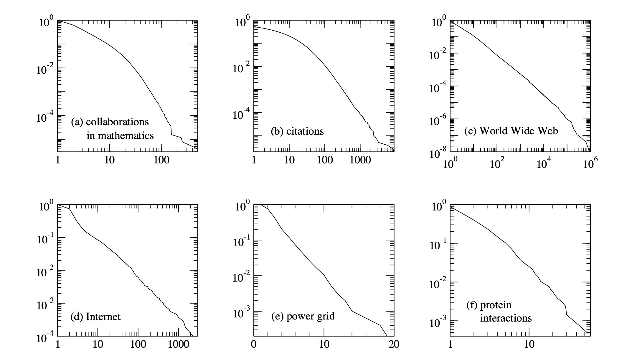
The networks shown are: (a) the collaboration network of mathematicians [182]; (b) citations between 1981 and 1997 to all papers cataloged by the Institute for Scientific Information [351]; (c) a 300 million vertex subset of the World Wide Web, circa 1999 [74]; (d) the Internet at the level of autonomous systems, April 1999 [86]; (e) the power grid of the western United States [416]; (f) the interaction network of proteins in the metabolism of the yeast S. Cerevisiae [212].
The structure and function of complex networks, M. E. J. Newman
https://arxiv.org/abs/cond-mat/0303516
Note that the \(x\)-axis of the power grid example is a linear scale but the \(y\)-axis is a log scale. This means that the degree distributions of the power grid example does not follow a power-law degree distribution. It has an exponential tail.
Clustering
The next important property of a network to understand is clustering.
In the context of networks, clustering refers to the tendency for groups of nodes to have higher connectivity within the group than the network-wide average.
The simplest measure of local clustering is clustering coefficient.
The clustering coefficient tells you if the neighbors of a node tend to be neighbors.
Specifically, the clustering coefficient measures the probability that two of your neighbors are connected.
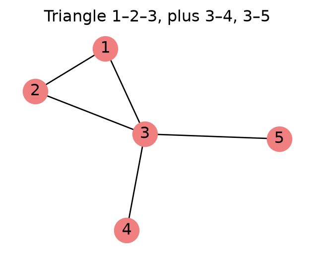
To define this measure, we introduce the notion of a triangle in a network. A triangle is a set of three nodes in the graph that are connected to each other.
There are two definitions of the clustering coefficient. The first is
\[
C^{(1)} = \frac{\sum_i \text{number of triangles that include node } i}{\sum_i \text{number of pairs of neighbors of node }i}.
\]
This is the ratio of the total triangle count to the total neighbor-pair count.
It is the probability that a random pair of neighbors are connected.
The Example Graph Calculation
Node
Neighbors
Pairs \(\binom{d}{2}\)
Triangles
Ratio
1
{2, 3}
1
1
1
2
{1, 3}
1
1
1
3
{1, 2, 4, 5}
6
1
1/6
4
{3}
0
0
0
5
{3}
0
0
0
Total
8
3
\(C^{(1)} = 3/8 = 0.375\). Node 3 has \(\binom{4}{2} = 6\) pairs of neighbors, but only \(\{1, 2\}\) is connected.
print(f"transitivity (C1) = {nx.transitivity(G):.3f}")print(f"average_clustering (C2) = {nx.average_clustering(G):.3f}")print("per-node clustering:", {k: round(v, 3) for k, v in nx.clustering(G).items()})
The second way to measure the clustering coefficient is the mean of the ratios, i.e.,
\[
C^{(2)} = \frac{1}{n} \sum_i \frac{\text{number of triangles that include node } i}{\text{number of pairs of neighbors of node }i},
\]
where \(n\) is the total number of nodes. A node with degree less than 2 has no pairs of neighbors; by convention its ratio is 0.
This is the probability that neighbors are connected for a random node.
In the previous example, nodes 4 and 5 contribute 0, so \(C^{(2)} = \frac{1}{5} \left(1 + 1 + \frac{1}{6} + 0 + 0\right) = \frac{13}{30} = 0.433.\)
In NetworkX, \(C^{(1)}\) is nx.transitivity and \(C^{(2)}\) is nx.average_clustering. \(C^{(1)}\) gives more weight to high-degree nodes, which have many pairs of neighbors.
What is the clustering coefficient in a \(G(n, p)\) random graph?
The probability that two of your neighbors are connected is the same as the probability that any two nodes are connected, i.e., \(C^{(1)} = C^{(2)} = p\).
Real World Graphs
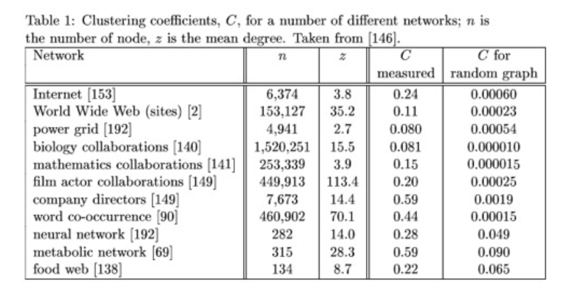
In practice, real world graphs show strong clustering.
For example, consider a social network. Your friends are much more likely to be themselves friends than two randomly chosen people.
Data: M. E. J. Newman, Random graphs as models of networks (2002), Table 1 — every row and value matches. The image reproduces that table from a secondary source; the bracketed numbers are that source’s citations, not Newman’s.
Clustering and Path Length: Small Worlds
Clustering raises a question: how long is a typical shortest path between nodes? If \(d(i, j)\) is the shortest path length between nodes \(i\) and \(j\), two summaries are:
the diameter, the largest shortest-path length, \(\max_{i, j} d(i, j)\), and
the average shortest path length, the typical one,
\[
L = \frac{1}{\binom{N}{2}} \sum_{i < j} d(i, j),
\]
where \(N\) is the number of nodes and the sum runs over the \(\binom{N}{2}\) unordered pairs.
Both need a connected graph: across components \(d(i, j) = \infty\). On a disconnected graph, use the largest connected component.
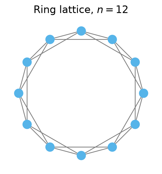
Let’s consider a highly clustered graph: a ring lattice, in which each node is joined to its 4 nearest neighbors around a ring.
Each node has 4 neighbors, so \(\binom{4}{2} = 6\) pairs of neighbors. Of these 6 pairs, 3 are connected, so the clustering coefficient is 0.5. This is quite high.
How long are the paths in a ring lattice?
for n_ring in [20, 100, 1000]: ring = nx.watts_strogatz_graph(n_ring, 4, 0)print(f"n = {n_ring:4d}: C = {nx.average_clustering(ring):.2f}, "f"L = {nx.average_shortest_path_length(ring):6.1f}, "f"n/8 = {n_ring /8:6.1f}")
n =   20: C = 0.50, L =    2.9, n/8 =    2.5
n =  100: C = 0.50, L =   12.9, n/8 =   12.5
n = 1000: C = 0.50, L =  125.4, n/8 =  125.0
The average shortest path is approximately \(n/8\), where \(n\) is the number of nodes: on average you go 1/4 of the way around the ring, in hops of 2.
The path length grows linearly with \(n\): if the number of nodes is large, the average path length is large.
Real-world social networks are highly clustered. Does that mean the paths between people in a large social network are long?
If you choose two people at random from the population of the United States, is the shortest path length between them long?
In the 1960s the social psychologist Stanley Milgram set out to empirically answer this question.
In the best-known version of the study (Travers and Milgram, Sociometry, 1969), 296 people, most of them in Nebraska, were each asked to get a letter to a particular stockbroker in Boston.
The rule was that they could only pass the letter to someone they knew on a first-name basis.
Surprisingly, 64 of the letters made it to the stockbroker!
More surprising was the length of the chains: a mean of 5.2 intermediaries, about six links.
This statistic became famous when John Guare wrote a play called Six Degrees of Separation.
Given what we know about clustering in social networks, this is quite surprising. How can we explain it?
The first clue comes from another classic social science paper, called The Strength of Weak Ties, by Mark Granovetter (1973).
It is one of the most cited papers in sociology, with tens of thousands of citations.
Granovetter interviewed people about how they found their jobs. He found that most people did not get a job through someone that was a close friend, but rather through a distant acquaintance.
This suggests that an important way that information travels in a social network is via the rare connections that exist outside of the local clustering of friendships.
This was all put on an experimental basis in another classic paper, by the social scientist Duncan Watts and the mathematician Steve Strogatz.
In their paper Collective Dynamics of Small-World Networks (1998), Watts and Strogatz performed an elegant experiment.
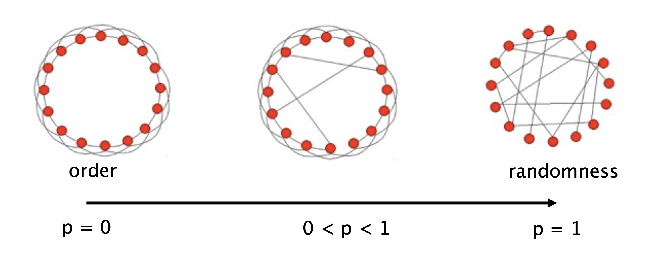
They asked, what if we take a highly clustered network, and slightly perturb it?
Specifically, they started with a network in which each node is connected to a fixed number of neighbors, and connections are made in a highly clustered way.
Then, with probability \(p\), rewire each edge: change it to connect to a random destination.
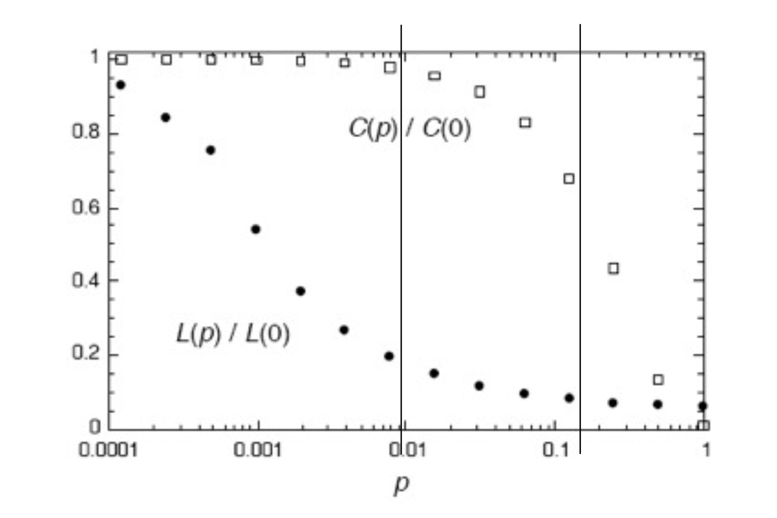
As \(p\) varies, what happens to
the average path length \(L(p)\) and
the clustering coefficient \(C(p)\)?
Here is the famous figure from that paper. Observe the log scale on the \(p\) axis. The values of both the average path length and the clustering coefficient are plotted, normalized by their values when \(p=0\).
We can repeat the experiment on our ring lattices: rewire each edge with probability \(p = 0.05\).
for n_ring in [20, 100, 1000]: ring = nx.watts_strogatz_graph(n_ring, 4, 0) rewired = nx.connected_watts_strogatz_graph(n_ring, 4, 0.05, seed=0)print(f"n = {n_ring:4d}: L {nx.average_shortest_path_length(ring):6.1f} -> "f"{nx.average_shortest_path_length(rewired):5.1f}, "f"C {nx.average_clustering(ring):.2f} -> {nx.average_clustering(rewired):.2f}")
n =   20: L    2.9 ->   2.9,   C 0.50 -> 0.53
n =  100: L   12.9 ->   6.6,   C 0.50 -> 0.45
n = 1000: L  125.4 ->  11.0,   C 0.50 -> 0.42
For \(n = 1000\), rewiring 5% of the edges cuts the average path length from 125.4 to 11.0, more than a factor of 10, while the clustering coefficient only drops from 0.50 to 0.42.
What Watts and Strogatz showed is that it only takes a small amount of long-range connections to dramatically shrink the average path length between nodes.
They showed that high clustering and short path lengths can coexist. They called networks with high clustering and short path lengths small world networks.
This phenomenon expresses itself repeatedly.
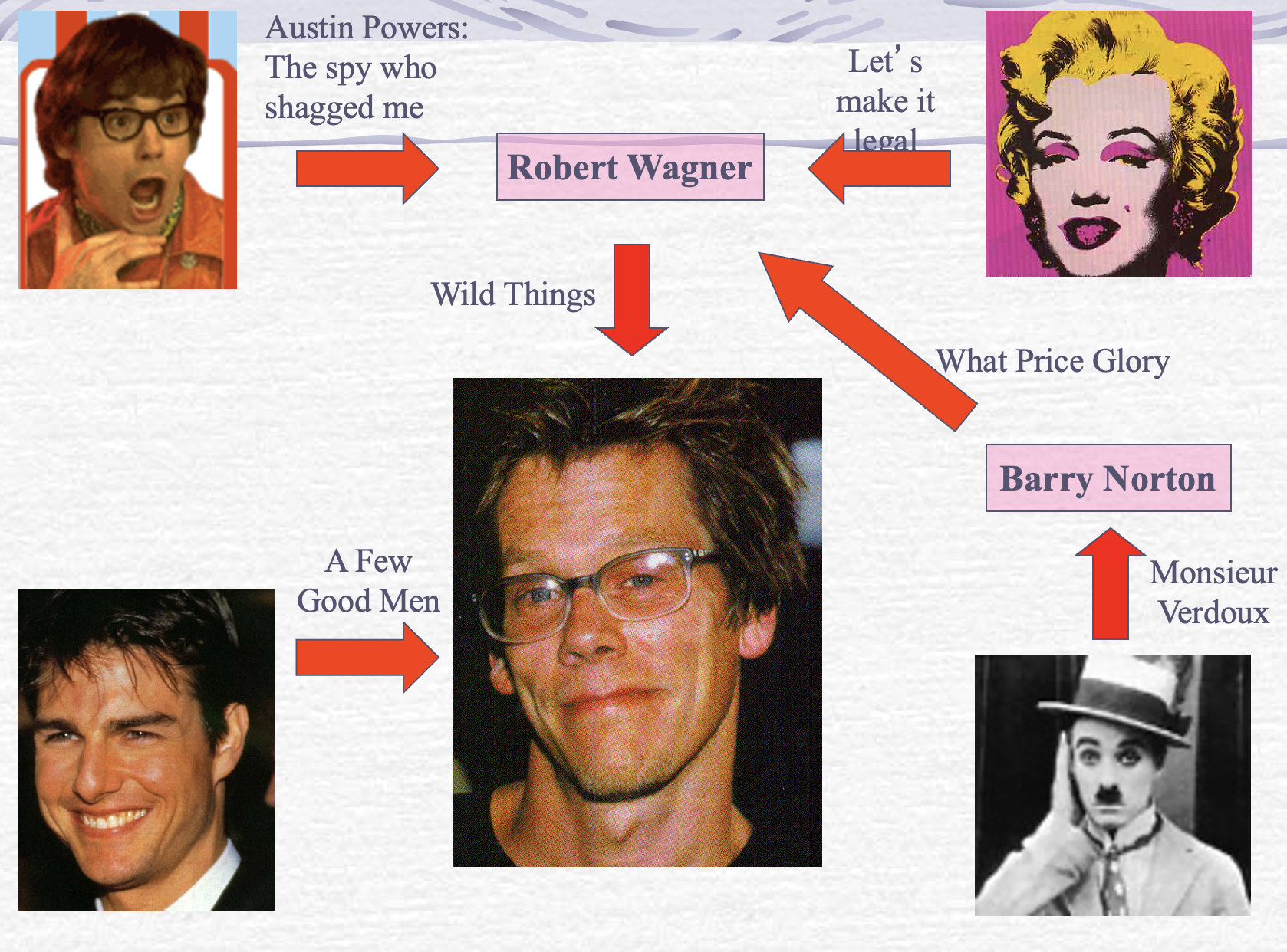
For example, consider the network of movie actors: two actors are connected if they appear in the same movie.
Thus we have the phenomenon of the six degrees of Kevin Bacon.
Implications of Small Worlds
Viruses spread rapidly in small worlds.
One of the goals of pandemic lock-downs is to prevent people circulating outside of their local social groups. This is an attempt to eliminate the effect of long-range (weak-tie) connections.
This is the idea behind travel bans and mandatory quarantining after travel.
Analyzing Graphs
We have seen different strategies to characterize a graph. To perform further analysis we will employ the following strategies:
visualize the network in a way that communicates as much insight as possible, and
compute important metrics of the network.
Visualizing Networks
As an example, we’ll consider the following network, which records American football games between NCAA Division IA colleges in the Fall of 2000 (available here).
Each vertex represents a football team, which belongs to a specific conference (Big Ten, Conference USA, Pac-10, etc.). The conference is stored as the node attribute value.
An edge between two vertices \(v_1\) and \(v_2\) means that the two teams played each other. The network is unweighted.
This data comes from M. Girvan and M. E. J. Newman, Community structure in social and biological networks, Proc. Natl. Acad. Sci. USA 99, 7821-7826 (2002).
import os, urllib.requestdef data_file(path):"""Course data file: use a local copy (here, or in the repo root above a notebook in jupyter_notebooks/), else fetch it from the Materials repo (Colab)."""for prefix in ('', '../'):if os.path.exists(prefix + path):return prefix + path os.makedirs(os.path.dirname(path) or'.', exist_ok=True) urllib.request.urlretrieve('https://raw.githubusercontent.com/tools4ds/DS701-Materials-FA26/main/'+ path, path)return pathfootball = nx.read_gml(data_file('data/football.gml'))print(f'The football network has {football.number_of_nodes()} nodes 'f'and {football.number_of_edges()} edges')
The football network has 115 nodes and 613 edges
To get a sense of what is unusual here, we can compare this network to a \(G(n, p)\) random network with the same number of nodes and edges. The \(p\) that matches is exactly the density of the football network.
n = football.number_of_nodes()p = nx.density(football) # e / (n choose 2)F_random = nx.erdos_renyi_graph(n, p, seed=0)print(f"p = density = {p:.4f}; random graph has {F_random.number_of_edges()} edges")
p = density = 0.0935; random graph has 630 edges
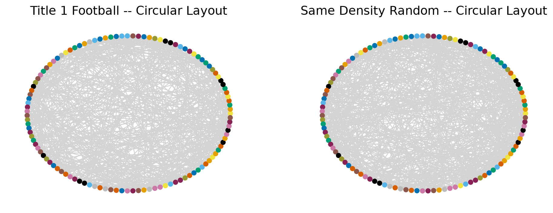
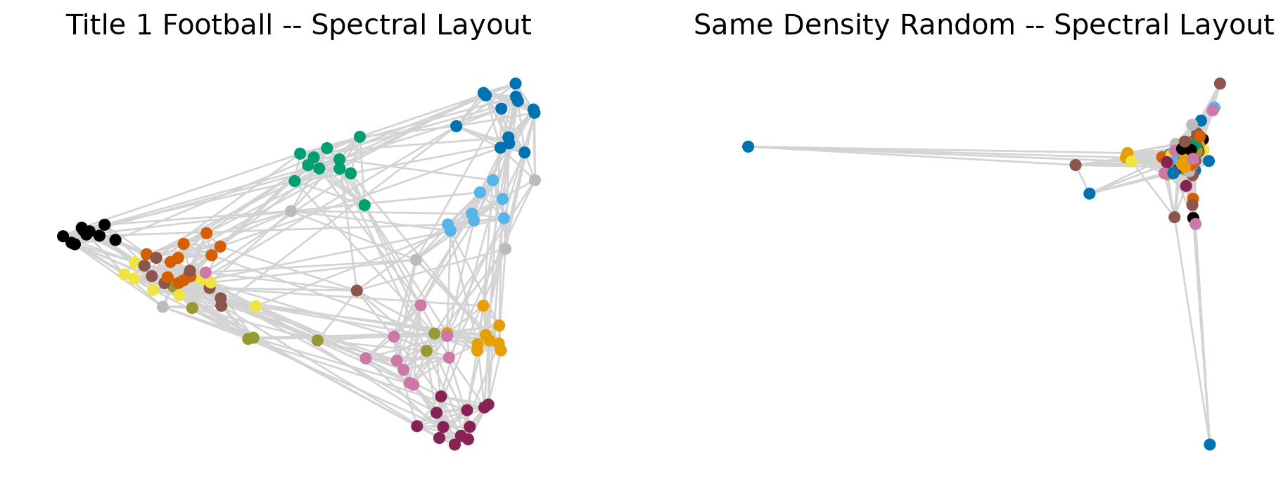
We will color each team by its conference. The same colors are given to the nodes of the random graph, which has no idea what a conference is.
Code
conferences = ['Atlantic Coast', 'Big East', 'Big Ten', 'Big Twelve','Conference USA', 'Independents', 'Mid-American', 'Mountain West','Pacific Ten', 'Southeastern', 'Sun Belt', 'Western Athletic']# 11 conferences need 11 colors: Okabe-Ito plus three dark tones.# Independents (value 5) are not a conference, so they are grey.conf_palette = OKABE_ITO + ['#882255', '#999933', '#8C564B']conf_colors = [conf_palette[i] for i inrange(5)] + ['#BBBBBB'] +\ [conf_palette[i] for i inrange(5, 11)]conf = [football.nodes[team]['value'] for team in football.nodes()]node_colors = [conf_colors[c] for c in conf]def draw_pair(layout, title): fig, (ax1, ax2) = plt.subplots(1, 2, figsize=(12, 4.2))for ax, graph, name in [(ax1, football, 'Title 1 Football'), (ax2, F_random, 'Same Density Random')]: nx.draw_networkx(graph, ax=ax, pos=layout(graph), node_size=35, node_color=node_colors, edge_color='lightgray', with_labels=False, linewidths=0.5) ax.set_title(f'{name} -- {title}', size=15) ax.axis('off')return figdraw_pair(nx.circular_layout, 'Circular Layout')plt.show()
The circular layout keeps all the edges in the interior. There is some non-random structure here, but it’s not clear exactly what it is.
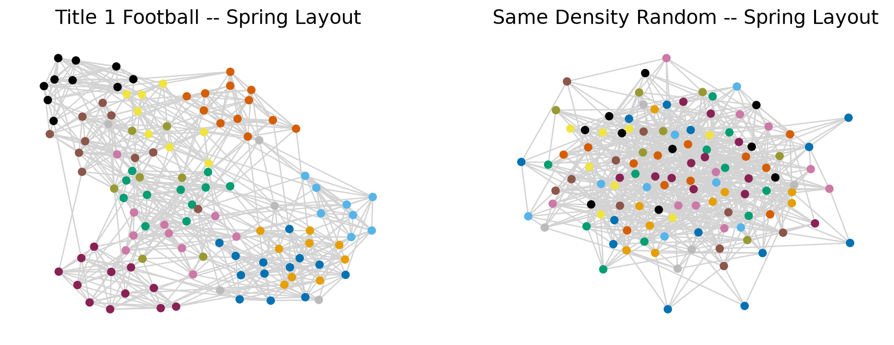
To better investigate this network we will use a more informative layout.
The standard networkx routine, nx.spring_layout, uses a force-directed (Fruchterman–Reingold) layout:
every edge acts as a spring that pulls its two endpoints together (harder for larger weight),
every pair of nodes repels each other,
starting from random positions, the routine moves the nodes step by step until the forces roughly balance.
A densely connected group has many springs holding it together, so it ends up as a tight clump.
A different rule, nx.kamada_kawai_layout, instead places the nodes so that distances in the picture match shortest-path distances in the graph, in a least-squares sense.
The spring layout pulls densely connected groups together. On the left each clump is one color: the clusters are the conferences. On the right the colors are mixed at random.
Spectral Layout
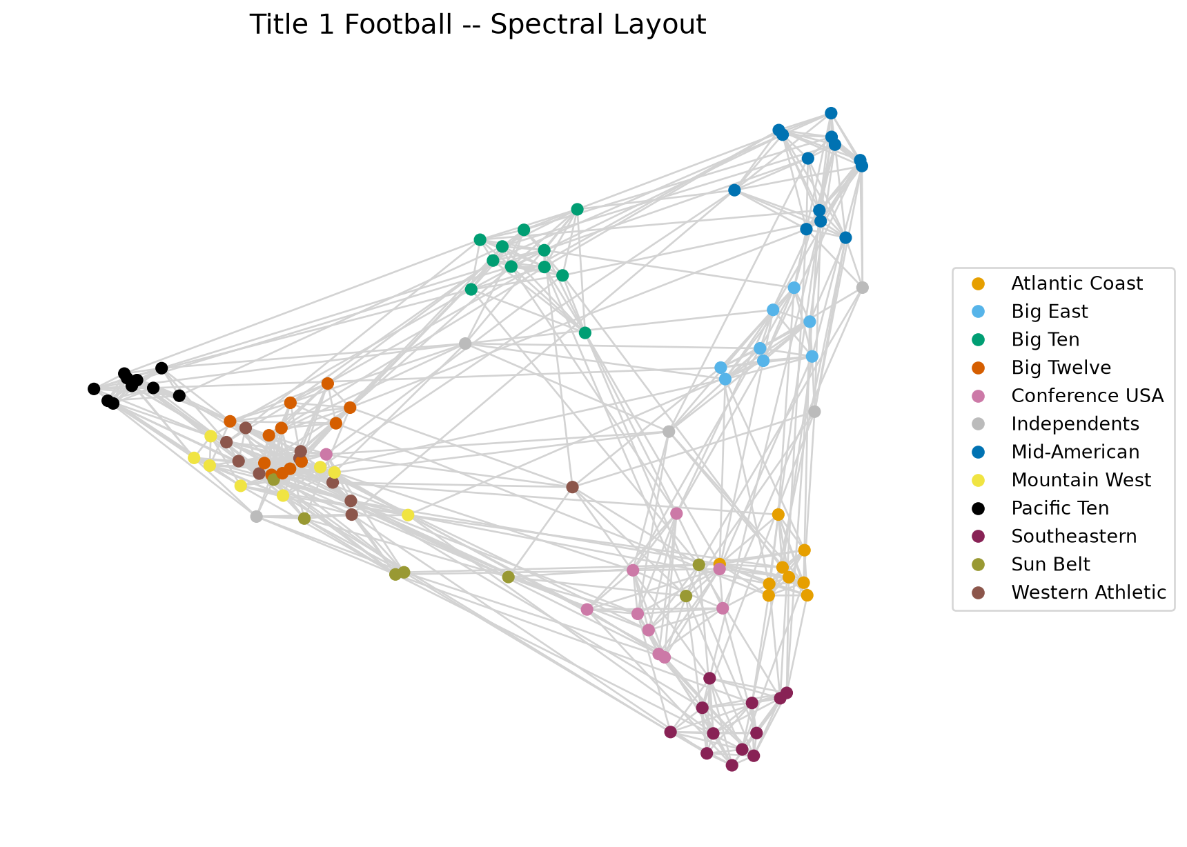
Finally, we can try the spectral layout. We will define the spectral layout in the next lecture.
The clusters of teams are the conferences, and there are not too many high-degree nodes.
Metrics
Another way to understand network structured data is to look at important metrics.
For example, we can start with the clustering coefficient (\(C^{(2)}\), nx.average_clustering):
Code
clustering_coefficient = nx.average_clustering(football)print(f'The clustering coefficient of the Football network is {clustering_coefficient:0.3f}')cc_random = nx.average_clustering(F_random)print(f'The clustering coefficient for the equivalent random network is {cc_random:0.3f}')
The clustering coefficient of the Football network is 0.403
The clustering coefficient for the equivalent random network is 0.088
The football network is more than four times as clustered as the random graph: teams in the same conference all play each other.
Another useful metric is the diameter, along with the average shortest path length. Both need a connected graph, so we check first.
Football network: connected = True, diameter = 4, average shortest path length = 2.508
Equivalent random network: connected = True, diameter = 4, average shortest path length = 2.215
Both graphs are connected, so both metrics are defined. The paths are short in both: football is a small world, with much more clustering than random but similar path lengths.
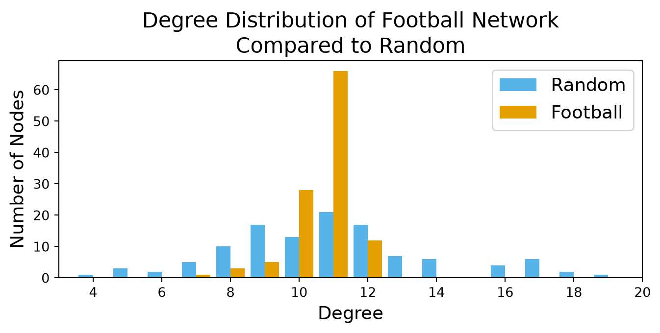
The next property we can look at is the degree distribution, compared with the equivalent random network.
Code
degree_freq = nx.degree_histogram(football)rand_degree_freq = nx.degree_histogram(F_random)plt.figure(figsize=(8, 3.0))plt.bar(np.arange(len(rand_degree_freq)) -0.21, rand_degree_freq, 0.42, color=OKABE_ITO[1], label='Random')plt.bar(np.arange(len(degree_freq)) +0.21, degree_freq, 0.42, color=OKABE_ITO[0], label='Football')plt.xticks(range(4, 21, 2))plt.xlim(3, 20)plt.xlabel('Degree', size=14)plt.ylabel('Number of Nodes', size=14)plt.legend(loc='best', fontsize=14)plt.title('Degree Distribution of Football Network\nCompared to Random', size=16)plt.show()
Far more teams play 11 games than chance would give: that is scheduling. The opposite of a heavy tail: the real network is more regular than random.
Recap
You can now:
build a graph from an edge list and read the adjacency matrix as the graph: degree is a row sum (out- and in-degree for directed graphs), the average degree is \(2e/n\), the density is \(e/\binom{n}{2}\), and \((A^2)_{ij}\) counts walks of length 2;
ask the first structural questions: connected components (strongly connected for directed graphs), shortest paths, diameter and average path length, and the clustering coefficients \(C^{(1)}\) (transitivity) and \(C^{(2)}\) (average_clustering);
use \(G(n, p)\) at the same density as a baseline: binomial degrees with no hubs, clustering \(p\); real networks show heavy tails on a log–log CCDF, far more clustering, and short paths (small worlds);
visualize a network with spring and spectral layouts and compare it with the baseline.
Next:which nodes matter? Centrality, and what the eigenvectors of \(A\) tell you about a network.