Causal Inference I: Correlation, Causation, and Counterfactuals
So far in this course we have built tools that are very good at answering one kind of question: given what I observe, what should I predict? Clustering, regression, and classification all learn associations in data.
But many of the questions we actually care about as data scientists are of a different kind. They are questions about what would happen if we acted:
If we change the checkout button from blue to green, will more people buy?
If a patient takes this drug, will they recover faster?
If a student enrolls in the tutoring program, will their grade go up?
If the city raises the minimum wage, will employment fall?
These are causal questions, and — as we will see — no amount of predictive accuracy answers them by itself.
A fitted regression is not a causal claim
You just fit regressions. What does a coefficient mean?
and read off a coefficient, a confidence interval, and a \(p\)-value for each variable.
There are two very different readings of a coefficient \(\hat\beta_1\) on \(X\):
Associational reading (what OLS estimates)
“Among the units in my data, those with \(X\) one unit higher have \(Y\) higher by \(\hat\beta_1\) on average.”
Causal reading (what a decision-maker wants)
“If I raised\(X\) by one unit, \(Y\) would change by \(\hat\beta_1\) on average.”
Least squares gives you the first reading, always. It gives you the second only under extra assumptions that the data cannot check for you. This lecture is about what those assumptions are, and what happens when they fail.
A regression you would recognize
Two variables measured daily across the summer: ice cream sales and drowning deaths. Let’s fit the regression exactly as we did in Lecture 11.
Code
import numpy as np, pandas as pdimport statsmodels.formula.api as smfrng = np.random.default_rng(701)n =200temp = rng.uniform(60, 100, n) # daily high temperature (°F)ice_cream =2.0* temp + rng.normal(0, 15, n) # ice cream salesdrownings =0.10* temp + rng.normal(0, 2.0, n) # drowning deaths# NOTE: ice cream does NOT appear in the equation for drownings.df = pd.DataFrame({"ice_cream": ice_cream, "drownings": drownings, "temp": temp})res = smf.ols("drownings ~ ice_cream", data=df).fit()print(res.summary().tables[1])
A positive slope, a tight confidence interval, \(p \approx 0\). Every diagnostic from Lecture 11 says the fit is fine. Should the city ban ice cream to reduce drownings?
Correlation is not causation
The regression is correct as a description of the data: on days with more ice cream sales there are more drownings.
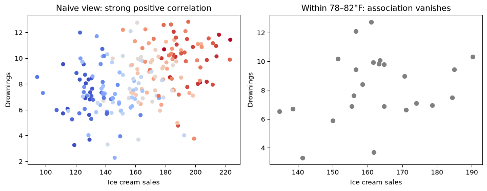
But look at how the data were generated: a third variable, hot weather, drives both. Hot days increase ice cream sales and send more people swimming.
Temperature is a confounder. Ice cream has no effect on drowning, and banning it would change nothing.
The slogan “correlation is not causation” is famous, and yet the mistakes it warns about are everywhere — most often hidden inside a regression table that looks authoritative.
Confounding, visualized
Once we hold the confounder fixed (look only at days near 80°F), the relationship between ice cream and drowning disappears. There was never a causal link.
Confounding
NoteDefinition
A confounder is a variable that causally affects both the treatment (or explanatory variable) \(X\)and the outcome \(Y\). It creates an association between \(X\) and \(Y\) that is not due to \(X\) causing \(Y\).
Multiple regression can sometimes fix this — if we measure the confounder and include it:
slope on ice_cream, ignoring temp:  +0.032
slope on ice_cream, adjusting temp: -0.007   (truth: 0)
Adding temp to the formula drives the ice-cream coefficient to zero. So “controlling for” a variable is just adding it to the regression — but which variables to add is a causal question that the fitting procedure cannot answer. If temperature had not been measured, no amount of model selection would have saved us.
Same trap, higher stakes
A hospital analytics team fits a model on patient records and finds a strong, statistically significant relationship:
Patients who visit the hospital are more likely to die within the year than patients who do not.
Should we conclude that hospitals cause death and recommend people avoid them?
Of course not. Sick people go to hospitals. The hospital visit is associated with death because both are driven by a common cause — being sick.
The model is a perfectly good predictor (“I see a hospital visit, I predict higher mortality”) and a catastrophically bad guide to action (“close the hospitals”). This gap between prediction and intervention is the entire subject of these two lectures. (Angrist and Pischke 2009)
Prediction vs. intervention
Two different questions
It is worth being precise about the distinction.
Prediction (association)
\[ P(Y \mid X = x) \]
“Among people I observe to have \(X = x\), what is the distribution of \(Y\)?”
This is what supervised learning — including every regression you have fit — estimates.
Intervention (causation)
\[ P(Y \mid do(X = x)) \]
“If I set\(X = x\) for everyone, what is the distribution of \(Y\)?”
In general \(P(Y \mid X=x) \neq P(Y \mid do(X=x))\). The whole game is figuring out when — and how — we can recover the second from data that only shows us the first.
The other potential outcome — the counterfactual — is missing.
Unit
\(T_i\)
\(Y_i(0)\)
\(Y_i(1)\)
\(\tau_i\)
Ann
1
?
7
?
Bob
0
4
?
?
Cara
1
?
9
?
Dan
0
3
?
?
We can never compute \(\tau_i\) for a single individual. Causal inference is fundamentally a missing data problem(Imbens and Rubin 2015).
The Average Treatment Effect (ATE)
Since individual effects are unknowable, we target population averages.
NoteDefinition
The Average Treatment Effect is the expected difference between a unit’s two potential outcomes, averaged over the whole population: \[ \text{ATE} = \mathbb{E}[\,Y(1) - Y(0)\,] = \mathbb{E}[Y(1)] - \mathbb{E}[Y(0)]. \]
Related quantities you will meet:
ATT — the effect on the treated, \(\mathbb{E}[Y(1) - Y(0)\mid T=1]\),
CATE — the conditional effect for a subgroup, \(\mathbb{E}[Y(1) - Y(0)\mid X=x]\) (the basis of “heterogeneous treatment effects” and uplift modeling).
Selection bias: why we can’t just compare treated vs. untreated
The tempting estimator is the naive difference in means:
\[ \underbrace{\mathbb{E}[Y \mid T=1] - \mathbb{E}[Y \mid T=0]}_{\text{what we can measure}}. \]
Add and subtract the missing counterfactual \(\mathbb{E}[Y(0)\mid T=1]\) to decompose it:
Selection bias is the difference in outcomes that treated and untreated units would have shown even without any treatment: \(\mathbb{E}[Y(0)\mid T{=}1] - \mathbb{E}[Y(0)\mid T{=}0]\). It is nonzero whenever who gets treated depends on things that also affect the outcome.
Exactly the hospital example: patients who visit are sicker to begin with. Our job is to make that term vanish. (The coefficient on T in the regression Y ~ Tis this naive difference — so it inherits the same bias.)
Simpson’s paradox
Confounding in numbers: a kidney stone study
A famous real study compared two treatments for kidney stones (Charig et al. 1986). Here are the recovery rates:
Treatment A (surgery)
Treatment B (less invasive)
Small stones
81/87 = 93%
234/270 = 87%
Large stones
192/263 = 73%
55/80 = 69%
Overall
273/350 = 78%
289/350 = 83%
Treatment A wins for small stones and for large stones — yet Treatment B wins overall.
Stone size is a confounder. Doctors gave the risky Treatment A to the hard (large-stone) cases and Treatment B to the easy (small-stone) cases. The overall numbers mix effect with case-mix.
Simpson’s paradox
NoteDefinition
Simpson’s paradox occurs when an association between \(X\) and \(Y\) that holds in every subgroup of the data reverses (or disappears) when the subgroups are combined. It is caused by a confounder whose distribution differs across the levels of \(X\).
The within-stratum comparisons hold the confounder (stone size) fixed, so they reflect the treatment effect. Treatment A is better.
The overall comparison is contaminated by selection bias.
The paradox is not a mathematical curiosity — it is a warning: aggregated associations can point the opposite direction from the truth. Deciding which variables to adjust for is itself a causal question (Lecture II).
A second real example: Berkeley admissions
In 1973, UC Berkeley graduate admissions data showed (Bickel et al. 1975):
Overall: men were admitted at a noticeably higher rate than women — suggesting bias.
Within almost every department: women were admitted at an equal or slightly higher rate.
The confounder was department choice: women applied disproportionately to more competitive departments with low admission rates. Same paradox, same lesson.
Randomization
The gold standard: randomized experiments
How do we break confounding by design? Randomly assign the treatment.
If a coin flip decides \(T_i\), then treatment is statistically independent of the potential outcomes: \[ \{Y_i(0), Y_i(1)\} \perp\!\!\!\perp T_i. \]
Independence kills the selection-bias term, because the treated and untreated groups are — in expectation — identical in every respect (measured and unmeasured) except the treatment: \[ \mathbb{E}[Y(0)\mid T{=}1] = \mathbb{E}[Y(0)\mid T{=}0]. \]
So the naive difference in means becomes an unbiased estimate of the ATE(Imbens and Rubin 2015).
Randomization removes confounding
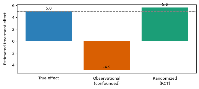
The true effect is \(+5\). The observational estimate is badly biased (sick patients both got the drug and had worse outcomes). The randomized estimate recovers the truth.
Try it yourself in the notebook: change p_treat_obs so that healthier patients are more likely to be treated, and predict the direction of the bias before you run the cell.
RCTs in the wild
Randomized experiments are everywhere once you look:
Medicine — randomized clinical trials for drug approval,
Tech — A/B tests are RCTs for product changes (button colors, ranking algorithms),
Agriculture — R. A. Fisher’s randomized field trials, where it all began.
When you can randomize, do it. But often you cannot — for cost, ethics, or because the “treatment” already happened. That is the subject of Lecture II.
Summary
Summary
A regression coefficient is an association, not an effect. OLS estimates \(P(Y \mid X)\); a causal claim is about \(P(Y \mid do(X))\), and the two differ whenever there is confounding.
A confounder is a common cause of treatment and outcome. Adjusting for it (holding it fixed, or adding it to the regression) removes the spurious association — but only if you measured it and knew to include it.
Potential outcomes \(Y(1), Y(0)\) define the effect; you only ever observe one. This is the fundamental problem of causal inference, so we estimate averages like the \(\text{ATE} = \mathbb{E}[Y(1) - Y(0)]\).
Naive difference in means \(=\) causal effect \(+\) selection bias. Simpson’s paradox is what selection bias looks like in a table: within-group and overall comparisons can point in opposite directions.
Randomization makes treatment independent of potential outcomes, so the selection-bias term is zero and the naive difference is unbiased for the ATE.
Next: when you cannot randomize, how do causal graphs tell you what to adjust for — and what not to?
Angrist, Joshua D., and Jörn-Steffen Pischke. 2009. Mostly Harmless Econometrics: An Empiricist’s Companion. Princeton University Press.
Bickel, P. J., E. A. Hammel, and J. W. O’Connell. 1975. “Sex Bias in Graduate Admissions: Data from Berkeley.”Science 187 (4175): 398–404. https://doi.org/10.1126/science.187.4175.398.
Charig, C. R., D. R. Webb, S. R. Payne, and J. E. Wickham. 1986. “Comparison of Treatment of Renal Calculi by Open Surgery, Percutaneous Nephrolithotomy, and Extracorporeal Shockwave Lithotripsy.”British Medical Journal (Clinical Research Ed.) 292 (6524): 879–82. https://doi.org/10.1136/bmj.292.6524.879.
Imbens, Guido W., and Donald B. Rubin. 2015. Causal Inference for Statistics, Social, and Biomedical Sciences: An Introduction. Cambridge University Press.
Pearl, Judea. 2009. Causality: Models, Reasoning, and Inference. 2nd ed. Cambridge University Press.
Pearl, Judea, and Dana Mackenzie. 2018. The Book of Why: The New Science of Cause and Effect. Basic Books.
Rubin, Donald B. 1974. “Estimating Causal Effects of Treatments in Randomized and Nonrandomized Studies.”Journal of Educational Psychology 66 (5): 688–701. https://doi.org/10.1037/h0037350.
Splawa-Neyman, Jerzy, D. M. Dabrowska, and T. P. Speed. 1990. “On the Application of Probability Theory to Agricultural Experiments. Essay on Principles. Section 9.”Statistical Science 5 (4): 465–72. https://doi.org/10.1214/ss/1177012031.