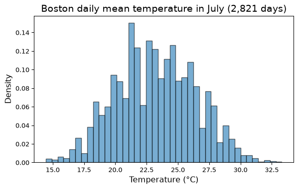
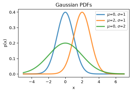
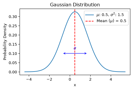
\(\mu\), the mean – where the bell is centered, and
\(\sigma^2\), the variance (\(\sigma\) is the standard deviation) – how wide the bell is.
Why do we reach for it so often? Because sums of many small independent effects tend to be Gaussian – we will make this precise (the Central Limit Theorem) at the end of the lecture.
Fitting the Model
A Gaussian model for July temperatures is fully specified once we choose \(\mu\) and \(\sigma\).
The natural choice: set \(\mu\) to the sample mean and \(\sigma\) to the sample standard deviation of the observed July days.
Code
mu_hat = july.mean()sigma_hat = july.std()print(f"Fitted Gaussian for July: mu = {mu_hat:.2f} °C, sigma = {sigma_hat:.2f} °C")
Fitted Gaussian for July: mu = 23.23 °C, sigma = 3.17 °C
Right now “the natural choice” is a heuristic. In the second part of the lecture we will see that these are precisely the maximum likelihood estimates – the parameters that make the observed data most probable.
Checking the Fit
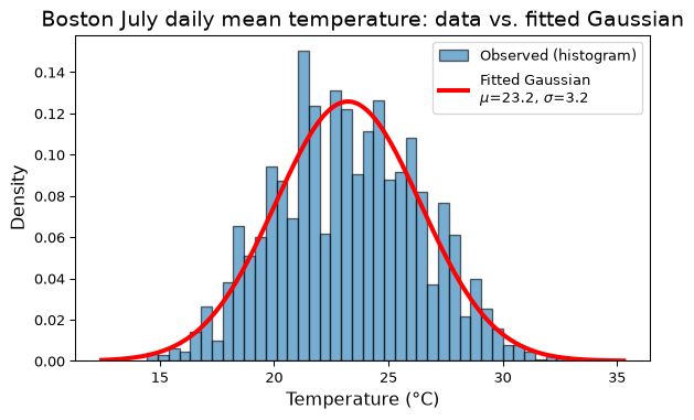
A model that we don’t check is just an assumption. The simplest check is visual: overlay the fitted density on the histogram.
Code
plt.figure(figsize=(7, 3))plt.hist(july, bins=40, density=True, alpha=0.6, edgecolor='black', label='Observed (histogram)')xs = np.linspace(july.min() -2, july.max() +2, 300)plt.plot(xs, norm.pdf(xs, mu_hat, sigma_hat), 'r-', lw=3, label=f'Fitted Gaussian\n$\\mu$={mu_hat:.1f}, $\\sigma$={sigma_hat:.1f}')plt.title('Boston July daily mean temperature: data vs. fitted Gaussian', size=14)plt.xlabel('Temperature (°C)', size=12)plt.ylabel('Density', size=12)plt.legend()plt.show()
Not perfect – the histogram is lumpier than the smooth curve, and slightly asymmetric – but a Gaussian is a reasonable description of July.
Checking the Fit Quantitatively
A Gaussian makes concrete predictions we can compare against the data: about 68% of values should fall within \(\mu \pm \sigma\) and about 95% within \(\mu \pm 2\sigma\).
Code
for k in [1, 2, 3]: lo, hi = mu_hat - k * sigma_hat, mu_hat + k * sigma_hat observed = ((july >= lo) & (july <= hi)).mean() predicted = norm.cdf(k) - norm.cdf(-k)print(f"within {k} sigma: observed {observed:.3f} Gaussian predicts {predicted:.3f}")
within 1 sigma:  observed 0.664   Gaussian predicts 0.683
within 2 sigma:  observed 0.966   Gaussian predicts 0.954
within 3 sigma:  observed 0.999   Gaussian predicts 0.997
Close agreement – the model captures the spread of the data well.
Does Same Model Fit Every Month?
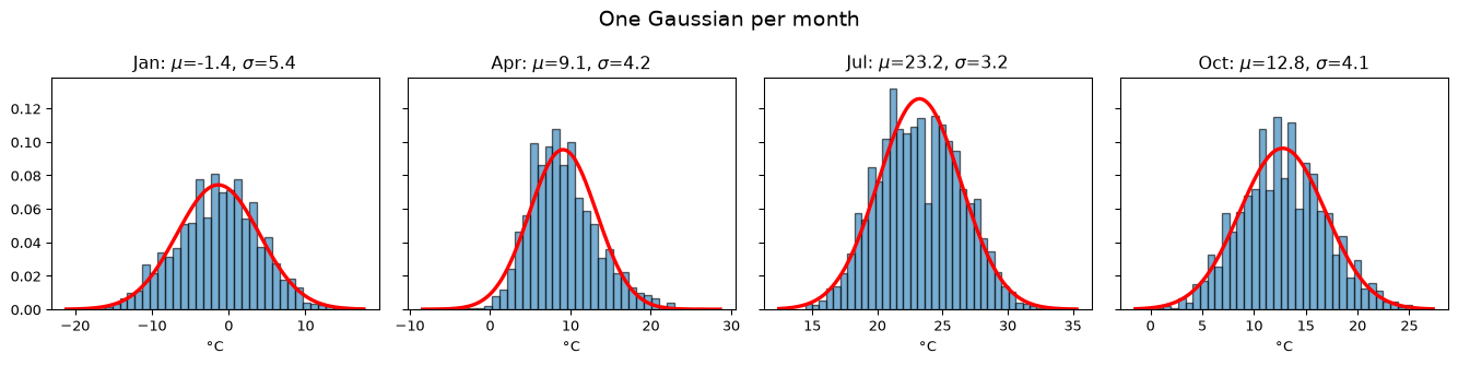
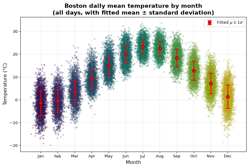
Fitting is cheap, so let’s fit a separate Gaussian to each month and look at four of them.
Notice two things: (1) the parameters differ a lot – winter months are colder and more variable; (2) the fit is visibly worse in April (a longer warm tail, with the peak sitting left of the fitted mean). Checking the fit tells us where the model is trustworthy.
The Whole Year at a Glance
Plotting every day, plus each month’s fitted \(\mu \pm \sigma\), summarizes the twelve fitted models in one picture.
Once we trust the model, we can ask questions the raw data answers only clumsily.
For example: what is the probability that a July day in Boston has a mean temperature above 30 °C?
Code
p_model = norm.sf(30, mu_hat, sigma_hat) # sf = 1 - cdf, the upper tailp_data = (july >30).mean()print(f"Gaussian model: P(T > 30 °C) = {p_model:.4f}")print(f"Empirical: fraction of July days above 30 °C = {p_data:.4f}")
Gaussian model:  P(T > 30 °C) = 0.0165
Empirical:       fraction of July days above 30 °C = 0.0117
Same order of magnitude, with the model somewhat overstating the tail (the data’s warm tail is a bit lighter than Gaussian). For rarer events (say, above 33 °C) the model still gives an answer even where the data has only a handful of cases – with the caveat that a fit is always least trustworthy in the tails.
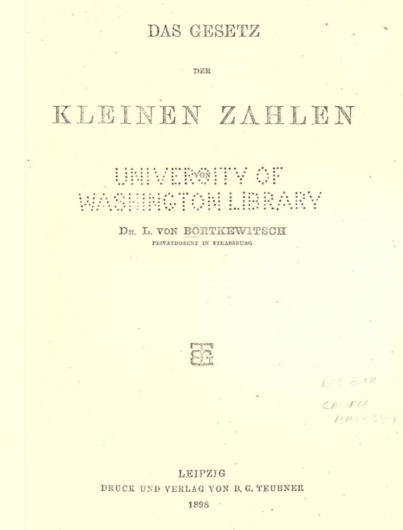
Studied the number of Prussian cavalry soldiers killed by horse kicks, per army corps per year, 1875 – 1894
Some years a corps had 3 or 4 such deaths – was something going on, or was this what randomness looks like?
The Horse-Kick Data
Twenty years of counts for fourteen corps (the data is in data/HorseKicks.txt).
Code
import os, urllib.requestdef data_file(path):"""Course data file: use a local copy (here, or in the repo root above a notebook in jupyter_notebooks/), else fetch it from the Materials repo (Colab)."""for prefix in ('', '../'):if os.path.exists(prefix + path):return prefix + path os.makedirs(os.path.dirname(path) or'.', exist_ok=True) urllib.request.urlretrieve('https://raw.githubusercontent.com/tools4ds/DS701-Materials-FA26/main/'+ path, path)return pathhorse_kicks = pd.read_csv(data_file('data/HorseKicks.txt'), sep='\t', index_col='Year')horse_kicks.head(5)
GC
C1
C2
C3
C4
C5
C6
C7
C8
C9
C10
C11
C14
C15
Year
1875
0
0
0
0
0
0
0
1
1
0
0
0
1
0
1876
2
0
0
0
1
0
0
0
0
0
0
0
1
1
1877
2
0
0
0
0
0
1
1
0
0
1
0
2
0
1878
1
2
2
1
1
0
0
0
0
0
1
0
1
0
1879
0
0
0
1
1
2
2
0
1
0
0
2
1
0
Following Bortkiewicz’s classic analysis, we drop the four corps with atypical organization (the Guard Corps GC and corps C1, C6, C11), leaving 10 corps \(\times\) 20 years \(= 200\) corps-years.
Each observation is a small non-negative count. A Gaussian is the wrong shape for that. We need a different model.
The Model: The Poisson Distribution
The Poisson distribution models “how many events occur in a fixed interval” when events happen at a constant average rate but otherwise at random.
Definition. A random variable \(X\) taking values \(0, 1, 2, \ldots\) has a Poisson distribution with parameter \(\lambda > 0\) if
It has a single parameter\(\lambda\), and both its mean and its variance equal \(\lambda\).
Other classic Poisson-shaped quantities: misprints per page, calls arriving at a call center per minute, radioactive decays per second.
Fitting the Poisson
With one parameter there is only one thing to estimate: the rate \(\lambda\). The natural estimate is the sample mean count.
Code
counts = horse_kicks.drop(columns=['GC', 'C1', 'C6', 'C11']).values.ravel()lam_hat = counts.mean()print(f"{len(counts)} corps-years, {counts.sum()} deaths, lambda_hat = {lam_hat:.3f} deaths per corps per year")
200 corps-years, 122 deaths, lambda_hat = 0.610 deaths per corps per year
(As with the Gaussian mean, this is the maximum likelihood estimate – coming up shortly.)
Checking the Fit: Observed vs. Predicted Counts
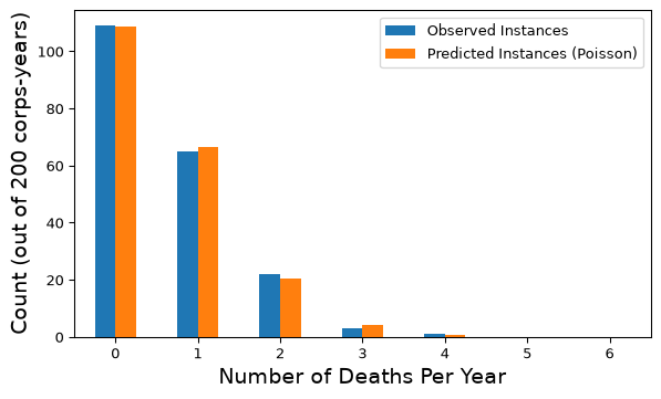
If the Poisson model is right, then out of 200 corps-years we expect \(200 \cdot p(k)\) of them to have exactly \(k\) deaths.
fit_table.plot.bar(figsize=(7, 3))plt.xlabel("Number of Deaths Per Year", size=14)plt.ylabel("Count (out of 200 corps-years)", size=14)plt.xticks(rotation=0)plt.show()
The agreement is remarkable. The years with 3 or 4 deaths are not evidence of anything unusual – they are exactly what a constant, random rate of \(0.61\) per year produces over 200 tries.
Checking the Fit: A Property Check
The Poisson has a built-in consistency check: its mean and variance are both \(\lambda\). Does the data agree?
Code
print(f"sample mean = {counts.mean():.3f}")print(f"sample variance = {counts.var():.3f}")
sample mean     = 0.610
sample variance = 0.608
Yes. When counts show variance much larger than the mean (“overdispersion”), that is a signal the Poisson is the wrong model.
The Pattern So Far
Both examples followed the same four steps:
Look at the data and choose a family of distributions whose shape matches (bell-shaped and continuous \(\to\) Gaussian; small counts \(\to\) Poisson).
Estimate the parameters from the data (\(\hat\mu, \hat\sigma\) or \(\hat\lambda\)).
Check the fit: overlay density on histogram, compare predicted and observed counts, check the model’s implied properties.
Use the model to answer questions.
Step 2 was done by “the natural choice” both times. Now let’s justify it – and get a recipe that works for any model.
Maximum Likelihood Estimation (MLE)
Motivation
Probability distributions are specified by their parameters.
The Gaussian distribution is determined by the parameters \(\mu\) and \(\sigma^{2}\), i.e.,
Maximum likelihood estimation is a method to estimate the parameters of a probability distribution given a sample of observed data that best fits the data.
Likelihood Function
The likelihood function \(L(\boldsymbol{\theta}, x)\) represents the probability of observing the given data \(x\) as a function of the parameters \(\boldsymbol{\theta}\) of the distribution.
The primary purpose of the likelihood function is to estimate the parameters that make the observed data \(x\) most probable.
The likelihood function for a set of samples \(x_{n}~\text{for}~n=1, \ldots, N\) drawn from an independent and identically distributed (i.i.d.) Gaussian distribution is
The product comes from independence: the probability of seeing all \(N\) samples is the product of the probabilities of seeing each one.
Maximizing the Likelihood
For a particular set of parameters \(\mu, \sigma^{2}\)
large values of \(L(\mu, \sigma^{2}, x_1, \ldots, x_n)\) indicate the observed data is very probable (high likelihood) and thus well modeled by the parameters
small values of \(L(\mu, \sigma^{2}, x_1, \ldots, x_n)\) indicate the observed data is very improbable (low likelihood) and thus poorly modeled by the parameters
The parameters that maximize the likelihood function are called the maximum likelihood estimates.
Log-likelihood
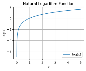
A common manipulation to obtain a more useful form of the likelihood function is to take its natural logarithm.
Advantages of the log-likelihood:
The log function is monotonically increasing, so the MLE is the same as the log-likelihood estimate
The product of probabilities becomes a sum of logarithms, which is more numerically stable
Using the log-likelihood we will be able to derive formulas for the maximum likelihood estimates.
Seeing the Log-likelihood on Real Data
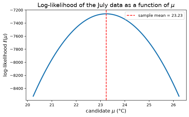
Before deriving anything, let’s just compute the Gaussian log-likelihood of the July temperatures for a range of candidate means \(\mu\) (holding \(\sigma\) at the sample value).
Code
mus = np.linspace(mu_hat -3, mu_hat +3, 200)loglik = [norm.logpdf(july, m, sigma_hat).sum() for m in mus]plt.figure(figsize=(7, 3))plt.plot(mus, loglik, lw=2.5)plt.axvline(mu_hat, color='r', linestyle='--', label=f'sample mean = {mu_hat:.2f}')plt.xlabel('candidate $\\mu$ (°C)', size=12)plt.ylabel('log-likelihood $\\ell(\\mu)$', size=12)plt.title('Log-likelihood of the July data as a function of $\\mu$', size=14)plt.legend()plt.show()
The log-likelihood peaks exactly at the sample mean. That is not a coincidence – let’s show why.
Maximizing the log-likelihood
How do we maximize (optimize) a function of parameters?
To find the optimal parameters of a function, we compute partial derivatives of the function and set them equal to zero. The solution to these equations gives us a local optimal value for the parameters.
The full derivation of these results is provided here.
Tip: Try deriving these results yourself!
So “the natural choice” we made for the temperatures – sample mean and sample standard deviation – is the maximum likelihood fit. (The MLE variance divides by \(N\); pandas.std() divides by \(N-1\). For \(N\) in the thousands the difference is negligible.)
The Same Recipe for the Poisson
Nothing about the recipe was specific to the Gaussian. For counts \(k_1, \ldots, k_N\) modeled as i.i.d. Poisson(\(\lambda\)):
The MLE for the Poisson rate is the sample mean count – exactly what we used for the horse kicks.
Summary of MLE
The recipe: write down the probability of the observed data as a function of the parameters (the likelihood), take the log, and find the parameters that maximize it.
For samples \(x_{1}, \ldots, x_n\) from a Gaussian, this means maximizing
You will see MLE again. Gaussian Mixture Models (next lecture) maximize a likelihood where the parameters of several Gaussians are unknown at once, and logistic regression (later) is MLE for a model of class probabilities.
Two Variables at Once
Stocks as Random Variables
So far each model described a single quantity. Very often we care about how two quantities vary together.
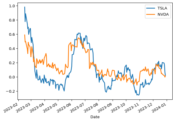
Let’s take the daily closing prices of Tesla and NVIDIA in 2023, and look at their 30-day returns:
Code
import yfinance as yfstocks = ['TSLA', 'NVDA']df = pd.DataFrame()for s in stocks: df[s] = pd.DataFrame(yf.download(s, start='2023-01-01', end='2023-12-31', progress =False))['Close']rets = df.pct_change(30)rets[['TSLA', 'NVDA']].plot(lw=2, figsize=(7, 3))plt.legend(loc='best')plt.show()
Treating these two time-series as random variables, we are interested in how they vary together.
Covariance
This is captured by the concept of covariance.
Definition. For two random variables \(X\) and \(Y\), their covariance is defined as:
If covariance is positive, this tells us that \(X\) and \(Y\) tend to both be above their means together and both below their means together.
We will often denote \(\text{Cov}(X,Y)\) as \(\sigma_{XY}\).
Note that \(\text{Cov}(X, X) = E[(X-\mu_X)^2] = \sigma_X^2\) – the covariance of a variable with itself is its variance.
Correlation
If we are interested in asking “how similar” are two random variables, we want to normalize covariance by the amount of variance shown by the random variables.
The tool for this purpose is correlation, i.e., normalized covariance:
If \(\rho(X, Y) = 0\) then \(X\) and \(Y\) are uncorrelated.
Note
Note that this is not the same thing as being independent! It just means there is no linear relationship between the two.
But independence implies uncorrelated. Plug in equations and check.
\(\rho\) is sometimes called “Pearson \(r\)” after Karl Pearson who popularized it.
Stock Covariance
Let’s estimate the covariance of the two closing prices from the data. Just as the sample mean estimates \(\mu\), the sample covariance estimates \(\text{Cov}(X, Y)\):
Code
df.cov()
TSLA
NVDA
TSLA
1757.018115
387.385870
NVDA
387.385870
115.065645
In the case of Tesla (\(X\)) and NVIDIA (\(Y\)) above, we find that
\[\text{Cov}(X,Y) \approx 388.\]
The diagonal entries are the variances of each stock’s price; the off-diagonal entry is the covariance.
Stock Correlation
How similar are these random variables? Let’s compute \(\rho(X,Y).\)
Code
df.corr()
TSLA
NVDA
TSLA
1.000000
0.861555
NVDA
0.861555
1.000000
We observe that
\[\rho(X,Y) \approx 0.86.\]
There appears to be some similarity between the two stocks.
The Multivariate Gaussian
The most common multivariate distribution we will work with is the multivariate Gaussian – it is what a Gaussian looks like in two or more dimensions.
The multivariate normal distribution of a random vector \(\mathbf{X} = (X_1, \dots, X_k)^T\) is denoted
where \(\mathbf{\mu} = E[\mathbf{X}] = (E[X_1], \dots, E[X_k])^T\)
and \(\Sigma\) is the \(k \times k\)covariance matrix where \(\Sigma_{i,j} = \text{Cov}(X_i, X_j)\).
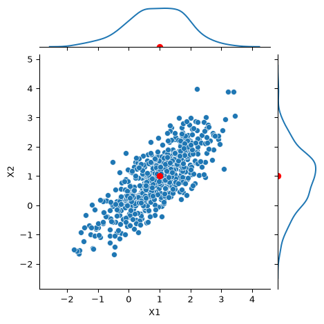
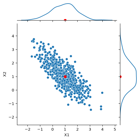
So the two parameters are the same as before – a mean and a “variance” – except now the mean is a vector and the variance is a matrix. The covariance matrix is what determines the shape of the distribution.
The MLE story carries over: the maximum likelihood estimates of \(\mathbf{\mu}\) and \(\Sigma\) are the sample mean vector and the sample covariance matrix – exactly the df.mean() and df.cov() we already computed.
Code
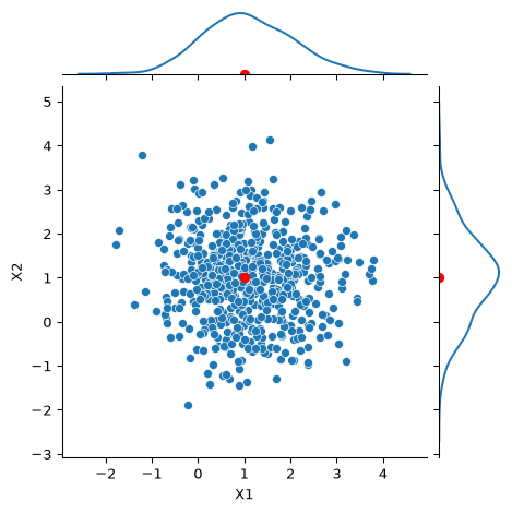
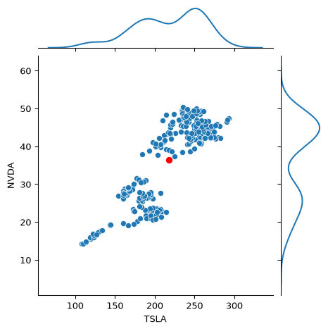
g = sns.JointGrid(data = df, x ='TSLA', y ='NVDA', height =4)g.plot(sns.scatterplot, sns.kdeplot)g.ax_joint.plot(df.mean()['TSLA'], df.mean()['NVDA'], 'ro', markersize =6)plt.show()
Recall that the correlation between these two stocks was about 0.86 – the cloud is stretched along the diagonal, like our \(\Sigma_{12} = 0.8\) example. (Whether a single Gaussian is a good fit here is questionable – and that is precisely the motivation for mixtures of Gaussians next lecture.)
Uncertainty: How Good Is a Sample Mean?
The Central Limit Theorem
We have been estimating means from data all lecture. How much should we trust such an estimate?
The key tool is the celebrated Central Limit Theorem. Informally,
The sum (or average) of a large number of independent observations from any distribution4 with finite variance tends to have a Gaussian distribution.
This is also why the Gaussian is such a good default model: measurement errors, daily temperatures, and many other quantities are themselves the accumulation of many small independent effects.
Note the “any distribution” – the individual observations do not need to be Gaussian.
The CLT in Action
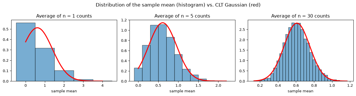
Let’s check it on the horse-kick counts, which are certainly not Gaussian (they are 0, 1, 2, …). We repeatedly draw \(n\) corps-years at random and record the average count.
Code
rng = np.random.default_rng(0)fig, axes = plt.subplots(1, 3, figsize=(13, 3.5))for ax, n inzip(axes, [1, 5, 30]): means = np.array([rng.choice(counts, size=n, replace=True).mean() for _ inrange(5000)])# the sample mean of n counts can only take values 0, 1/n, 2/n, ... so use bins centered on those bins = np.arange(means.min() -0.5/ n, means.max() +1/ n, 1/ n) ax.hist(means, bins=bins, density=True, alpha=0.6, edgecolor='black') xs = np.linspace(min(means), max(means), 200) ax.plot(xs, norm.pdf(xs, lam_hat, np.sqrt(counts.var() / n)), 'r-', lw=2.5) ax.set_title(f'Average of n = {n} counts') ax.set_xlabel('sample mean')plt.suptitle('Distribution of the sample mean (histogram) vs. CLT Gaussian (red)', size=13)plt.tight_layout()plt.show()
By \(n = 30\) the sample mean is well described by a Gaussian – and notice how it narrows as \(n\) grows.
Confidence Intervals: The Question
We computed the mean July temperature from about 90 years of data and got a single number.
Another 90 years from the same climate would give a slightly different number. How different?
So the honest way to report a mean is not just \(\bar{x}\), but \(\bar{x}\)together with a range that we are confident contains the true mean \(\mu\).
That range is a confidence interval. Building one takes four short steps:
The sample mean \(\bar{x}\) is approximately Gaussian (the CLT).
So we know how far \(\bar{x}\) typically lands from \(\mu\).
Flip that statement around, so it is \(\mu\) that is inside a range around \(\bar{x}\).
Estimate the one quantity we do not know, \(\sigma\), from the data.
What “95% Confident” Means
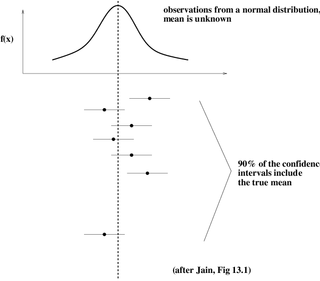
Each horizontal bar is the interval computed from one dataset. The true mean \(\mu\) (vertical line) is a fixed number; it is the interval that is random, because it is built from random data.
“95% confidence” describes the procedure: about 95 in 100 intervals built this way contain \(\mu\). Any single interval either contains it or does not – we just cannot tell which.
Step 1: The Sample Mean Is Approximately Gaussian
Take \(n\) independent samples \(x_1, \dots, x_n\) from a distribution with mean \(\mu\) and variance \(\sigma^2\), and average them to get \(\bar{x}\).
The Central Limit Theorem we just saw says that, for large \(n\),
The standard deviation of \(\bar{x}\), \(\;\sigma/\sqrt{n}\), is called the standard error (SE). It shrinks like \(1/\sqrt{n}\) – the narrowing we saw in the CLT simulation.
The usual rule of thumb is \(n \geq 30\) for the Gaussian approximation to be good; our datasets are far larger.
Step 2: How Far Does \(\bar{x}\) Land From \(\mu\)?
Measure the distance from \(\bar{x}\) to \(\mu\) in units of standard errors:
\[
S = \frac{\bar{x} - \mu}{\sigma/\sqrt{n}} \;\sim\; \mathcal{N}(0, 1).
\]
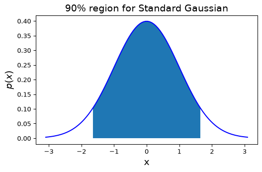
Then “\(\bar{x}\) lands within \(k\) standard errors of \(\mu\)” has probability \(P(-k < S < k)\) – a number we can read straight off the standard Gaussian.
For a 95% probability we want 5% left over in the tails – 2.5% on each side – so the right edge sits at the 97.5th percentile of the standard Gaussian:
\[ k = \texttt{norm.ppf(0.975)} \approx 1.96. \]
want
tails
\(k\)
90%
5% + 5%
1.645
95%
2.5% + 2.5%
1.96
99%
0.5% + 0.5%
2.576
Step 3: Flip It Around
Step 2 gives a statement about where \(\bar{x}\) falls, centered on \(\mu\):
But we know\(\bar{x}\) and don’t know\(\mu\), so we want \(\mu\) in the middle instead.
The event in the parentheses is just “\(\lvert \bar{x} - \mu \rvert < 1.96\,\sigma/\sqrt{n}\)”, and a distance is the same whichever end you measure it from. So it is the same event as “\(\mu\) is within \(1.96\,\sigma/\sqrt{n}\) of \(\bar{x}\)”:
Now \(\mu\) is inside a range whose endpoints depend only on \(\bar{x}\), \(n\) – and \(\sigma\).
Step 4: Estimate \(\sigma\), and the Final Formula
We do not know \(\sigma\) either, so we estimate it with the sample standard deviation \(s = \sqrt{\tfrac{1}{n-1}\sum (x_i - \bar{x})^2}\). That gives the 95% confidence interval for the mean:
\[
\bar{x} \;\pm\; 1.96\,\frac{s}{\sqrt{n}}
\qquad\text{-- roughly, "the mean plus or minus two standard errors."}
\]
The general notation you will meet in textbooks and libraries. Write the confidence level as \(1 - \alpha\), so \(\alpha\) is the probability of missing (95% \(\leftrightarrow\)\(\alpha = 0.05\)). The miss probability is split between the two tails, \(\alpha/2\) each, so the multiplier is the \((1-\alpha/2)\) quantile, written \(z_{1-\alpha/2}\):
It is exactly the formula above with the confidence level made adjustable – nothing new is happening.
A Confidence Interval on Real Data
What is the mean daily temperature in Boston in July? Let’s report it the way you should report a mean in a project: with a confidence interval.
Code
n =len(july)xbar, s = july.mean(), july.std()z = norm.ppf(0.975) # 1.96se = s / np.sqrt(n)print(f"n = {n}, sample mean = {xbar:.2f} °C, sample std = {s:.2f} °C")print(f"standard error = {se:.3f} °C")print(f"95% CI for the mean July temperature: [{xbar - z*se:.2f}, {xbar + z*se:.2f}] °C")
n = 2821,  sample mean = 23.23 °C,  sample std = 3.17 °C
standard error = 0.060 °C
95% CI for the mean July temperature: [23.12, 23.35] °C
With thousands of days the interval is very tight. Compare a single year – 31 days – where the same formula gives a much wider interval:
Code
july_2020 = temps[(temps['MONTH'] ==7) & (temps['YEAR'] ==2020)]['TMEAN']n1, xbar1, se1 =len(july_2020), july_2020.mean(), july_2020.std() / np.sqrt(len(july_2020))print(f"July 2020 only: n = {n1}, mean = {xbar1:.2f} °C, 95% CI = [{xbar1 - z*se1:.2f}, {xbar1 + z*se1:.2f}] °C")
July 2020 only: n = 31, mean = 24.05 °C, 95% CI = [22.83, 25.28] °C
Reading a Confidence Interval Correctly
The 95% refers to the procedure: if we repeated the whole experiment many times, about 95% of the intervals we construct would contain the true mean. Any particular interval either does or does not.
The interval shrinks like \(1/\sqrt{n}\): to halve its width you need four times the data.
It quantifies uncertainty in the mean only, not the spread of individual values. Individual July days range over roughly \(\mu \pm 2\sigma \approx \pm 6\) °C, even though the mean is pinned down to a fraction of a degree.
The formula assumes independent samples. Consecutive days are not truly independent (hot days cluster), so the true interval is somewhat wider than reported. Be honest about that caveat when you use it.
Summary
Summary
Probability as a modeling tool – four things we did:
Fit and check. Choose a distribution family whose shape matches the data (Gaussian for daily temperatures, Poisson for horse-kick counts), estimate its parameters, then check the fit by overlaying the density, comparing predicted and observed counts, and testing implied properties.
Maximum Likelihood Estimation. The general recipe for step 2: write the likelihood of the data, take the log, maximize. For the Gaussian this gives the sample mean and variance; for the Poisson the sample mean count.
Covariance, correlation, and the multivariate Gaussian. How two variables move together, and how the covariance matrix \(\Sigma\) shapes the ellipses of a 2-D Gaussian. The MLE of \((\mathbf{\mu}, \Sigma)\) is the sample mean and sample covariance.
Uncertainty. The Central Limit Theorem says sample means are approximately Gaussian with standard error \(\sigma/\sqrt{n}\), which gives the confidence interval \(\bar{x} \pm z_{1-\alpha/2}\, s/\sqrt{n}\).
Next: Gaussian Mixture Models
The stock returns above did not look like one Gaussian. Many real datasets look like several overlapping Gaussians – one per cluster.
A Gaussian Mixture Model is exactly that: a weighted sum of multivariate Gaussians, each with its own \(\mathbf{\mu}_k\) and \(\Sigma_k\).
We will fit it by maximum likelihood – the same principle as today – but because we don’t know which cluster each point came from, the likelihood cannot be maximized in closed form. That is what the Expectation-Maximization algorithm is for.
Everything from today carries over: the multivariate Gaussian and its covariance ellipses, the log-likelihood, and the Gaussian MLE formulas.
The notation \(X \sim \mathcal{N}(\mu, \sigma^2)\) is read as “X is distributed as a normal with mean \(\mu\) and variance \(\sigma^2\)”↩︎
By no conegut - MacTutor History of Mathematics: http://www-history.mcs.st-andrews.ac.uk/PictDisplay/Bortkiewicz.html, Public Domain, https://commons.wikimedia.org/w/index.php?curid=79219622↩︎