
Time Series Analysis

Colab
Introduction to Time Series
What is a Time Series?
Time series = data points indexed by time (hourly, daily, monthly…)
Two key goals:
- Analysis: What patterns exist? Trends? Seasonality? Anomalies?
- Forecasting: What comes next?
Time Series Are Everywhere
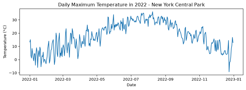
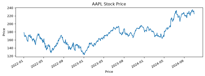
| Domain | Example Questions |
|---|---|
| Finance | Will this stock go up? What’s my portfolio risk? |
| Healthcare | Is this patient’s vitals trending abnormally? |
| Climate | How much warmer will next decade be? |
| Retail | How much inventory do I need for Black Friday? |
The Four Components
Every time series can be decomposed into:
| Component | What it captures | Example |
|---|---|---|
| Trend | Long-term direction | “Are EV sales growing?” |
| Seasonality | Fixed-period cycles | “Ice cream sales spike in summer” |
| Cyclic | Variable-length oscillations | “Business cycles” |
| Noise | Random variation | “Day-to-day fluctuations” |
Today’s Roadmap
- Visualize — See patterns before modeling
- Decompose — Separate trend, seasonality, noise
- Test — Is it stationary? (Spoiler: it matters)
- Model — AR, MA, ARIMA, SARIMA
- Forecast — Predict the future (with uncertainty)
Time and Date Manipulation
Many time series data sets are indexed by date or time. The python datetime library and the pandas library provide a powerful set of tools for manipulating time series data.
The Time Series chapter of the book Python for Data Analysis, 3rd Ed. provides a good overview of these tools. We’ll share a few excerpts here.
Code
import numpy as np
import pandas as pd
from datetime import datetime

now = datetime.now()
print(f"Date and time when this cell was executed: {now}")
print(f"Year: {now.year}, month: {now.month}, day: {now.day}")

delta = now - datetime(2024, 1, 1)
print(f"Since beginning of 2024 till when this cell was run there were {delta.days} days and {delta.seconds} seconds.")
Date and time when this cell was executed: 2026-10-16 14:59:10.998900
Year: 2026, month: 10, day: 16
Since beginning of 2024 till when this cell was run there were 1019 days and 53950 seconds.You can also convert between strings and datetime.
Code
# string to datetime
date_string = "2024-01-01"
date_object = datetime.strptime(date_string, "%Y-%m-%d")
print(date_object)
2024-01-01 00:00:00You can also format datetime objects as strings.
Code
# datetime to string
now_str = now.strftime("%Y-%m-%d")
print(now_str)2026-10-16See Table 11.2 in the book for a list of formatting codes.
Let’s explore some of the pandas time series tools.
Create a time series with a datetime index.
Code
longer_ts = pd.Series(np.random.standard_normal(1000),
                      index=pd.date_range("2022-01-01", periods=1000))
print(type(longer_ts))
longer_ts
<class 'pandas.Series'>2022-01-01 -0.703802
2022-01-02 1.696098
2022-01-03 -0.262638
2022-01-04 -1.082923
2022-01-05 2.910648
...
2024-09-22 -0.776969
2024-09-23 -0.007169
2024-09-24 0.459618
2024-09-25 0.667978
2024-09-26 1.215421
Freq: D, Length: 1000, dtype: float64We can access just the samples from 2023 with simply:
Code
longer_ts["2023"]2023-01-01 -0.920289
2023-01-02 1.335858
2023-01-03 -2.110712
2023-01-04 -0.606369
2023-01-05 -1.273971
...
2023-12-27 1.721363
2023-12-28 0.766911
2023-12-29 -0.804235
2023-12-30 -0.047577
2023-12-31 -0.089052
Freq: D, Length: 365, dtype: float64Or the month of September 2023:
Code
longer_ts["2023-09"]2023-09-01 2.868394
2023-09-02 0.312478
2023-09-03 -0.297540
2023-09-04 0.655515
2023-09-05 -0.188157
2023-09-06 -1.012843
2023-09-07 -1.919829
2023-09-08 -1.611239
2023-09-09 -0.143388
2023-09-10 -1.569488
2023-09-11 -0.740844
2023-09-12 1.080935
2023-09-13 0.659290
2023-09-14 -0.242989
2023-09-15 -0.672110
2023-09-16 2.181657
2023-09-17 0.869828
2023-09-18 -0.181120
2023-09-19 -0.196851
2023-09-20 -1.167125
2023-09-21 0.436533
2023-09-22 -1.370049
2023-09-23 -0.354693
2023-09-24 1.187712
2023-09-25 -1.368071
2023-09-26 -0.289492
2023-09-27 3.034689
2023-09-28 1.059284
2023-09-29 -0.214889
2023-09-30 0.706838
Freq: D, dtype: float64Or slice by date range:
Code
longer_ts["2023-03-01":"2023-03-10"]2023-03-01 -0.150030
2023-03-02 -0.789881
2023-03-03 -2.399276
2023-03-04 -0.399259
2023-03-05 0.657991
2023-03-06 0.542360
2023-03-07 -1.053618
2023-03-08 0.506050
2023-03-09 0.740074
2023-03-10 -1.671099
Freq: D, dtype: float64or:
Code
longer_ts["2023-09-15":]2023-09-15 -0.672110
2023-09-16 2.181657
2023-09-17 0.869828
2023-09-18 -0.181120
2023-09-19 -0.196851
...
2024-09-22 -0.776969
2024-09-23 -0.007169
2024-09-24 0.459618
2024-09-25 0.667978
2024-09-26 1.215421
Freq: D, Length: 378, dtype: float64There are many more time series tools available that let you do things like:
- Shifting and setting frequencies of date ranges
- Time zone handling
- Time series resampling
- Time series rolling and expanding windows
Moving Window Functions
Let’s dive into the moving window functions.
Code
import pandas as pd
import yfinance as yf
import os

# Define the file path for cached data (10-year history)
aapl_10yr_file_path = os.path.join('data', 'aapl_stock_data_10yr.csv')

# Check if the file exists and load it, otherwise download
import warnings

aapl_data = None
if os.path.exists(aapl_10yr_file_path):
    # Load data from file - yfinance creates multi-level headers, skip rows 1,2
    aapl_data = pd.read_csv(aapl_10yr_file_path, header=0, skiprows=[1, 2], index_col=0, parse_dates=True)
else:
    # Download data from yfinance
    try:
        aapl_data = yf.download('AAPL', start='2012-01-01', end='2022-01-01', progress=False)

        # Check if download was successful (non-empty dataframe)
        if aapl_data.empty:
            warnings.warn("Downloaded data is empty. Please check the ticker symbol and date range.")
            aapl_data = None
        else:
            # Flatten columns if MultiIndex (yfinance >= 0.2.40)
            if isinstance(aapl_data.columns, pd.MultiIndex):
                aapl_data.columns = aapl_data.columns.get_level_values(0)

            # Save to file for future use
            aapl_data.to_csv(aapl_10yr_file_path)

    except Exception as e:
        warnings.warn(f"Error downloading data from yfinance: {str(e)}")
        aapl_data = None

if aapl_data is not None:
    print(aapl_data.head())
    aapl_close_px = aapl_data['Close']
else:
    print("AAPL data not available - skipping this example")
Close High Low Open Volume
Date
2012-01-05 12.513906 12.529472 12.353452 12.421706 271269600
2012-01-06 12.644725 12.655202 12.549530 12.565995 318292800
2012-01-09 12.624668 12.804880 12.613292 12.737525 394024400
2012-01-10 12.669870 12.752492 12.617782 12.749798 258196400
2012-01-11 12.649214 12.658195 12.552223 12.653105 215084800Code
# Plot the closing prices
import matplotlib.pyplot as plt

if aapl_data is not None:
    ax = aapl_close_px.plot(label='AAPL')
    aapl_close_px.rolling(window=250).mean().plot(label='250d MA', ax=ax)
    ax.legend()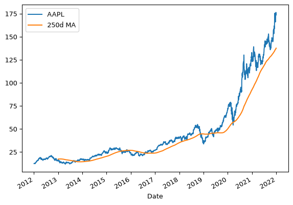
Visualization
Always visualize first! Let’s explore patterns in a classic dataset.
Air Passengers Dataset
We’re going to use a dataset of air passengers per month from 1949 to 1960.
Code
path = os.path.join('data', 'air_passengers_1949_1960.csv')
air_passengers = pd.read_csv(path, index_col='Date', parse_dates=True)
air_passengers.head()| Number of Passengers | |
|---|---|
| Date | |
| 1949-01-01 | 112 |
| 1949-02-01 | 118 |
| 1949-03-01 | 132 |
| 1949-04-01 | 129 |
| 1949-05-01 | 121 |
Time Series Plot
Let’s look at the time series plot.
Code
ts = air_passengers['Number of Passengers']
ts.plot(ylabel='Number of Passengers', title='Air Passengers 1949-1960', figsize=(10, 4))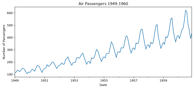
Clearly there are some trends and seasonality in the data.
Clearly: trend (going up) + seasonality (annual pattern) + growing amplitude.
Let’s visualize that seasonal pattern more explicitly:
Code
# Seasonal plot of air_passengers
import matplotlib.pyplot as plt
import seaborn as sns

# Extract month and year from the index
air_passengers['Month'] = air_passengers.index.month
air_passengers['Year'] = air_passengers.index.year

# Create a seasonal plot
#plt.figure(figsize=(10, 4))
sns.lineplot(data=air_passengers, x='Month', y='Number of Passengers', hue='Year', palette='tab10')
# plt.title('Seasonal Plot of Air Passengers')
# plt.ylabel('Number of Passengers')
# plt.xlabel('Month')
# plt.legend(title='Year', bbox_to_anchor=(1.05, 1), loc='upper left')
# plt.show()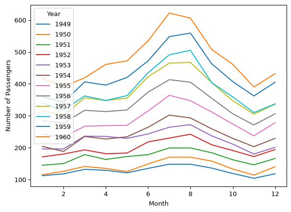
Notice: the seasonal amplitude is growing over time — important for model choice!
Let’s look at the distribution across years and months:
Code
# Add normalized column for later use
import matplotlib.pyplot as plt
air_passengers['Normalized_Passengers'] = air_passengers.groupby('Year')['Number of Passengers'].transform(lambda x: x / x.iloc[0])

# Create side-by-side plots
fig, (ax1, ax2) = plt.subplots(1, 2, figsize=(12, 4))

# Year-wise box plot
sns.boxplot(data=air_passengers, x='Year', y='Number of Passengers', palette='tab10', ax=ax1)
ax1.set_title('By Year: Clear Upward Trend')
ax1.set_ylabel('Passengers')
ax1.tick_params(axis='x', rotation=45)

# Month-wise box plot
sns.boxplot(data=air_passengers, x='Month', y='Number of Passengers', palette='tab10', hue='Month', legend=False, ax=ax2)
ax2.set_title('By Month: Summer Peak (Jul-Aug)')
ax2.set_ylabel('Passengers')

plt.tight_layout()
plt.show()
/var/folders/j_/hxxgy5dd7655k_416s6t9kgc0000gq/T/ipykernel_24056/2554698556.py:9: FutureWarning:
Passing `palette` without assigning `hue` is deprecated and will be removed in v0.14.0. Assign the `x` variable to `hue` and set `legend=False` for the same effect.
sns.boxplot(data=air_passengers, x='Year', y='Number of Passengers', palette='tab10', ax=ax1)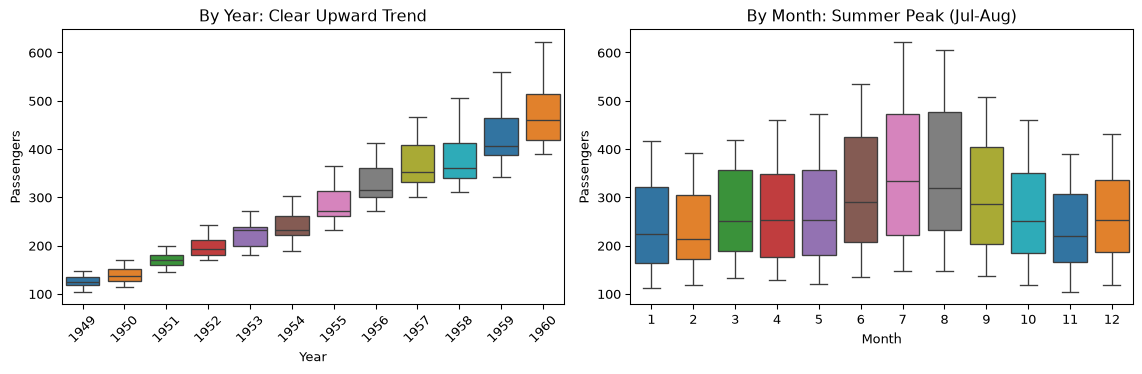
Left: Trend is obvious. Right: July-August are peak travel months.
Box plot: median, Q1-Q3 Interquartile Range, Whiskers: \(1.5\times \text{IQR}\)
Autocorrelation: The Key Diagnostic
Autocorrelation = correlation between \(y_t\) and \(y_{t-k}\) (lagged by \(k\) steps)
\[ \rho_k = \frac{\sum_{t=k+1}^{T} (y_t - \bar{y})(y_{t-k} - \bar{y})}{\sum_{t=1}^{T} (y_t - \bar{y})^2} \]
Why it matters:
- High autocorrelation (for \(k>0\)) → values depend on past → predictable!
- Peaks at regular lags → seasonality
- No autocorrelation → white noise (unpredictable)
ACF of Air Passengers
Code
from statsmodels.graphics.tsaplots import plot_acf

plot_acf(air_passengers['Number of Passengers'], lags=48)
plt.title('Autocorrelation Plot of Air Passengers')
plt.show()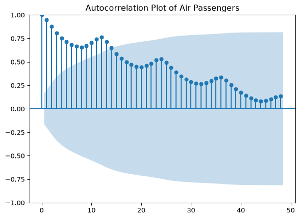
Reading the ACF: Blue shading = 95% CI. Peak at lag 12 is significant → yearly seasonality confirmed!
Time Series Decomposition
The Goal: Separate Signal from Noise
We want to break apart: Observed = Trend + Seasonality + Residual
Why?
- Understand the underlying patterns
- Remove seasonality for cleaner modeling
- Detect anomalies in the residuals
- Forecast each component separately
Additive vs Multiplicative
How do the components combine?
| Model | Formula | When to use |
|---|---|---|
| Additive | \(Y = T + S + \epsilon\) | Seasonal amplitude is constant |
| Multiplicative | \(Y = T \times S \times \epsilon\) | Seasonal amplitude grows with trend |
Look back at air passengers: amplitude grows → multiplicative is better!
Classical Decomposition: The Algorithm
Steps:
- Estimate trend — moving average smooths out seasonality
- Remove trend — detrended = observed - trend
- Estimate seasonality — average each month’s detrended values
- Residual — what’s left after removing trend & seasonality
Let’s do it step by step:
Code
import numpy as np

# Step 1: Trend via moving average
trend = ts.rolling(window=12, center=True).mean()

# Step 2: Detrend
detrended_ts = ts - trend

# Step 3: Seasonal pattern (average by month)
seasonal_ts = detrended_ts.groupby(detrended_ts.index.month).mean()

# Step 4: Residual
irregular_ts = detrended_ts - np.tile(seasonal_ts, len(detrended_ts) // len(seasonal_ts))

# Plot all components
fig, axes = plt.subplots(4, 1, figsize=(10, 8), sharex=False)

ts.plot(ax=axes[0], title='Original')
trend.plot(ax=axes[1], title='Trend (12-month MA)', color='orange')
detrended_ts.plot(ax=axes[2], title='Detrended', color='green')
irregular_ts.plot(ax=axes[3], title='Residual', color='red')

plt.tight_layout()
plt.show()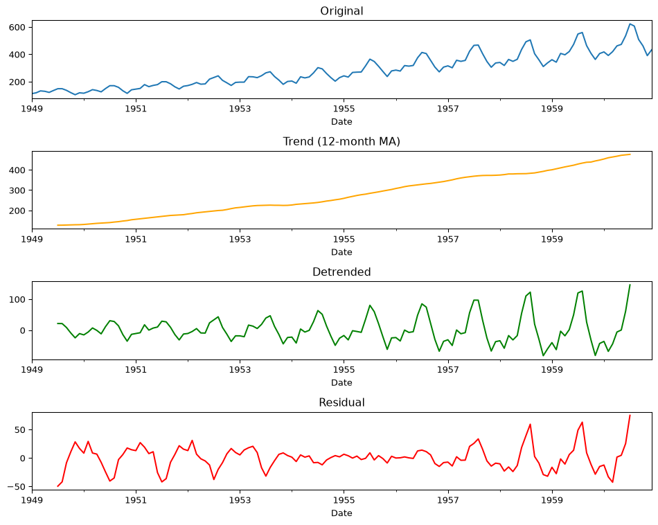
Question: Is the residual truly random? (Hint: look at the variance over time)
STL: A Better Decomposition
STL = Seasonal-Trend decomposition using Loess (Cleveland et al. 1990)
Why STL over classical?
- ✅ Handles changing seasonality (amplitude can vary)
- ✅ Robust to outliers
- ✅ Works with any period (not just 12 months)
See course notes for details on Loess (locally weighted regression)
Locally Estimated Scatterplot Smoothing – Loess1
Loess, which stands for “Locally Estimated Scatterplot Smoothing,” is a non-parametric method used to estimate non-linear relationships in data. It is particularly useful for smoothing scatterplots and is a type of local regression.
Key Features of Loess:
Local Fitting: Loess fits simple models to localized subsets of the data to build up a function that describes the deterministic part of the variation in the data, point by point.
Weighted Least Squares: It uses weighted least squares to fit a polynomial surface to the data. The weights decrease with distance from the point of interest, giving more influence to points near the target point.
Flexibility: Loess is flexible and can model complex relationships without assuming a specific global form for the data. It can adapt to various shapes and patterns in the data.
Smoothing Parameter: The degree of smoothing is controlled by a parameter, often denoted as \(\alpha\) or the span. This parameter determines the proportion of data points used in each local fit. A smaller span results in a curve that follows the data more closely, while a larger span results in a smoother curve.
Polynomial Degree: Loess can fit either linear or quadratic polynomials to the data. The choice of polynomial degree affects the smoothness and flexibility of the fit.
How Loess Works:
- Step 1: For each point in the dataset, a neighborhood of points is selected based on the smoothing parameter.
- Step 2: A weighted least squares regression is performed on the points in the neighborhood, with weights decreasing with distance from the target point.
- Step 3: The fitted value at the target point is computed from the local regression model.
- Step 4: This process is repeated for each point in the dataset, resulting in a smooth curve that captures the underlying trend.
Applications:
Loess is widely used in exploratory data analysis to visualize trends and patterns in data. It is particularly useful when the relationship between variables is complex and not well-represented by a simple linear or polynomial model.
Example in Python:
In Python, the statsmodels library provides a function for performing Loess smoothing:
Code
import numpy as np
import matplotlib.pyplot as plt
from statsmodels.nonparametric.smoothers_lowess import lowess

# Example data
np.random.seed(1)
x = np.linspace(0, 10, 100)
y = np.sin(x) + np.random.normal(0, 0.1, 100)

# Apply Loess smoothing
smoothed = lowess(y, x, frac=0.2)

# Plot
plt.scatter(x, y, label='Data', alpha=0.5)
plt.plot(smoothed[:, 0], smoothed[:, 1], color='red', label='Loess Smoothed')
plt.legend()
plt.show()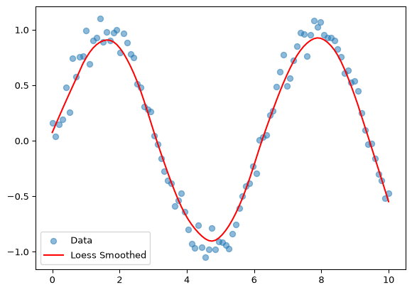
In this example, frac is the smoothing parameter that controls the amount of smoothing applied to the data.
In Practice: statsmodels
from statsmodels.tsa.seasonal import seasonal_decompose, STL

# Reload clean data
data = pd.read_csv(os.path.join('data', 'air_passengers_1949_1960.csv'), index_col='Date', parse_dates=True)
ts = data['Number of Passengers']
Additive vs Multiplicative: See the Difference
Code
fig, axes = plt.subplots(2, 4, figsize=(14, 6))

for i, model in enumerate(['additive', 'multiplicative']):
    decomp = seasonal_decompose(ts, model=model)
    decomp.observed.plot(ax=axes[i, 0], title='Observed' if i==0 else '')
    decomp.trend.plot(ax=axes[i, 1], title='Trend' if i==0 else '')
    decomp.seasonal.plot(ax=axes[i, 2], title='Seasonal' if i==0 else '')
    decomp.resid.plot(ax=axes[i, 3], title='Residual' if i==0 else '')
    axes[i, 0].set_ylabel(model.title())

plt.tight_layout()
plt.show()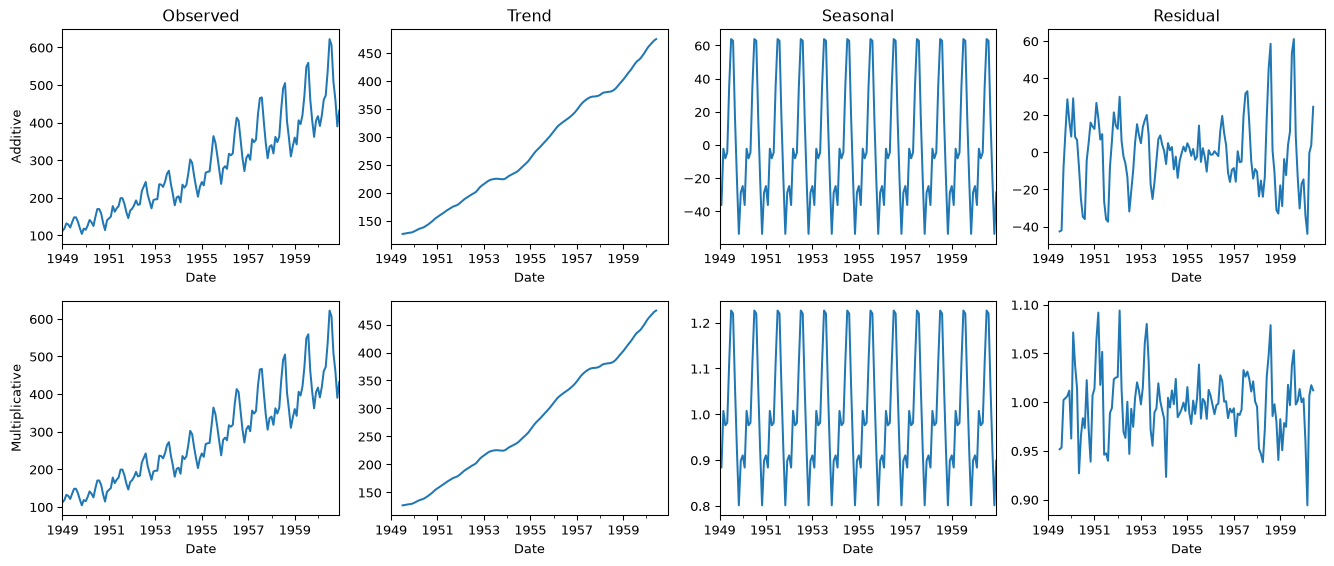
Key insight: Multiplicative residuals are more uniform — better fit!
STL in Action
Code
from statsmodels.tsa.seasonal import STL

stl = STL(ts, period=12, robust=True)
result = stl.fit()

fig, axes = plt.subplots(4, 1, figsize=(10, 6), sharex=True)
result.observed.plot(ax=axes[0], title='STL Decomposition')
axes[0].set_ylabel('Observed')
result.trend.plot(ax=axes[1])
axes[1].set_ylabel('Trend')
result.seasonal.plot(ax=axes[2])
axes[2].set_ylabel('Seasonal')
result.resid.plot(ax=axes[3])
axes[3].set_ylabel('Residual')
plt.tight_layout()
plt.show()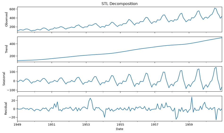
Stationarity: Why It Matters
The Stationarity Problem
Stationary = statistical properties (mean, variance) don’t change over time
Why do we care?
Most forecasting models assume stationarity.
If your data has:
- 📈 Trend → mean is changing
- 📊 Growing variance → variance is changing
- 🔄 Seasonality → periodic non-stationarity
…the model will fail. We must transform the data first.
Making Data Stationary
| Problem | Solution |
|---|---|
| Trend | Differencing: \(y'_t = y_t - y_{t-1}\) |
| Growing variance | Log transform: \(y'_t = \log(y_t)\) |
| Seasonality | Seasonal differencing: \(y'_t = y_t - y_{t-12}\) |
Testing for Stationarity
Two standard tests (both in statsmodels):
| Test | Null Hypothesis | Reject means… |
|---|---|---|
| ADF | Has unit root (non-stationary) | Stationary ✓ |
| KPSS | Is stationary | Non-stationary ✗ |
ADF (Augmented Dickey-Fuller): Tests whether a “unit root” is present — a mathematical property that causes non-stationarity. The test includes lagged differences to handle autocorrelation. If p-value < 0.05, reject the null → evidence the series is stationary.
KPSS (Kwiatkowski-Phillips-Schmidt-Shin): Flips the hypothesis — assumes stationarity and tests for evidence against it. Checks stats on residuals of the trend-stationary series. If p-value < 0.05, reject the null → evidence the series is non-stationary.
Stationarity Tests Continued
Why use both? They have opposite null hypotheses, so using them together provides stronger evidence:
| ADF Result | KPSS Result | Conclusion |
|---|---|---|
| Reject (p<0.05) | Fail to reject | Stationary ✓ |
| Fail to reject | Reject (p<0.05) | Non-stationary ✗ |
| Both reject | Both reject | Trend-stationary (difference needed) |
| Neither rejects | Neither rejects | Inconclusive — gather more data |
See course notes for worked examples of ADF and KPSS tests
ADF Test Demonstration
Let’s apply the tests, starting with ADF:
Code
import pandas as pd
from statsmodels.tsa.stattools import adfuller, kpss

air_passengers = pd.read_csv(os.path.join('data', 'air_passengers_1949_1960.csv'))

# Apply ADF and KPSS tests on the air passenger data

# ADF Test
result_adf = adfuller(air_passengers['Number of Passengers'])
print('ADF Statistic:', result_adf[0])
print('p-value:', result_adf[1])
print('Critical Values:')
for key, value in result_adf[4].items():
    print('\t%s: %.3f' % (key, value))
ADF Statistic: 0.8153688792060514
p-value: 0.991880243437641
Critical Values:
1%: -3.482
5%: -2.884
10%: -2.579Interpretation:
ADF Statistic: The ADF statistic is 0.815, which is greater than all the critical values at the 1%, 5%, and 10% significance levels.
p-value: The p-value is 0.991, which is significantly higher than common significance levels (e.g., 0.01, 0.05, 0.10).
Critical Values:
- 1%: -3.482
- 5%: -2.884
- 10%: -2.579
Conclusion:
Fail to Reject the Null Hypothesis: Since the ADF statistic (0.815) is greater than the critical values and the p-value (0.991) is much higher than typical significance levels, you fail to reject the null hypothesis. This suggests that the time series has a unit root and is non-stationary.
Implication: The time series data for the number of passengers is non-stationary, indicating that it may have a trend or other non-stationary components. To make the series stationary, you might consider differencing the data or applying other transformations, such as detrending or seasonal adjustment, before proceeding with further analysis or modeling.
KPSS Test Demonstration
Let’s apply the KPSS test.
Code
# KPSS Test
result_kpss = kpss(air_passengers['Number of Passengers'], regression='c')
print('\nKPSS Statistic:', result_kpss[0])
print('p-value:', result_kpss[1])
print('Critical Values:')
for key, value in result_kpss[3].items():
    print('\t%s: %.3f' % (key, value))
KPSS Statistic: 1.6513122354165206
p-value: 0.01
Critical Values:
    10%: 0.347
    5%: 0.463
    2.5%: 0.574
    1%: 0.739
/var/folders/j_/hxxgy5dd7655k_416s6t9kgc0000gq/T/ipykernel_24056/3460980279.py:2: InterpolationWarning: The test statistic is outside of the range of p-values available in the
look-up table. The actual p-value is smaller than the p-value returned.
result_kpss = kpss(air_passengers['Number of Passengers'], regression='c')The KPSS (Kwiatkowski-Phillips-Schmidt-Shin) test is another test used to assess the stationarity of a time series, but it has a different null hypothesis compared to the ADF test.
KPSS Test Interpretation:
Null Hypothesis ((H_0)): The null hypothesis of the KPSS test is that the time series is stationary around a deterministic trend (i.e., it does not have a unit root).
Alternative Hypothesis ((H_1)): The alternative hypothesis is that the time series is not stationary (i.e., it has a unit root).
Given Results:
- KPSS Statistic: 1.651
- p-value: 0.01
- Critical Values:
- 10%: 0.347
- 5%: 0.463
- 2.5%: 0.574
- 1%: 0.739
Conclusion:
Reject the Null Hypothesis: The KPSS statistic (1.651) is greater than all the critical values at the 10%, 5%, 2.5%, and 1% significance levels. This, along with the low p-value (0.01), suggests that you reject the null hypothesis of stationarity.
Implication: The time series is likely non-stationary according to the KPSS test. This aligns with the ADF test results, which also indicated non-stationarity.
Overall Interpretation:
Both the ADF and KPSS tests suggest that the time series is non-stationary. This consistent result from both tests strengthens the conclusion that the series may need differencing or other transformations to achieve stationarity before further analysis or modeling.
Time Series Models
The ARIMA Family
Building blocks for forecasting:
| Model | Idea | Parameters |
|---|---|---|
| AR(p) | Past values predict future | \(y_t = c + \phi_1 y_{t-1} + ... + \epsilon_t\) |
| MA(q) | Past errors predict future | \(y_t = \mu + \theta_1 \epsilon_{t-1} + ... + \epsilon_t\) |
| ARIMA(p,d,q) | AR + MA + differencing | Combines both, d = differencing order |
| SARIMA | ARIMA + seasonality | (p,d,q) × (P,D,Q,s) |
ARIMA: The Workhorse
\[ y_t = c + \underbrace{\phi_1 y_{t-1} + ... + \phi_p y_{t-p}}_{\text{AR: past values}} + \underbrace{\theta_1 \epsilon_{t-1} + ... + \theta_q \epsilon_{t-q}}_{\text{MA: past errors}} + \epsilon_t \]
ARIMA(p, d, q):
- p = AR order (how many past values?)
- d = differencing order (how many times to difference?)
- q = MA order (how many past errors?)
SARIMA: Adding Seasonality
For data with seasonal patterns, add seasonal terms:
SARIMA(p,d,q) × (P,D,Q,s)
- Lowercase (p,d,q) = short-term dynamics
- Uppercase (P,D,Q) = seasonal dynamics
- s = seasonal period (12 for monthly, 4 for quarterly)
Example: SARIMA(1,1,1)×(1,1,1,12) for monthly data with yearly seasonality
SARIMA in Practice
Let’s forecast air passengers with SARIMA(1,1,1)×(1,1,1,12):
Code
import numpy as np
from statsmodels.tsa.statespace.sarimax import SARIMAX

# Prepare data
path = os.path.join('data', 'air_passengers_1949_1960.csv')
data = pd.read_csv(path)
data['Month'] = pd.date_range(start='1949-01', periods=len(data), freq='ME')
data.set_index('Month', inplace=True)

# Log transform stabilizes growing variance
data['Log_Passengers'] = np.log(data['Number of Passengers'])
# Fit SARIMA model
model = SARIMAX(data['Log_Passengers'],
order=(1, 1, 1), # (p,d,q)
seasonal_order=(1, 1, 1, 12), # (P,D,Q,s)
freq='ME')
results = model.fit()/Users/tgardos/Source/courses/ds701/DS701-Course-Notes-FA26/.venv/lib/python3.12/site-packages/statsmodels/tsa/base/tsa_model.py:473: ValueWarning: No frequency information was provided, so inferred frequency ME will be used.
self._init_dates(dates, freq)Model Diagnostics
Code
results.plot_diagnostics(figsize=(12, 6))
plt.tight_layout()
plt.show()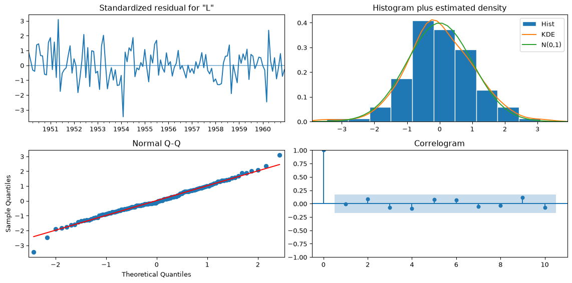
What to check:
- Residuals: Should look like white noise (no pattern)
- Histogram: Should be roughly normal
- Q-Q plot: Points should follow the diagonal
- ACF: No significant spikes (we captured all structure)
Finally, let’s make a forecast for 2 years out.
Code
# Forecasting
forecast = results.get_forecast(steps=24)
forecast_index = pd.date_range(data.index[-1] + pd.DateOffset(months=1), periods=24, freq='ME')
forecast_values = np.exp(forecast.predicted_mean)  # Convert back from log
confidence_intervals = np.exp(forecast.conf_int())

# Plot
plt.figure(figsize=(10, 6))
plt.plot(data['Number of Passengers'], label='Observed')
plt.plot(forecast_index, forecast_values, label='Forecast', color='red')
plt.fill_between(forecast_index, confidence_intervals.iloc[:, 0], confidence_intervals.iloc[:, 1], color='pink', alpha=0.3)
plt.legend()
plt.show()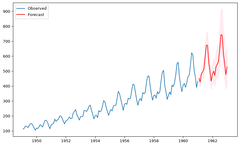
The light pink area shows the 95% confidence interval for the forecast.
Question: What observations do you have about the prediction?
Model Selection & Evaluation
How Do We Choose Parameters?
AIC & BIC: Balance fit vs. complexity
\[\text{AIC} = T\log\left(\frac{\text{SSE}}{T}\right) + 2k \quad \text{(lower is better)}\]
where \(k\) is the number of parameters in the model.
| Criterion | Penalizes complexity… |
|---|---|
| AIC | Moderately |
| BIC | More heavily (prefers simpler models) |
In practice: try multiple (p,d,q) combinations, pick lowest AIC/BIC.
Time Series Cross-Validation
⚠️ Can’t shuffle! Must respect temporal order.
Rolling forecast origin:
Train: [----] Test: [.]
Train: [-----] Test: [.]
Train: [------] Test: [.]
Always train on past, test on future — no data leakage!
Summary
Key Takeaways
- Visualize first — trends, seasonality, autocorrelation
- Decompose — separate signal from noise (STL > classical)
- Check stationarity — transform if needed (differencing, log)
- Model — ARIMA for non-seasonal, SARIMA for seasonal
- Validate — diagnostics + time-aware cross-validation
References
- Forecasting: Principles & Practice — the definitive free textbook
- statsmodels documentation
Bibliography
Cleveland, R. B., W. S. Cleveland, J. E. McRae, and I. J. Terpenning. 1990. “STL: A Seasonal-Trend Decomposition Procedure Based on Loess.” Journal of Official Statistics 6 (1): 3–33. http://bit.ly/stl1990.
Footnotes
gpt-4o, personal communication, Nov 2024↩︎